Project power BI freelance
تفاصيل العمل

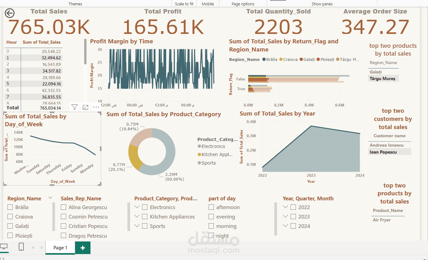
The image shows a Power BI dashboard with various visualizations related to sales performance. Here's a description of the dashboard:
### **Title:** Sales Performance Dashboard
### **Key Metrics Displayed:**
1. **Total Sales:** 765.03K
2. **Total Profit:** 165.61K
3. **Total Quantity Sold:** 2203
4. **Average Order Size:** 347.27
### **Visualizations:**
- **Profit Margin by Time:** A time-based line chart showing fluctuations in profit margin.
- **Total Sales by Hour:** A table listing sales for each hour of the day.
- **Total Sales by Day of the Week:** A line chart showing how sales vary across different weekdays.
- **Total Sales by Product Category:** A donut chart breaking sales into categories like Electronics, Kitchen Appliances, and Sports.
- **Total Sales by Return Flag & Region:** A bar chart showing the impact of returns on sales in different regions.
- **Total Sales by Year:** A line chart depicting sales growth over the years.
- **Top Two Products by Total Sales:** Highlights "Air Fryer" as a top-selling product.
- **Top Two Customers by Total Sales:** Shows "Andreea Ionescu" and "Ioan Popescu" as the highest-spending customers.
### **Filters Available:**
- **Region Name**
- **Sales Representative Name**
- **Product Category**
- **Part of the Day (Morning, Afternoon, Evening, Night)**
- **Year, Quarter, Month Selection**
The dashboard provides a comprehensive analysis of sales trends, profitability, and customer/product performance using interactive visuals.