Company Sales
تفاصيل العمل

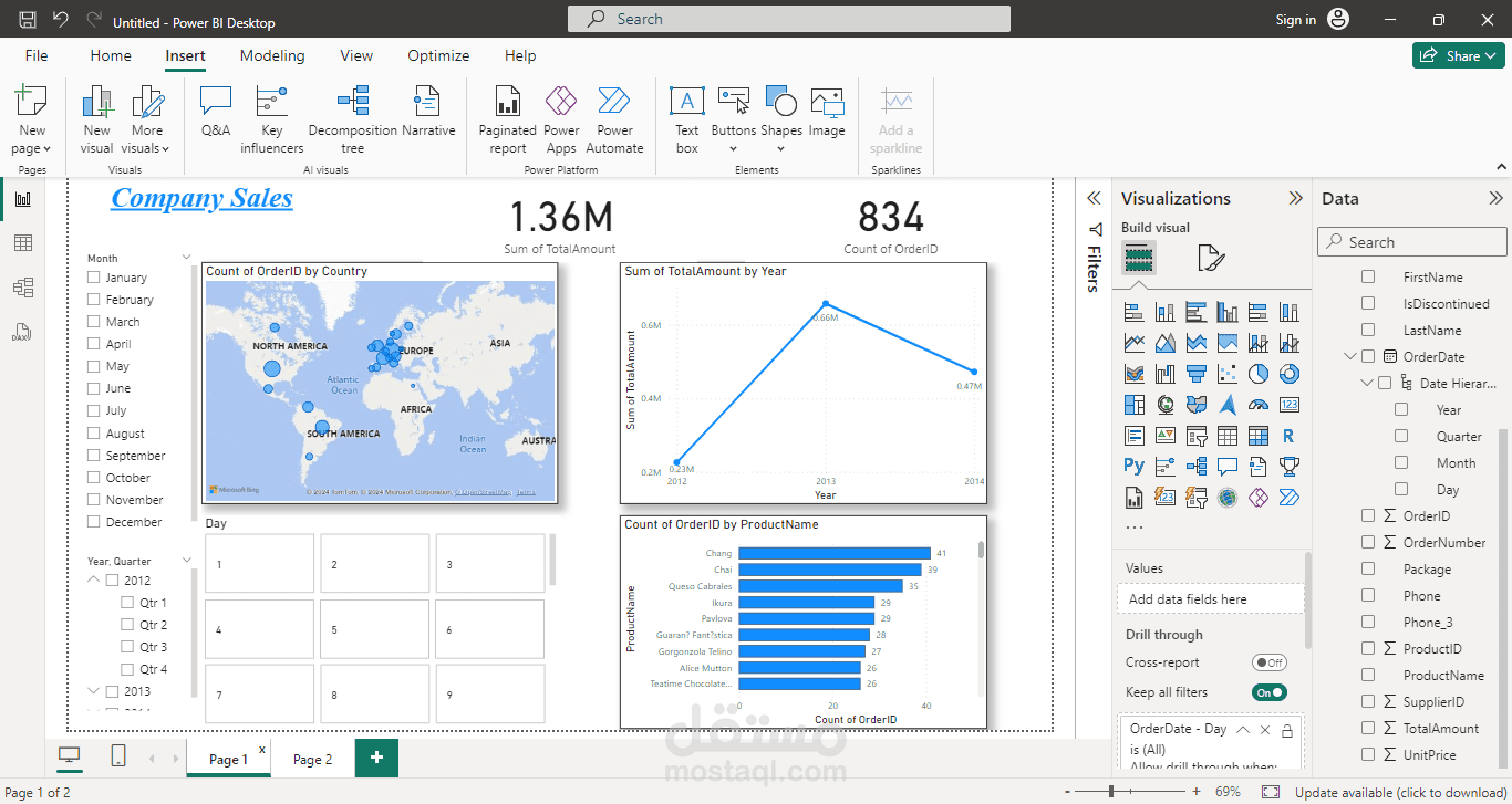
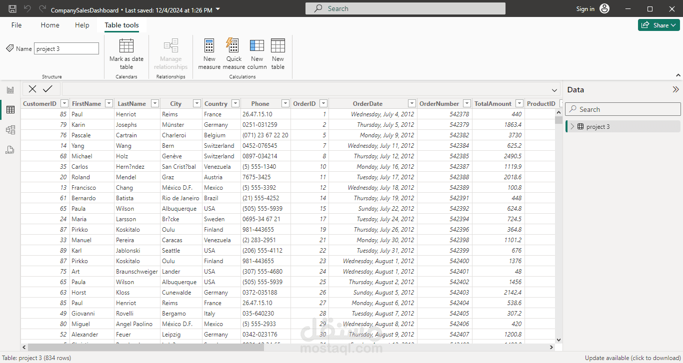
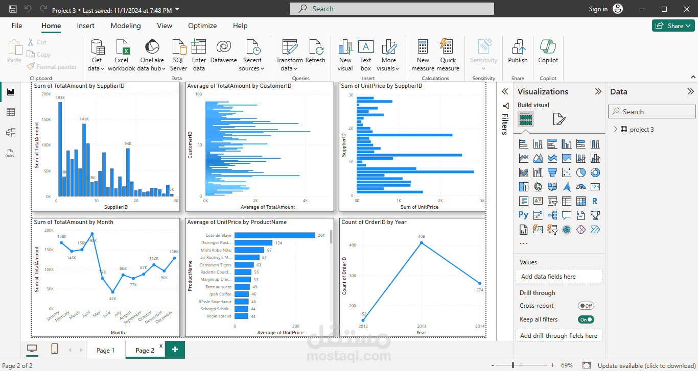
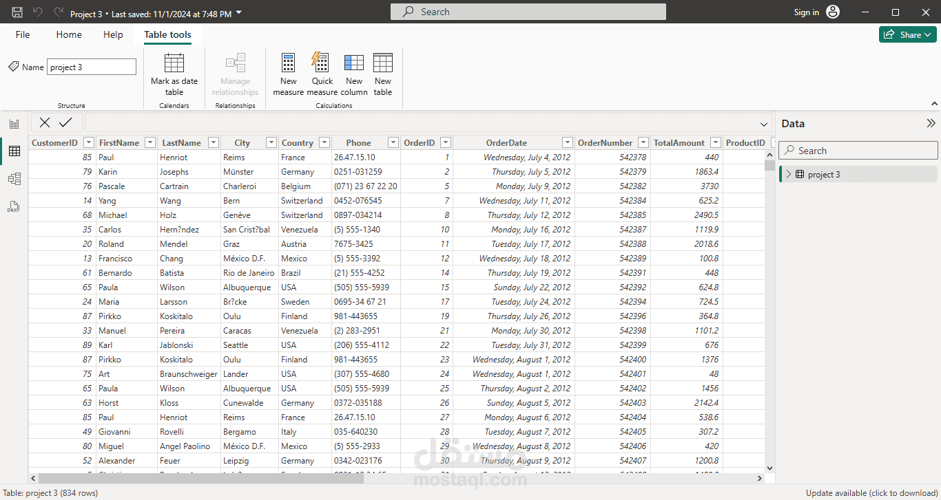
This portfolio showcases my expertise in data analysis and visualization, designed to help businesses gain insights and make informed decisions. In this project, I analyzed sales data, including orders, customers, suppliers, and products, to uncover key trends and patterns.
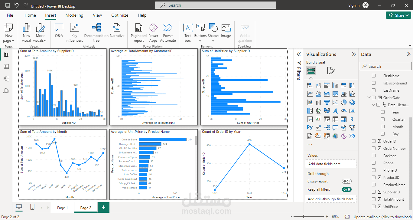
Key Visualizations:
Total Sales by Supplier: A bar chart illustrating each supplier’s contribution to total sales, helping identify top-performing suppliers.
Average Order Amount by Customer: A detailed view of average order values by customer, highlighting high-value clients.
Unit Price Sum by Supplier: An analysis of the sum of unit prices for each supplier, offering insights into pricing and product variety.
Monthly Sales Trends: A line chart showing sales totals across months, useful for identifying peak seasons and periods of high demand.
Average Price by Product: A breakdown of average prices by product, helping to pinpoint high-value items in the product lineup.
Yearly Order Count: A year-over-year analysis of order counts, showing growth trends and annual performance.
These visualizations are crafted to enhance business insights by identifying top suppliers, high-value customers, and key sales trends across products and time periods. With clear, well-structured visualizations, I ensure decision-makers can quickly interpret data and focus on growth opportunities.
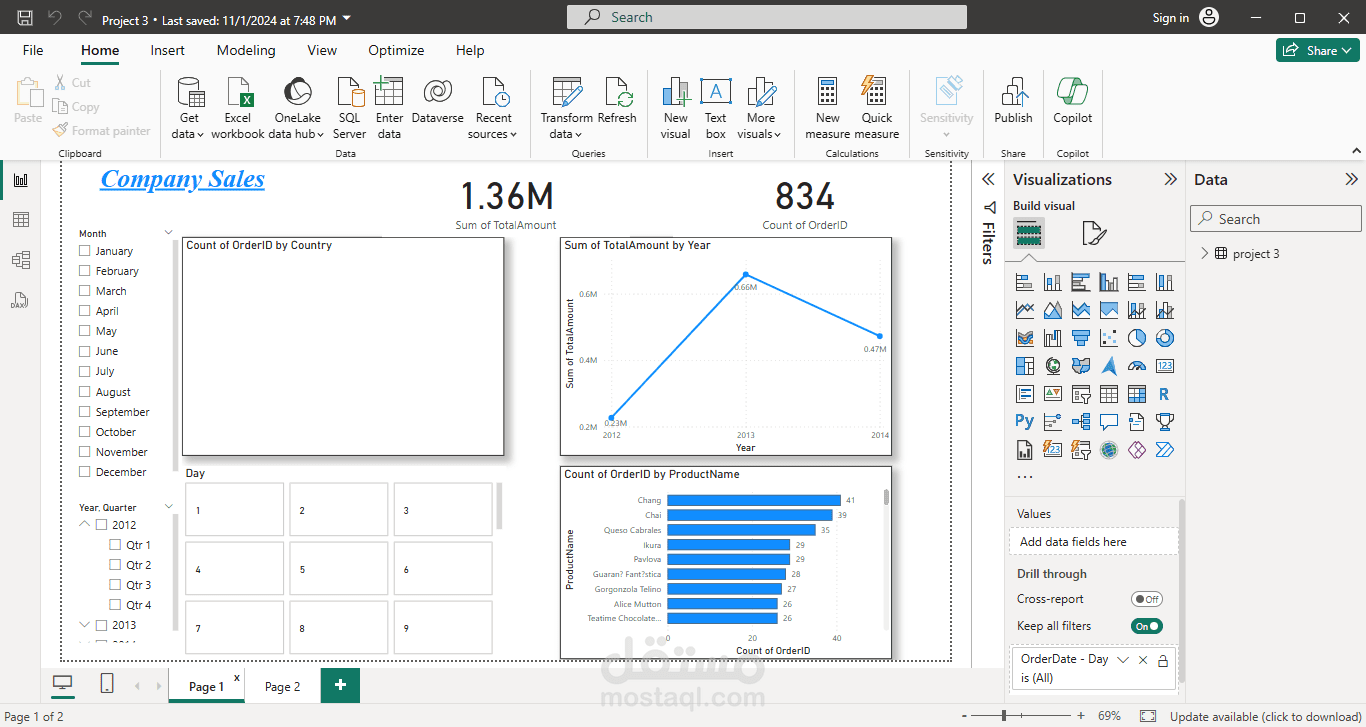
Tools Used: Power BI (or any other tool you used), Excel, SQL