Gapminder Data Visualization Dashboard
تفاصيل العمل
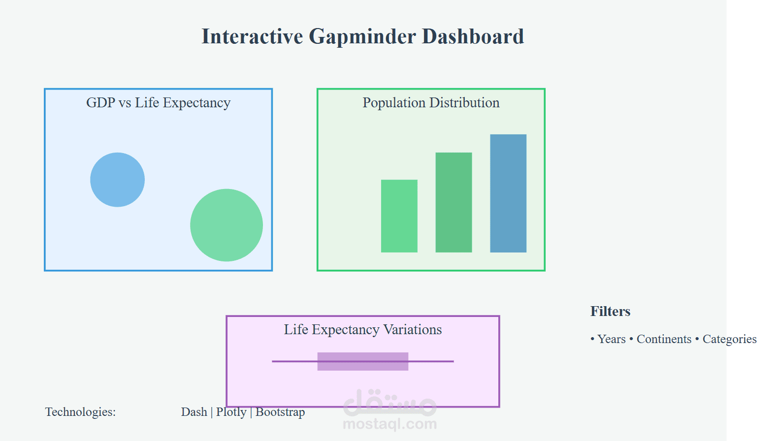
In this project, I built an interactive Gapminder Dashboard using Dash, Plotly, and Bootstrap to explore global socio-economic trends. The dashboard allows users to analyze GDP per capita, life expectancy, and population distribution across different years, continents, and countries.
Key Features:
Dynamic Filtering: Users can select specific years, continents, and categories to refine their analysis.
Interactive Charts:
Scatter Plot for analyzing GDP vs. Life Expectancy trends.
Bar Chart for population distribution by continent.
Box Plot for visualizing life expectancy variations across categories.
Real-time Updates: The dashboard updates instantly based on user input.