ui/ux design for Fall alert mobile app
تفاصيل العمل


user interface (UI) and user experience (UX) for a fall detection and alert system application. Here's a detailed description of the UI/UX design elements and flow:
1. Purpose of the App:
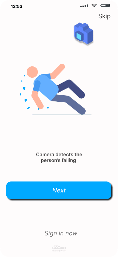
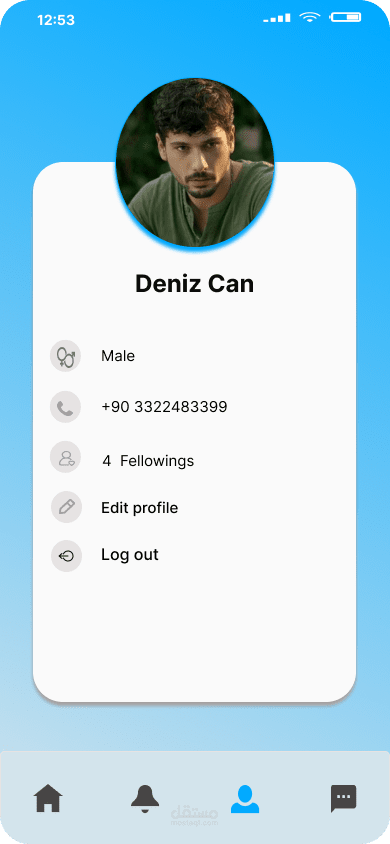
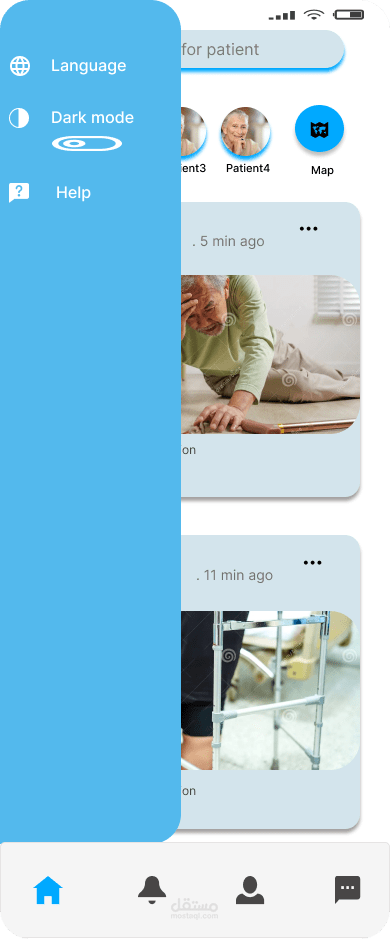
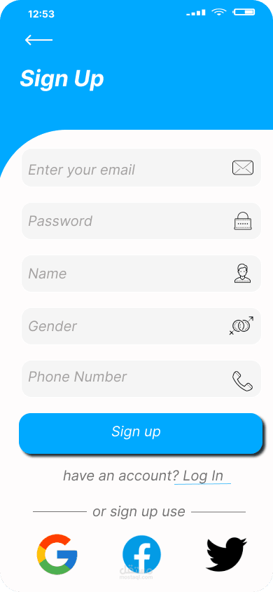
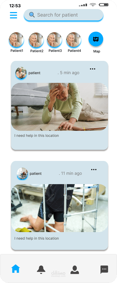
The app is intended to monitor and alert users or caregivers about potential falls, providing safety and reassurance for users, especially the elderly or those with health concerns. The design focuses on a simple, accessible, and intuitive interface to ensure usability for all age groups.
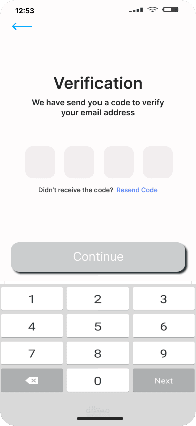
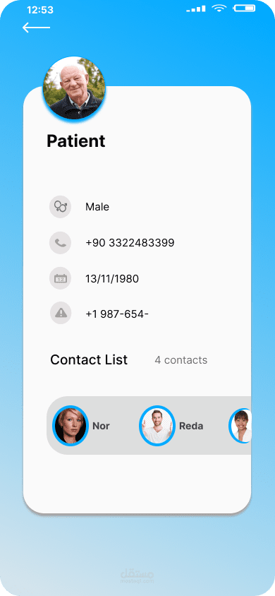
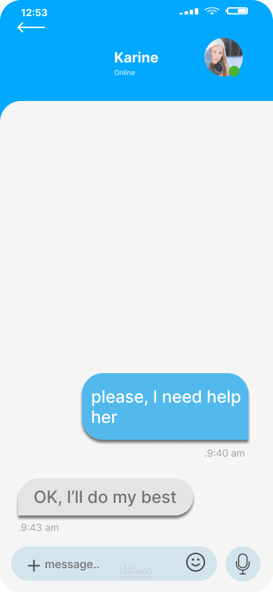
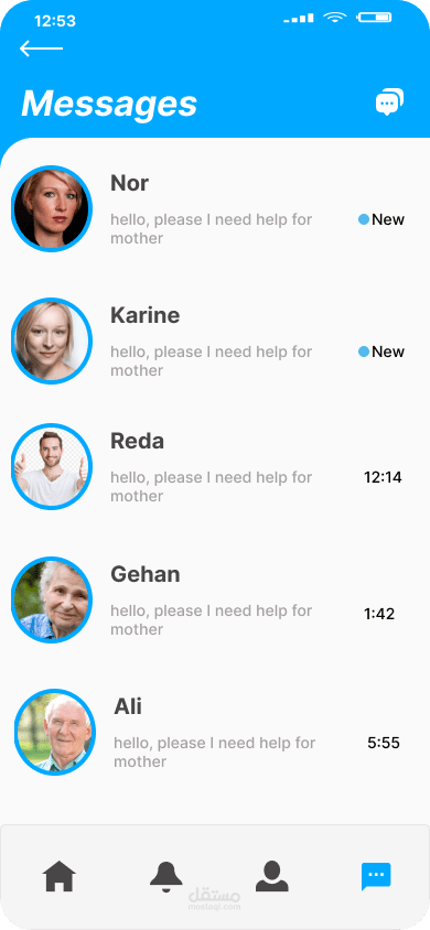
2. UI Design Overview:
Color Scheme:
Primary Colors: Blue and white dominate the design, reflecting trust, calmness, and professionalism, ideal for a health-related app.
Accents: Subtle use of other colors (e.g., green for success, black for text) enhances visual hierarchy without overwhelming users.
Typography:
Clean and modern fonts ensure readability.
Hierarchical text sizes guide users through the flow, with larger headings and smaller subtext for details.
Layout:
Minimalistic and organized, with plenty of white space to avoid clutter.
Consistent use of margins and padding ensures a clean and professional look.
Icons & Graphics:
Intuitive icons for navigation and features like messaging, notifications, and maps.
Simple illustrations used sparingly for visual appeal without distracting from the core functionality.