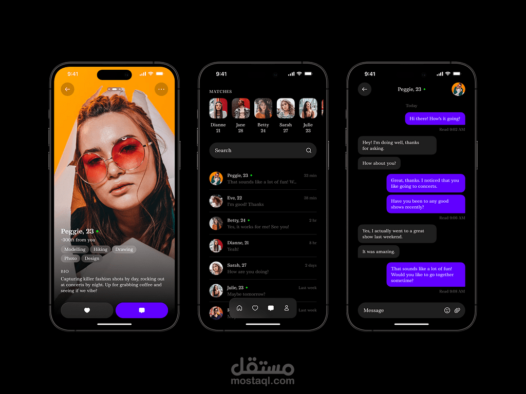
Dating App
تفاصيل العمل
Standard dating apps like Tinder are full of unnecessary clutter: stars, hearts, crosses, huge tab bars, etc. These elements occupy almost 2/3 of the screen. They distract the users from the young target audience, who get used to simple actions and minimalistic interfaces.
So here we are with the dating mobile app design aimed at young singles! It has an intuitive layout similar to Instagram stories, where you navigate through with quick swipes and taps. With just a simple action, you can express interest and start chatting with someone who catches your eye. It's all about making connections quickly and effortlessly – just browse through potential matches and strike up conversations. Swipe, tap, and connect with ease - no buttons needed!
