Data Professional Survey
تفاصيل العمل
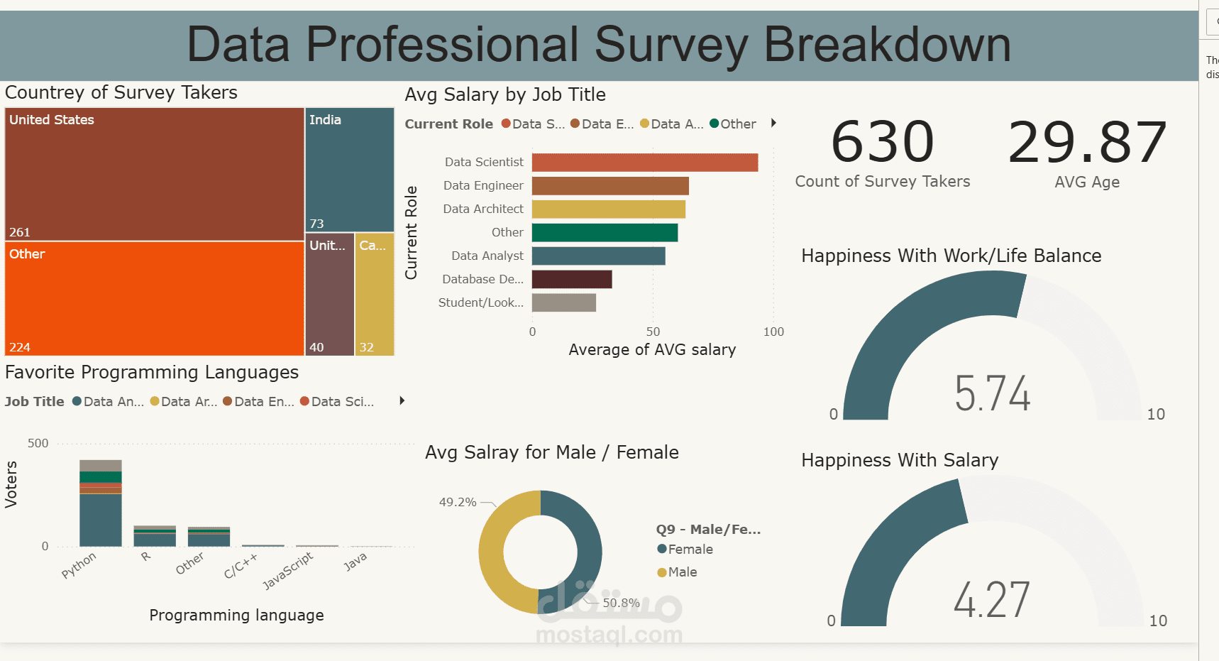
This Power BI project visualizes insights from a real dataset of data professionals. This dashboard provides a comprehensive overview of salary trends, preferences, and satisfaction levels among data professionals..
The dashboard includes: Country Distribution: A treemap showing the distribution of survey respondents by country. Average Salary by Job Title: A bar chart highlighting salary trends across roles like Data Scientist, Data Engineer, and others. Programming Language Preferences: A bar chart showing the popularity of programming languages, with Python as a favorite. Gender Salary Comparison: A donut chart comparing average salaries between male and female respondents. Happiness Metrics: Gauges measuring satisfaction with work-life balance and salary, and more