Quarter logo
تفاصيل العمل
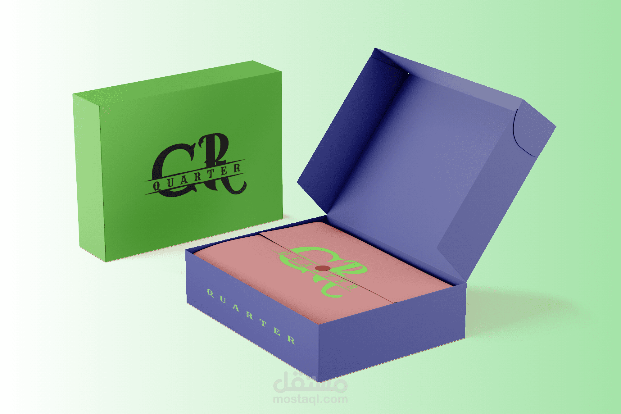
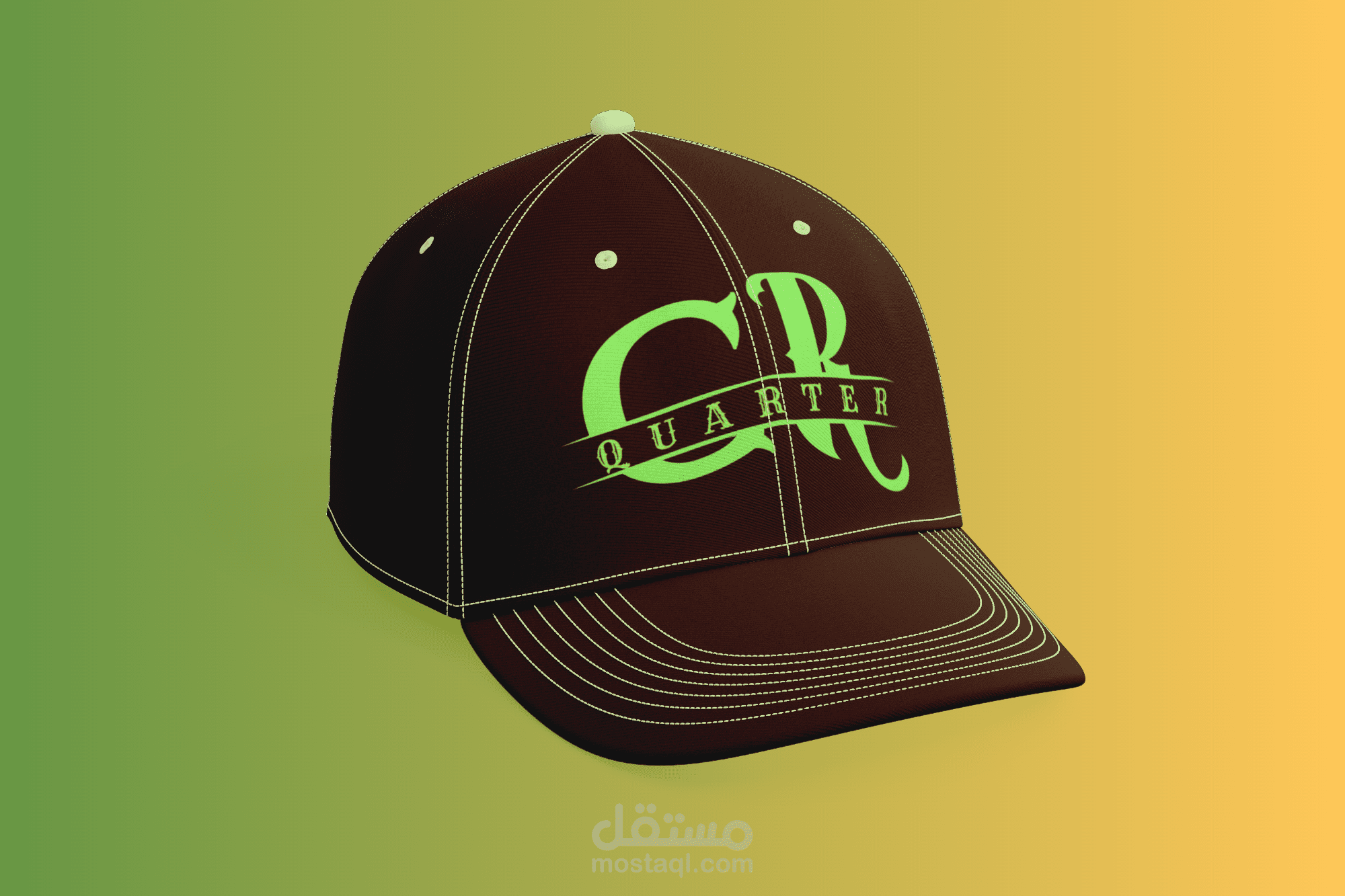
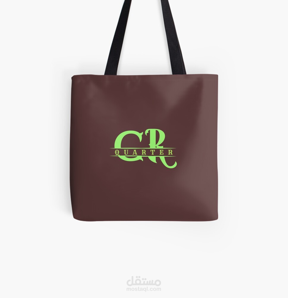
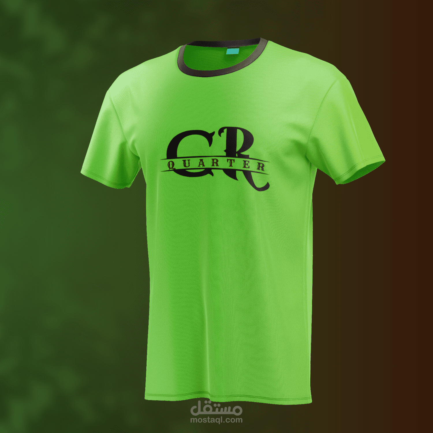
This logo creatively merges elegance with a bold statement. The primary focus is on the overlapping, stylized letters "C" and "R," which stand out in rich brown against a vibrant light green background, adding energy and a modern touch. The word "QUARTER" runs through the center, neatly divided by a horizontal line that balances the composition and emphasizes the brand name. The use of a serif font for "QUARTER" adds a classic, vintage feel, contrasting beautifully with the larger, curved letters above.
To achieve this design, I utilized Adobe Photoshop and Canva alongside additional editing tools to perfect the layout, ensuring the colors, typography, and spacing work harmoniously. The refined touches give the logo a unique, professional appearance that’s versatile for various branding applications.

