AROZAN Brand Identity
تفاصيل العمل
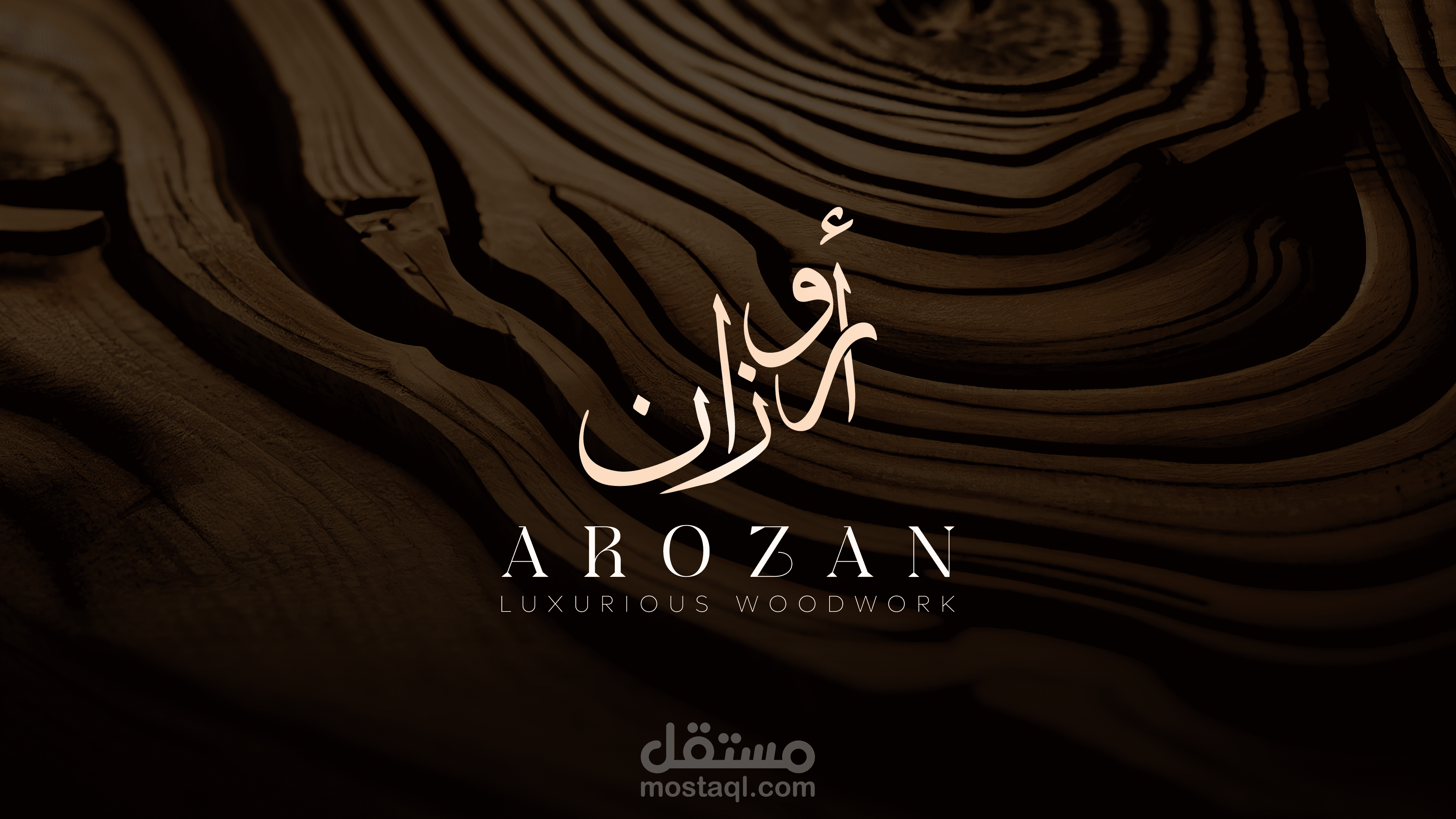
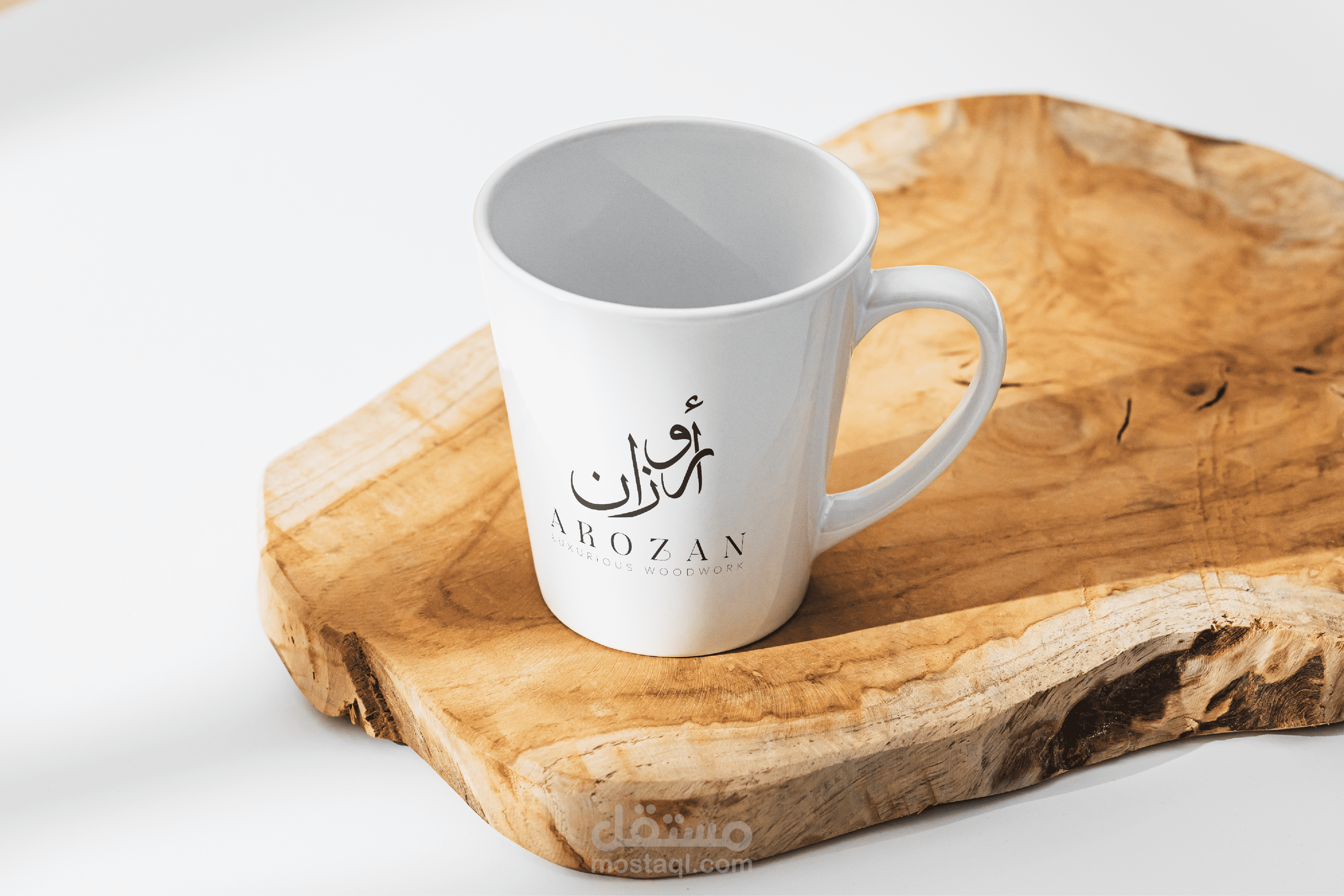
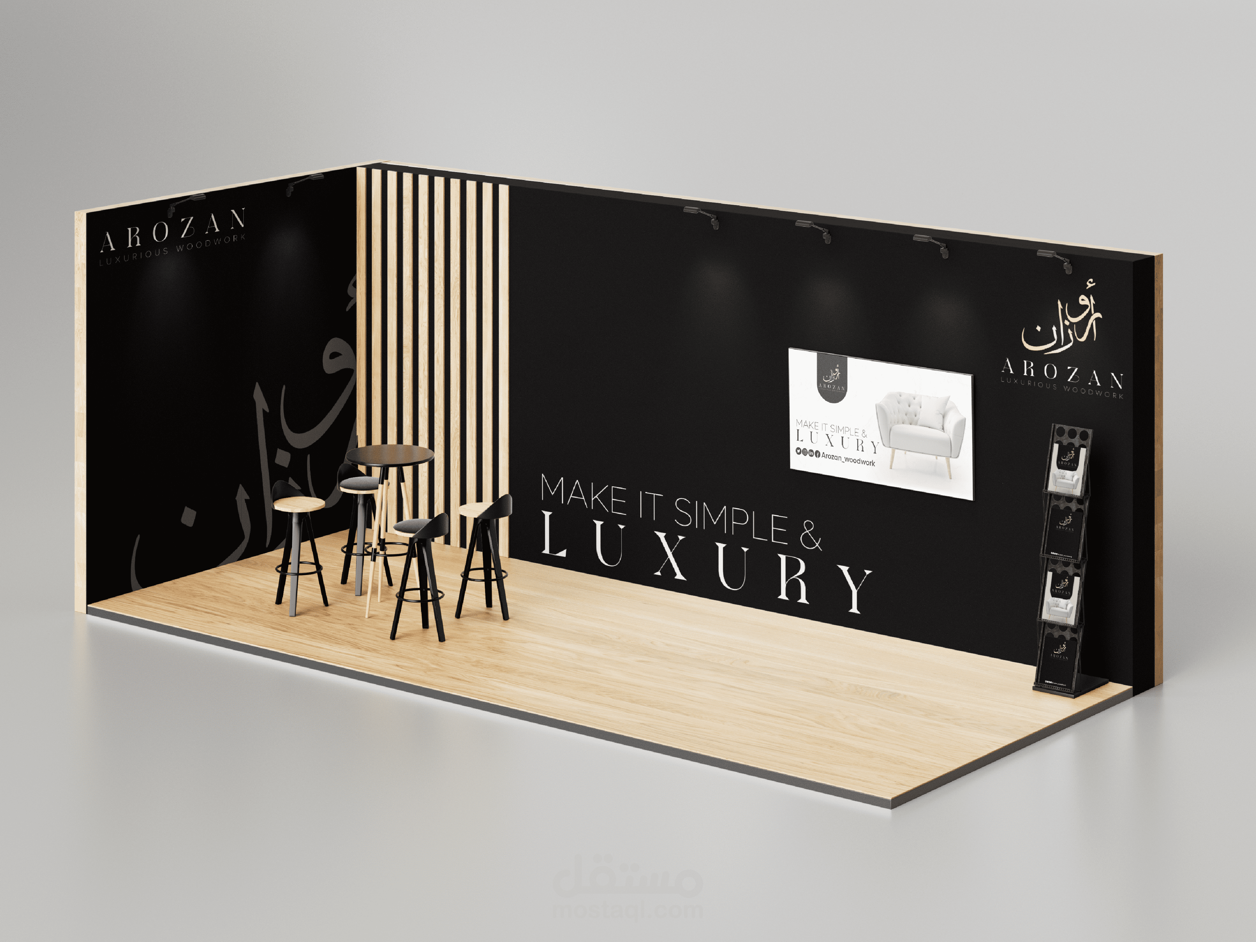
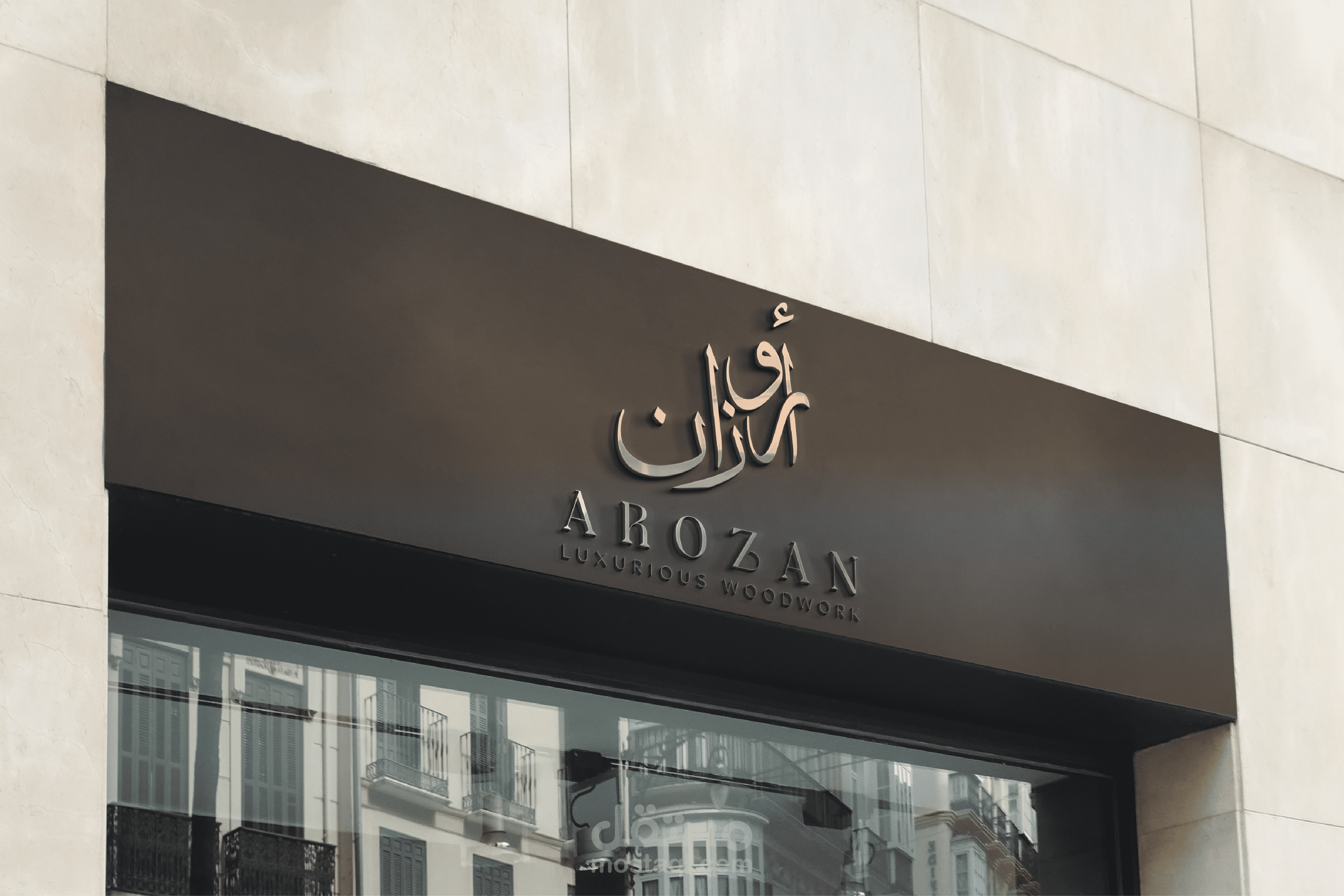
he AROZAN logo is a striking representation of the brand’s dedication to high-end, bespoke woodwork. The logo seamlessly blends timeless craftsmanship with modern luxury, making it a symbol of exclusivity, precision, and sophistication.
Typography:
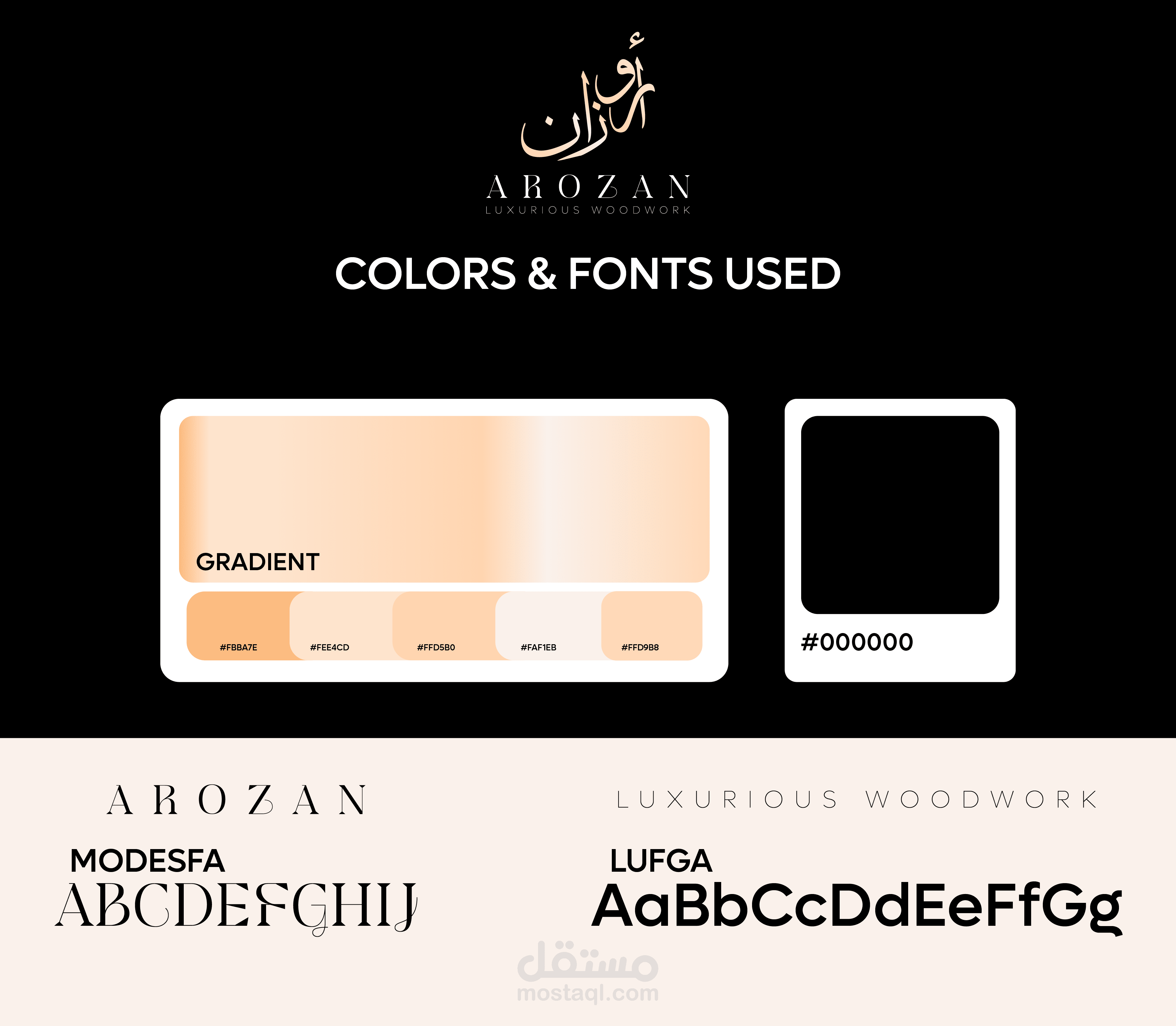
The logo features a custom-designed serif font with elegant, refined lines, showcasing both classic and contemporary elements. Each letter is meticulously crafted to evoke a sense of tradition and superior craftsmanship, yet the clean, sharp edges add a modern touch, ensuring that the logo remains relevant in the luxury market.
The typography is capitalized, giving the brand name a commanding and professional presence. The carefully spaced letters create a sense of balance and harmony, symbolizing the precision and attention to detail that define AROZAN's woodwork.
Color Palette:
The black used in the logo is deep and rich, signifying strength, elegance, and timelessness. This color creates a perfect backdrop, allowing the brand to appear bold and sophisticated in any context.
Pearl gold accents are subtly incorporated into the logo, adding a layer of refinement and luxury. The pearl gold tone is soft and lustrous, offering an air of understated opulence. It highlights the brand’s focus on creating premium, custom woodwork, capturing the essence of exclusivity and high craftsmanship.
The pairing of black and pearl gold ensures the logo feels both grounded and luxurious, making it ideal for a high-end brand that values both tradition and contemporary appeal.
Icon & Symbol:
The logo cleverly integrates wood elements to emphasize the brand’s core identity. A subtle wood grain pattern is embedded into the design, either within the letterforms or as part of the background, evoking the natural beauty of the materials used in the woodwork.
Additionally, a minimalistic symbol of a stylized carving tool or tree ring might accompany the typography, reinforcing the brand’s expertise and connection to the craft of fine woodworking. The icon is sleek and modern, yet timeless, ensuring the logo can stand the test of time while being adaptable across various applications.
Texture & Finish:
The pearl gold accents may be finished with a subtle metallic sheen, giving the logo a tactile, three-dimensional quality. This touch of shine enhances its luxurious feel and makes it ideal for premium branding materials like business cards, stationery, and packaging.
A matte black finish contrasts beautifully with the pearl gold, ensuring the design is clean and polished without feeling overly flashy. This sophisticated finish gives the logo a refined, understated elegance.
Overall Composition:
The layout is symmetrical, exuding balance, order, and professionalism. This symmetry mirrors the precision that AROZAN applies to every piece of woodwork, conveying a sense of meticulous craftsmanship.
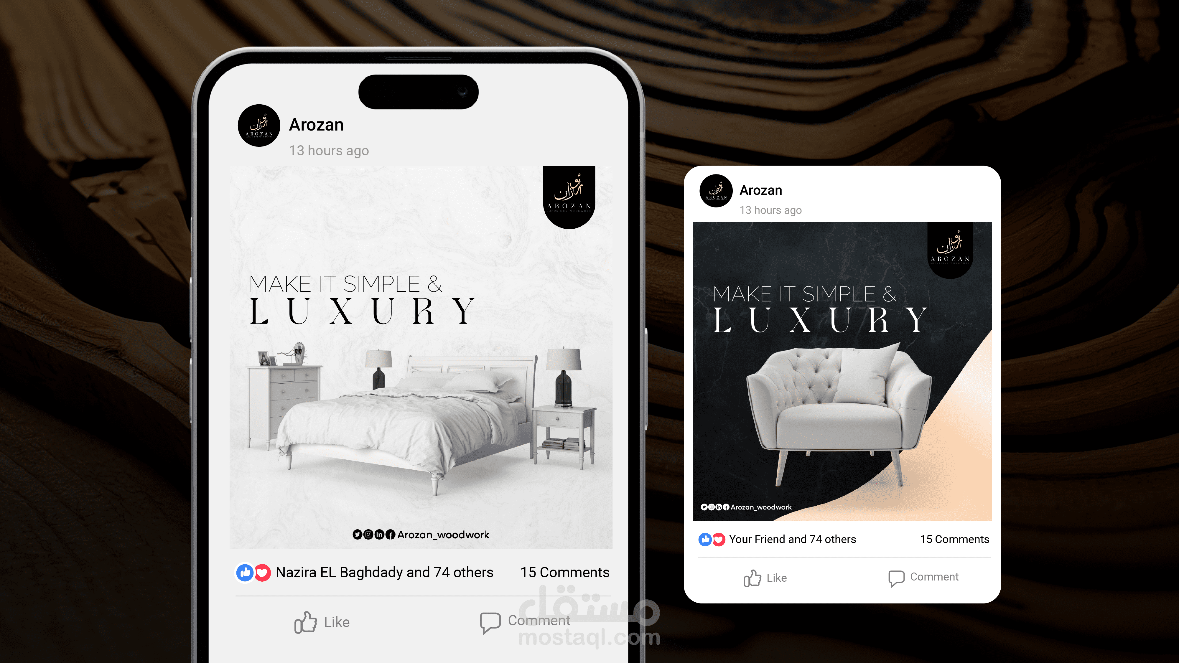
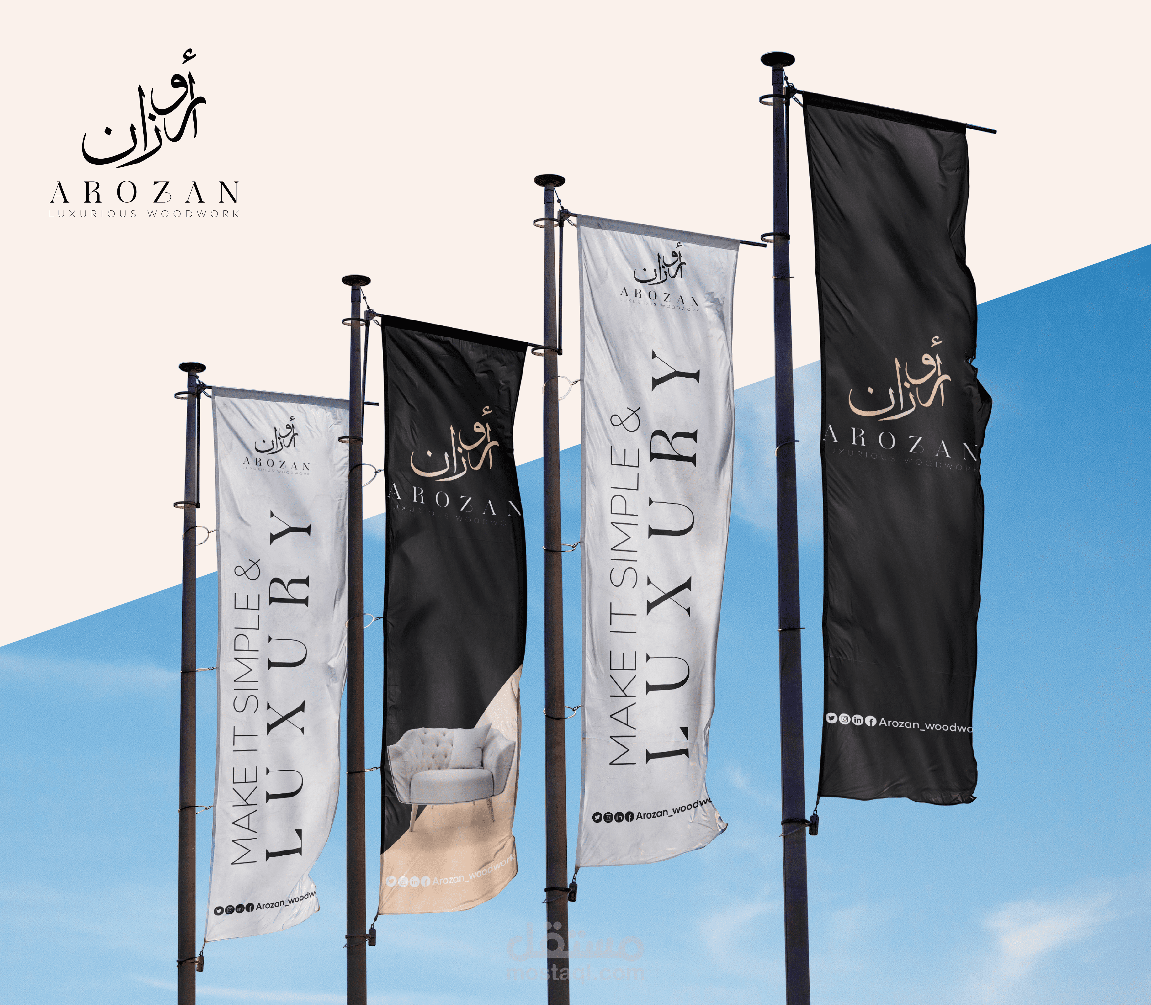
The logo’s form is versatile, working well in both large-scale formats (e.g., signage or store displays) and small, intricate placements (e.g., product engravings or branding on packaging). It maintains clarity and impact across all mediums.
Brand Identity:
The AROZAN logo is more than just a symbol—it represents the brand’s commitment to timeless beauty and masterful craftsmanship. Using black and pearl gold underlines the idea that AROZAN creates more than just functional woodwork; it makes art and luxury, where every detail matters.
The logo serves as a premium visual identity for a brand that aims to appeal to discerning clients who appreciate both the tradition and artistry of woodworking, and the modern, exclusive feel of high-end luxury goods.
بطاقة العمل
| اسم المستقل | Kareem G. |
| عدد الإعجابات | 0 |
| عدد المشاهدات | 5 |
| تاريخ الإضافة |
