customer churn out
تفاصيل العمل
This dashboard provides a comprehensive overview of customer churn trends, enabling data-driven decision-making to improve customer retention and reduce churn rates.
Key Components and Visualizations:
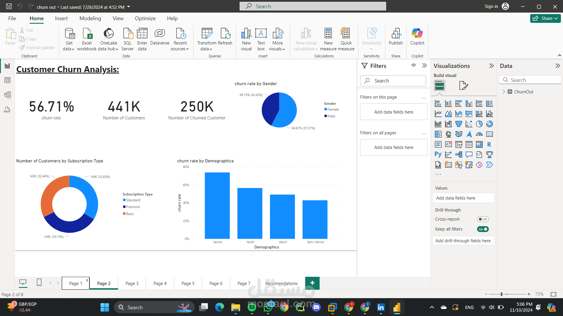
Main KPIs:
Churn Rate: Displays the overall customer churn rate.
Number of Customers: Shows the total number of customers.
Number of Churned Customers: Indicates the number of customers who have churned.
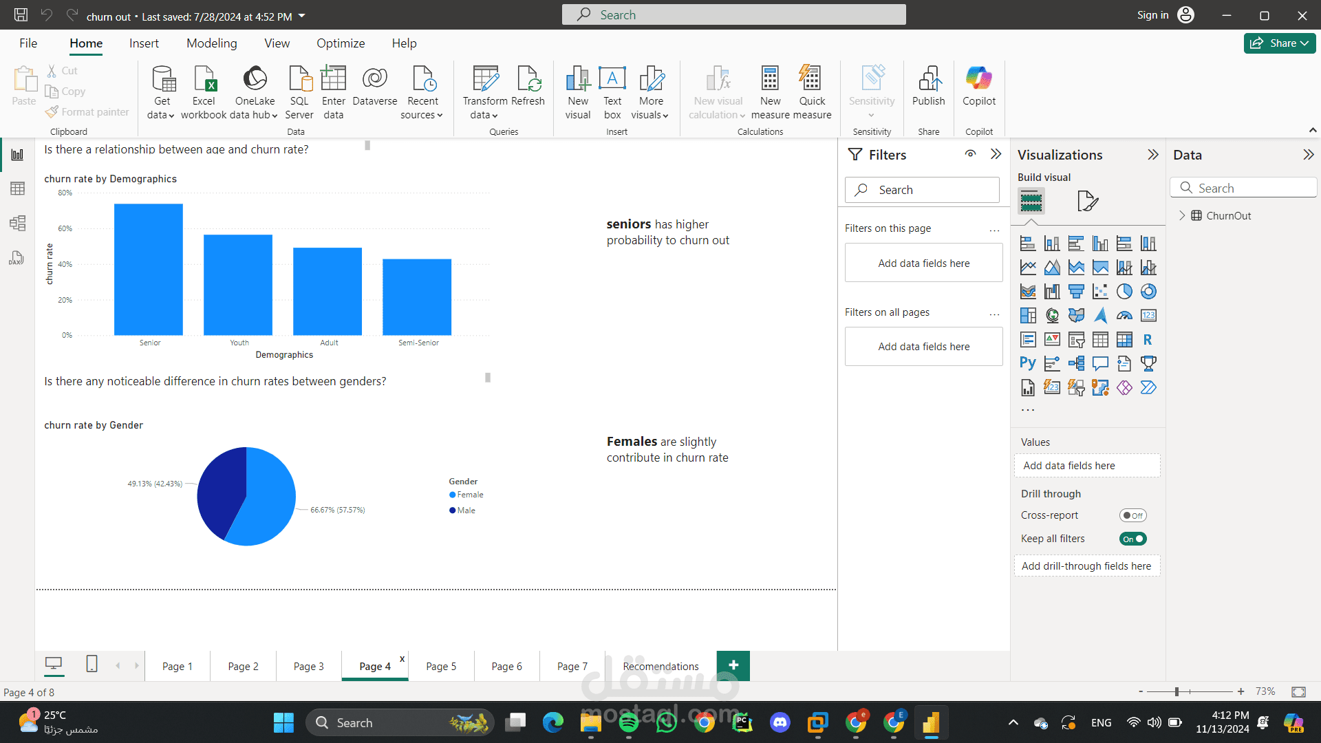
Customer Churn Rate by Gender:
A pie chart that visualizes the churn rate distribution by gender.
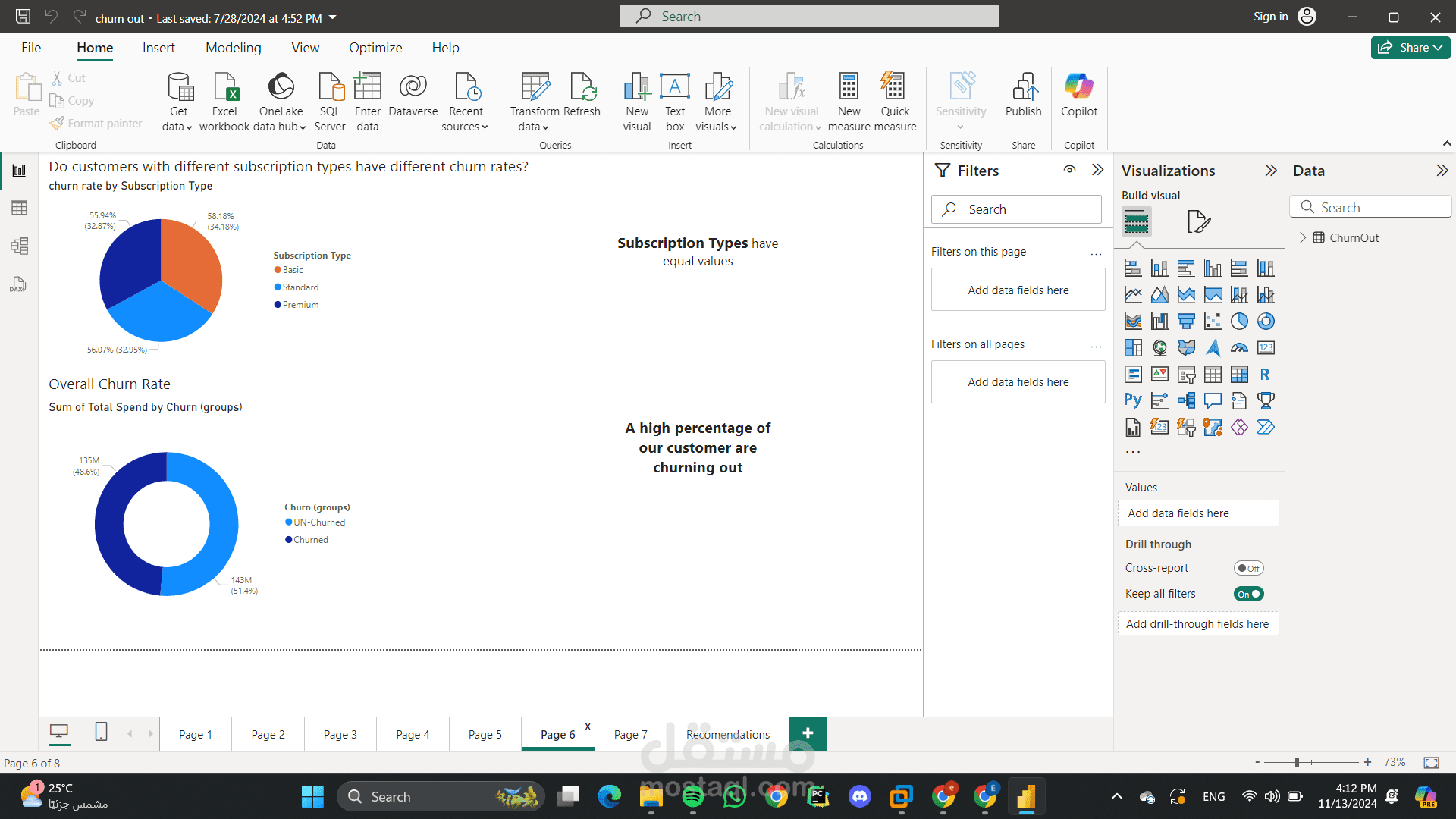
Number of Customers by Subscription Type:
A pie chart that shows the distribution of customers across different subscription types.
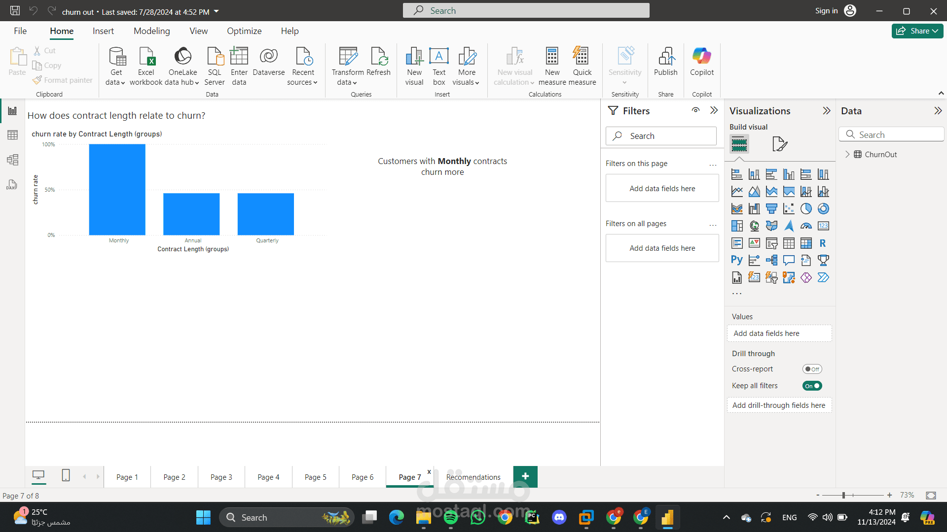
Churn Rate by Demographics:
A bar chart that compares the churn rate across different demographic groups.
Dashboard Design and Functionality:
Clear Layout: The dashboard has a clean and well-organized layout, with clear headings and easy-to-read visualizations.
Filters: Filters are available to allow users to customize the view and focus on specific segments of data.
Interactivity: The dashboard likely uses interactive elements, such as tooltips and drill-down capabilities, to provide more detailed insights upon user interaction.
Overall, this dashboard provides a clear and concise overview of customer churn trends and patterns, enabling businesses to identify areas for improvement and take action to reduce churn.
Additional Insights and Potential Improvements:
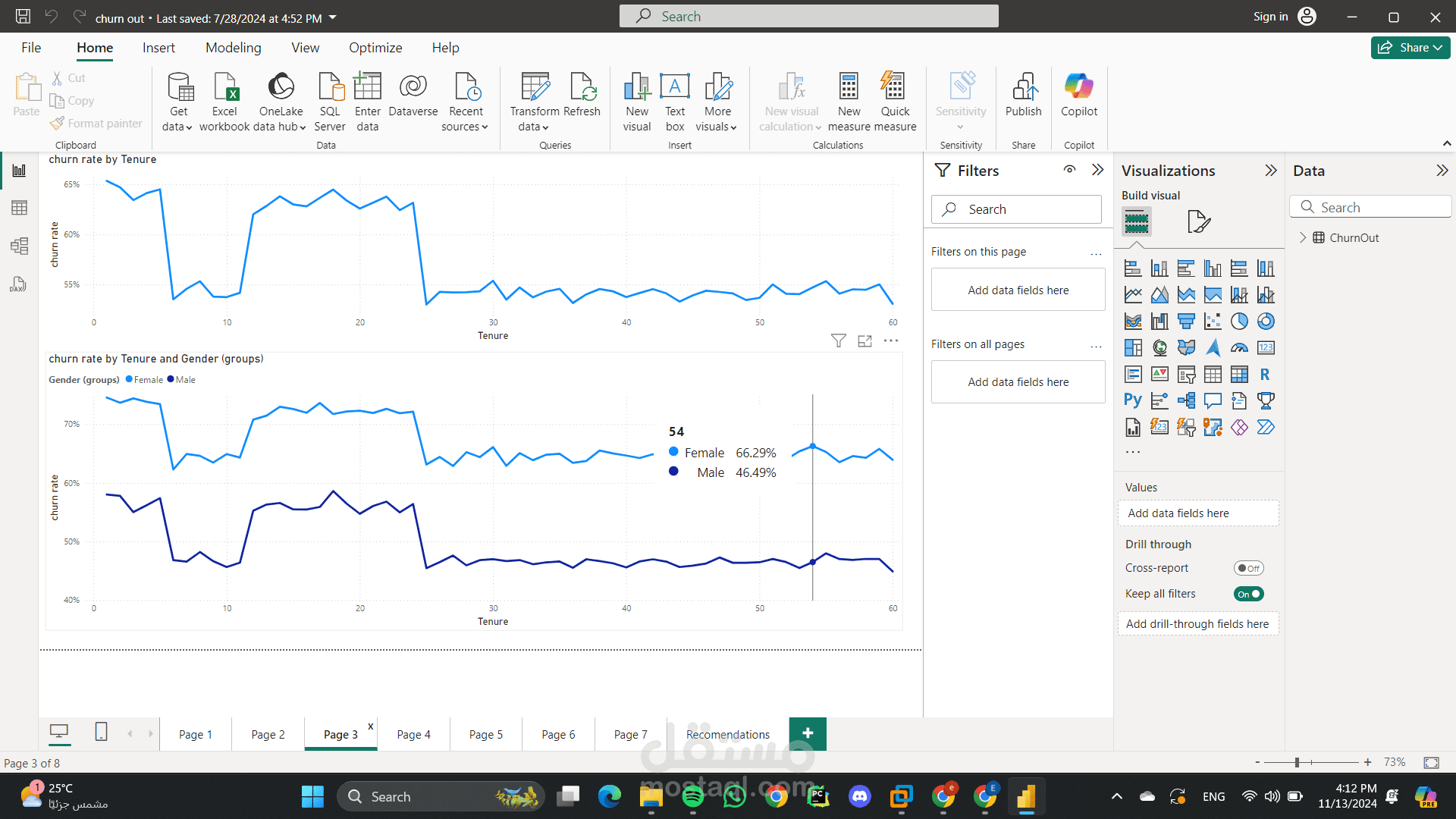
Time-Series Analysis: Incorporate time-series analysis to track churn rates over time and identify trends.
Cohort Analysis: Analyze customer cohorts to understand churn behavior and identify high-risk segments.
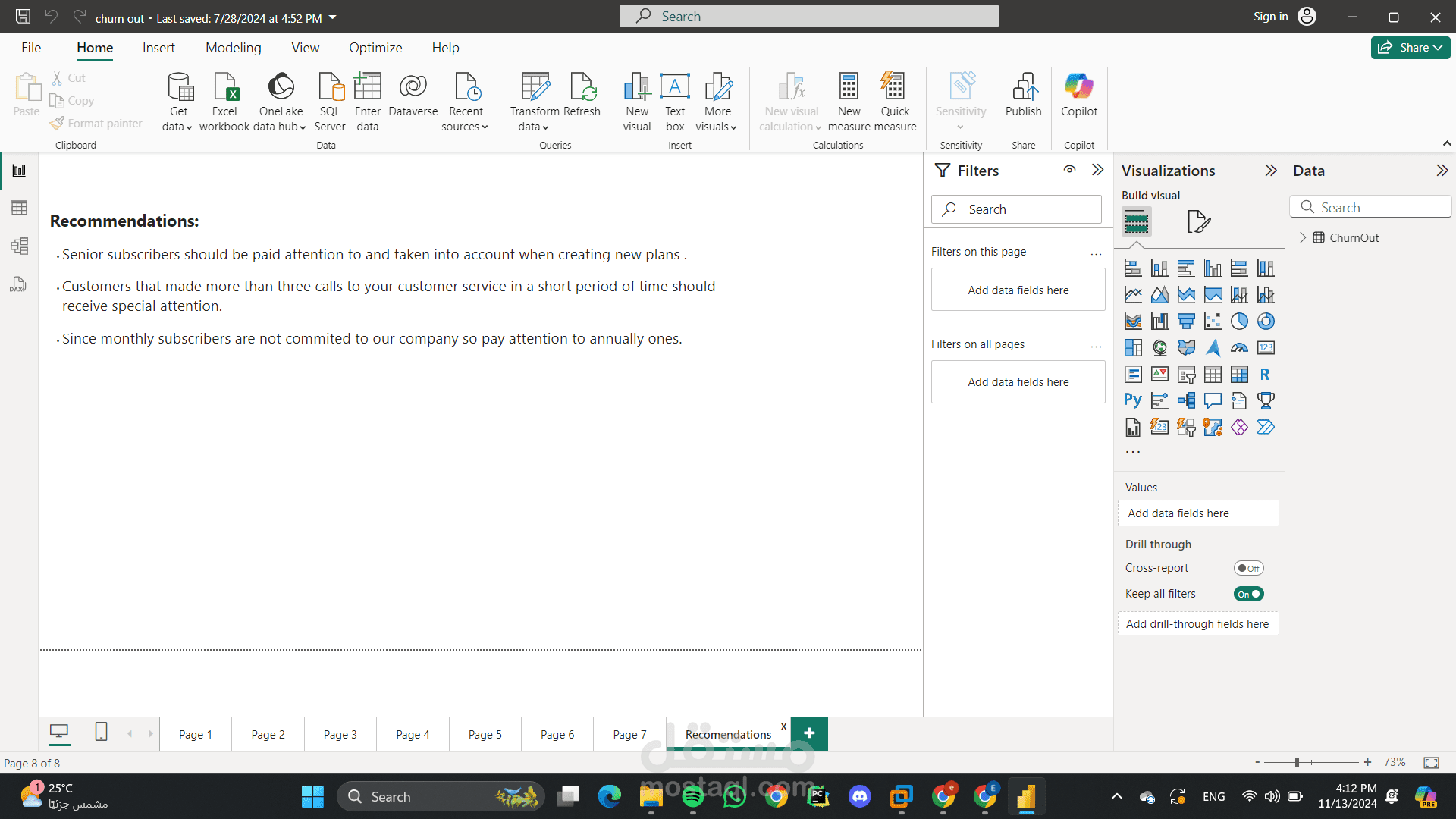
Predictive Modeling: Use machine learning to predict customer churn and proactively implement retention strategies.
Customer Segmentation: Segment customers based on various attributes to tailor retention efforts.
