Onero
تفاصيل العمل
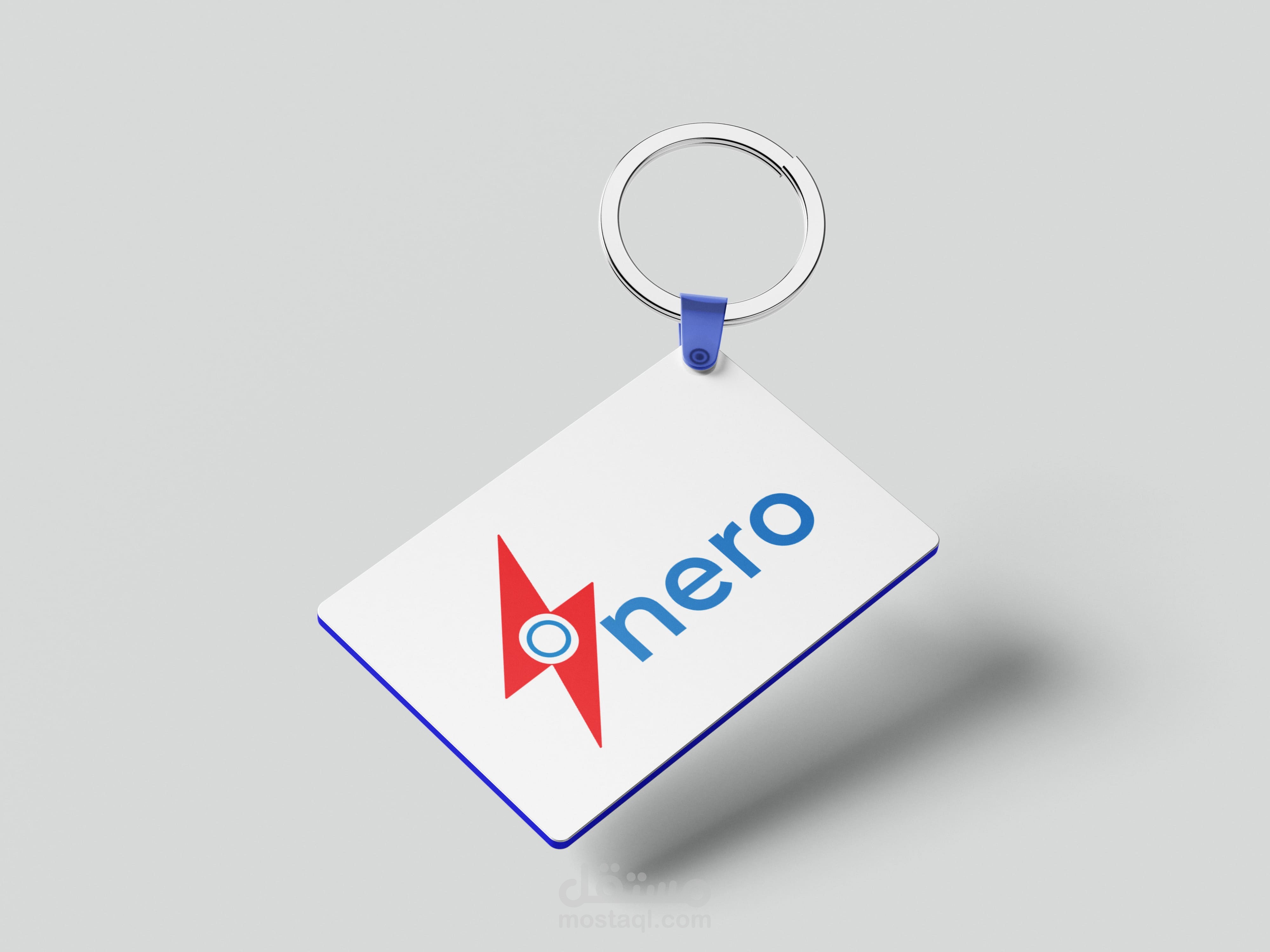
Logo Brief – "Nero"
Brand Name:
Nero
? Industry:
Technology / Energy / Digital Solutions
Brand Identity:
Nero is a modern, forward-thinking brand that operates in the technology sector. It aims to project an image of innovation, speed, energy, and reliability. The brand is likely involved in digital products, software, energy tech, or performance-enhancing solutions.
Logo Design Description:
1. Symbol:
The icon is a bold, angular lightning bolt in red, symbolizing power, energy, and speed.
A central black circle with a blue ring suggests focus, precision, or technology, possibly hinting at a lens, a target, or a power core.
The lightning bolt direction and sharp edges convey a sense of forward motion and cutting-edge performance.
2. Typography:
The wordmark "nero" uses a clean, geometric sans-serif font in blue, indicating professionalism, trust, and clarity.
The lowercase style makes the brand appear friendly, accessible, and modern.
? Logo Concept & Message:
The logo communicates:
Innovation: Through the clean and modern typeface.
Energy & Power: With the red lightning bolt.
Precision & Technology: With the circular motif embedded in the bolt.
Trust & Stability: Via the blue color used in both the icon and text.
Color Palette:
Red (#E31C24): Passion, energy, urgency.
Blue (#2A78C4): Reliability, intelligence, calm.
Black: Sophistication, strength.
White/Negative space: Cleanliness, simplicity.
Potential Uses:
This logo would work well across a variety of tech-oriented applications:
Software branding
Energy-tech startups
Mobile apps or SaaS platforms
Digital infrastructure companies
Gaming tech or performance solutions