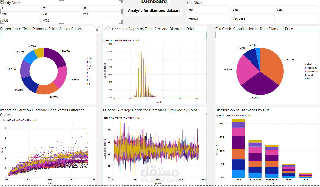
Diamond Dataset Dashboard Using Power BI
تفاصيل العمل
This dashboard, created using Power BI, provides a comprehensive analysis of a diamond dataset. It offers interactive visualizations that explore key factors such as carat weight, clarity, cut, color, and price. Through dynamic charts and graphs, users can easily identify patterns, trends, and correlations between these attributes. The dashboard also includes filtering options, enabling deeper insights into how specific characteristics influence diamond prices. With clear visual representation, this tool facilitates data-driven decision-making for those looking to analyze or understand the diamond market.
