Supply Chain Dashboard
تفاصيل العمل
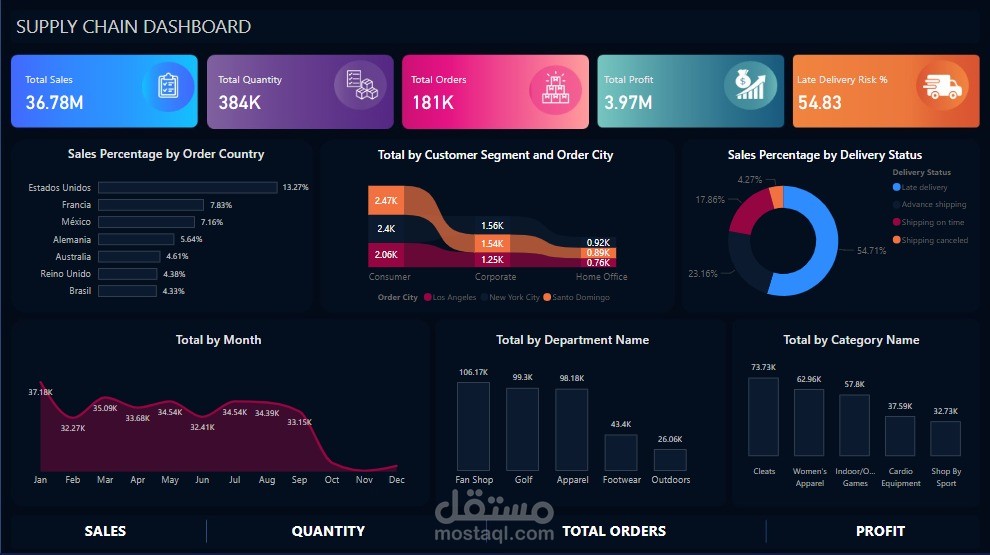
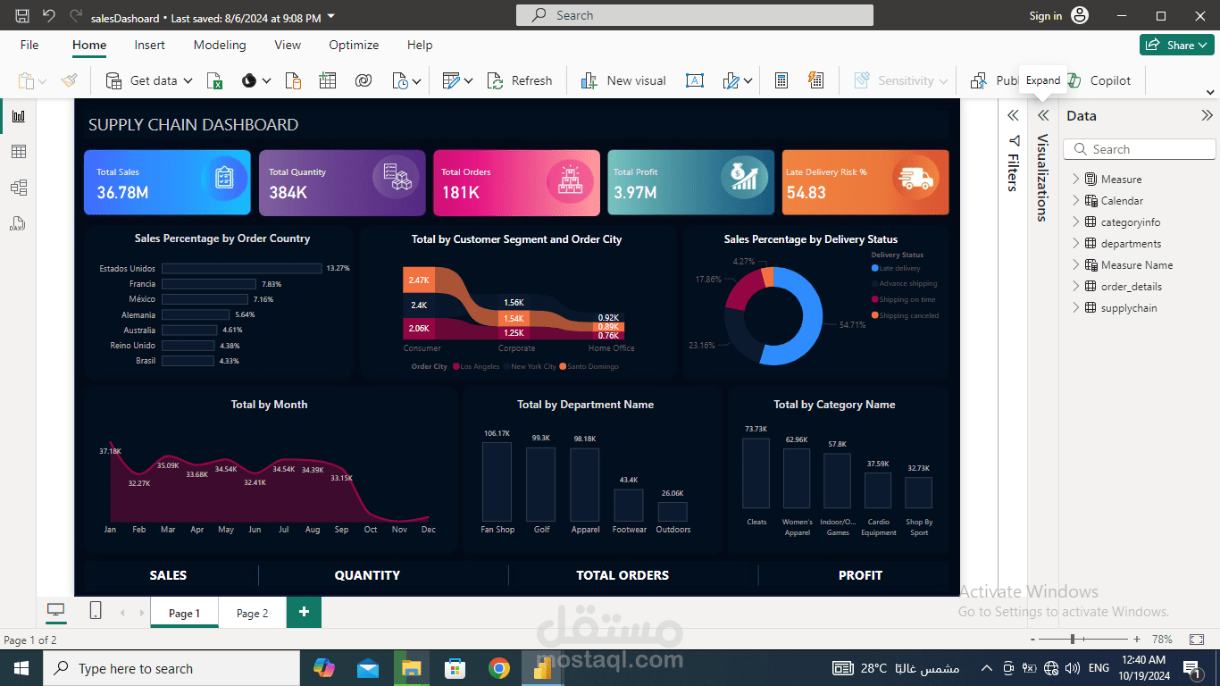
This is a Power BI Supply Chain Dashboard that provides a high-level overview of key performance metrics related to sales, orders, and delivery efficiency. The dashboard features a clean and structured layout with several visual elements, including:
1. Key Performance Indicators (KPIs):
- Total Sales: 36.78M (highlighted in blue).
- Total Quantity: 384K (purple).
- Total Orders: 181K (red).
- Total Profit: 3.97M (pink).
- Late Delivery Risk %: 54.83% (orange).
2. Sales Breakdown:
- Sales Percentage by Order Country: This bar chart shows sales distribution by country, with the USA leading at 13.27%, followed by France (7.83%) and Mexico (7.16%).
3. Customer Segment and City:
- This ribbon chart displays the sales breakdown by customer segment and order city, showcasing corporate and consumer sales with cities like New York City and Santo Domingo highlighted.
4. Sales Percentage by Delivery Status:
- This donut chart illustrates the proportion of deliveries, indicating a majority of "shipping on time" (54.71%) and segments of late or advanced shipping, among others.
5. Monthly Performance:
- The line chart titled "Total by Month" tracks sales performance over the year, peaking in January at 37.18K and experiencing fluctuations throughout the months.
6. Department and Category Insights:
- Total by Department Name: A bar chart displaying the sales performance of different departments like Apparel, Footwear, and Golf.
- Total by Category Name: A bar chart showing the top product categories, with Cleats leading at 73.7K, followed by Women’s Apparel (62.9K).
This dashboard provides essential insights into sales, customer segments, delivery performance, and category trends, aiding in strategic decision-making for supply chain management. The use of various chart types helps visualize complex data for efficient tracking and analysis.