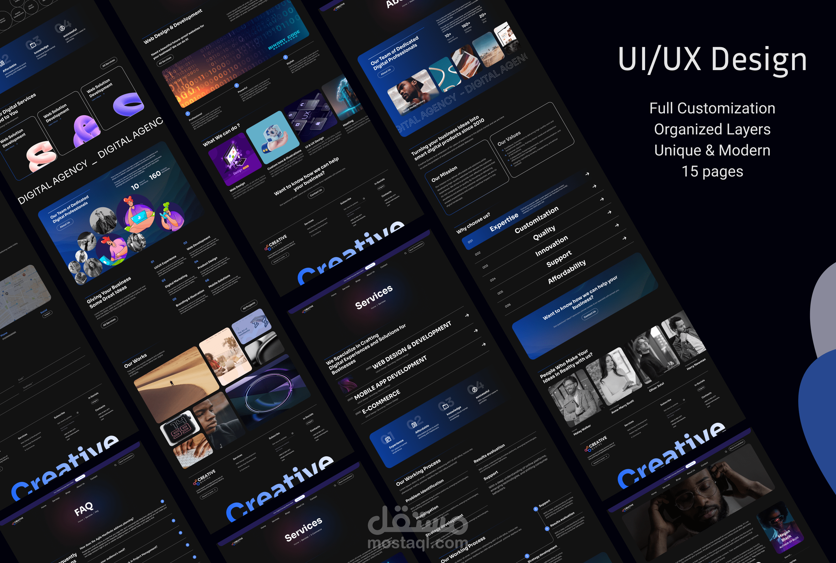
UI UX For Digital Agency
تفاصيل العمل
Intuitive Navigation: Designed with a clear, user-friendly structure, allowing users to easily navigate through services and information, minimizing frustration and maximizing engagement.
Visual Consistency: Harmonized color schemes, typography, and iconography ensure brand coherence across all platforms, creating a seamless and professional visual identity.
Responsive Design: Optimized for all devices, from desktops to mobile, ensuring an adaptive experience that looks great and performs smoothly on any screen size.
Interactive Prototyping: Includes high-fidelity prototypes with real-time interactivity, enabling users to experience the flow and functionality before development.
Optimized Performance: Lightweight design elements ensure fast load times and smooth transitions, enhancing user experience and search engine rankings.
User-Centric Focus: Every element is crafted with the end user in mind, prioritizing ease of use and accessibility to ensure a positive experience for all demographics.
بطاقة العمل
| اسم المستقل | Mary H. |
| عدد الإعجابات | 0 |
| عدد المشاهدات | 11 |
| تاريخ الإضافة |
