Travel Landing Page
تفاصيل العمل
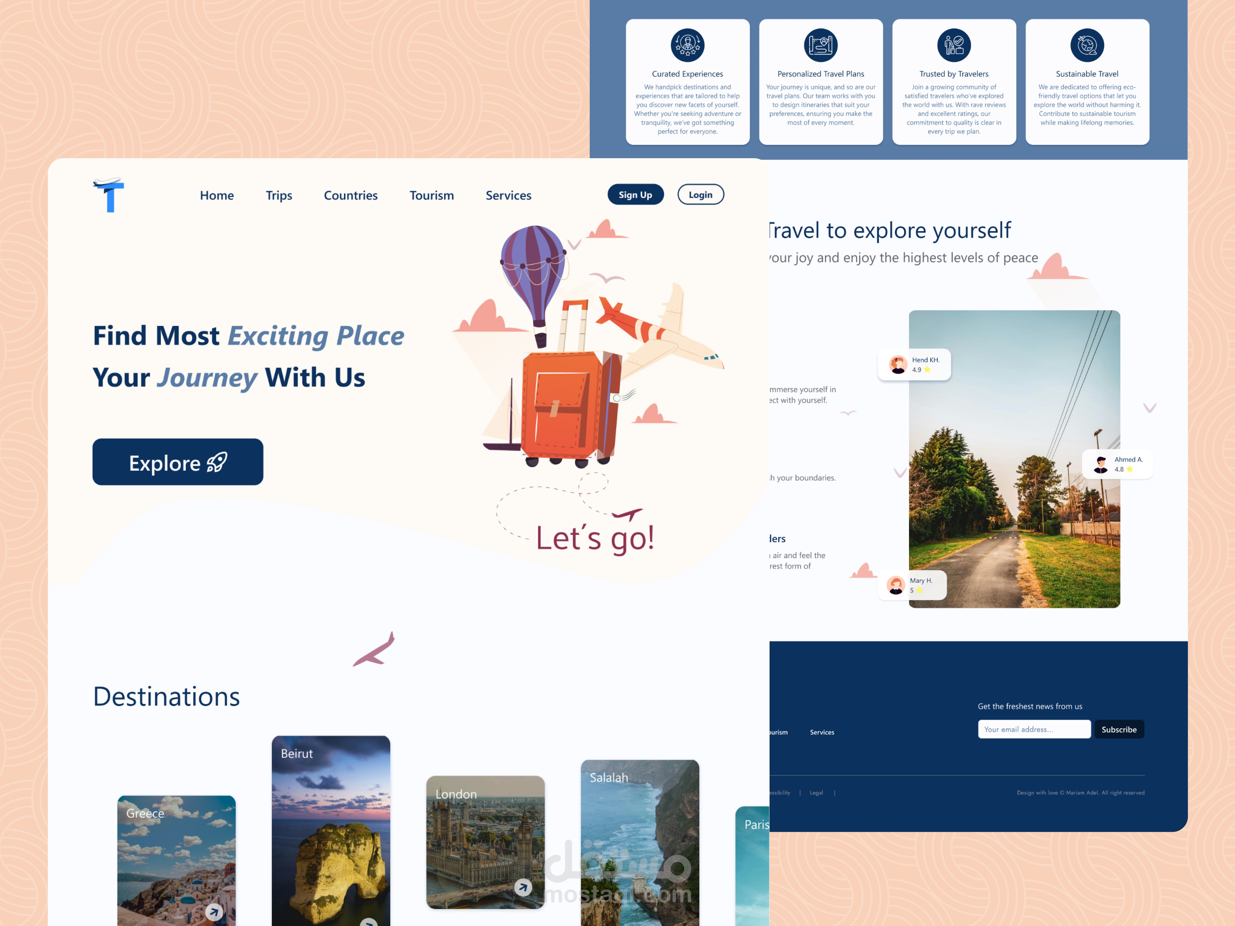
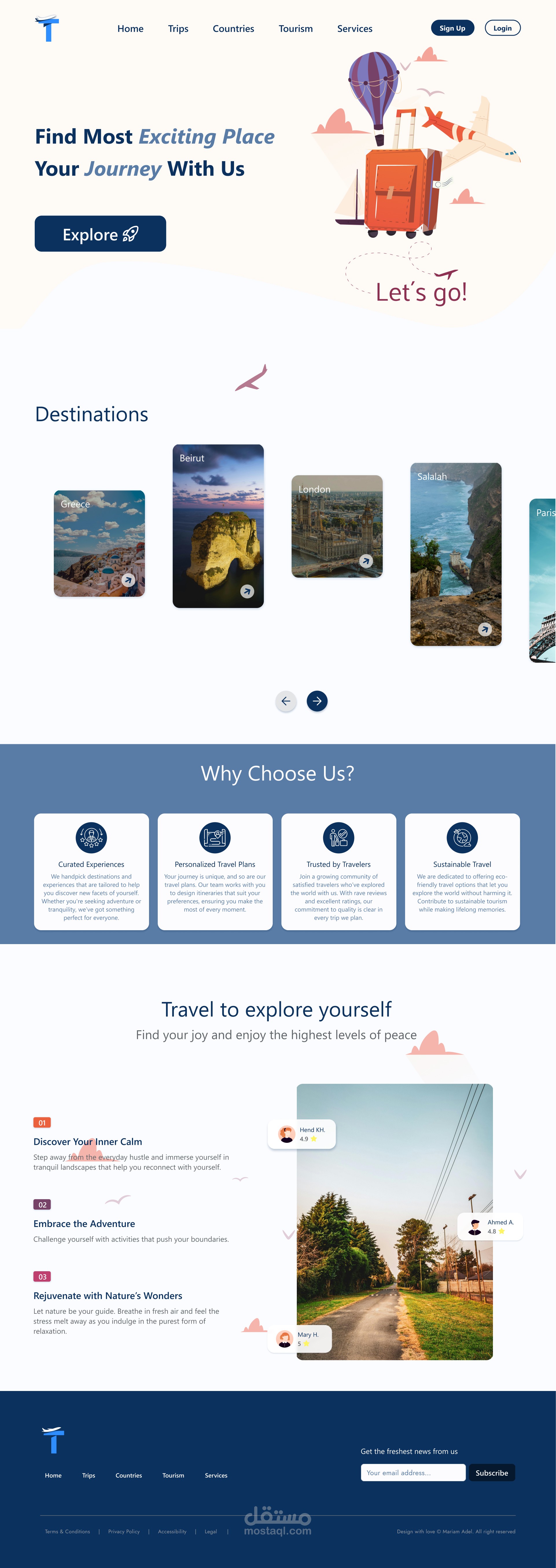
This is a landing page for a travel website based on a customer's request
After searching and doing visual feedback, I came up with these 4 sections
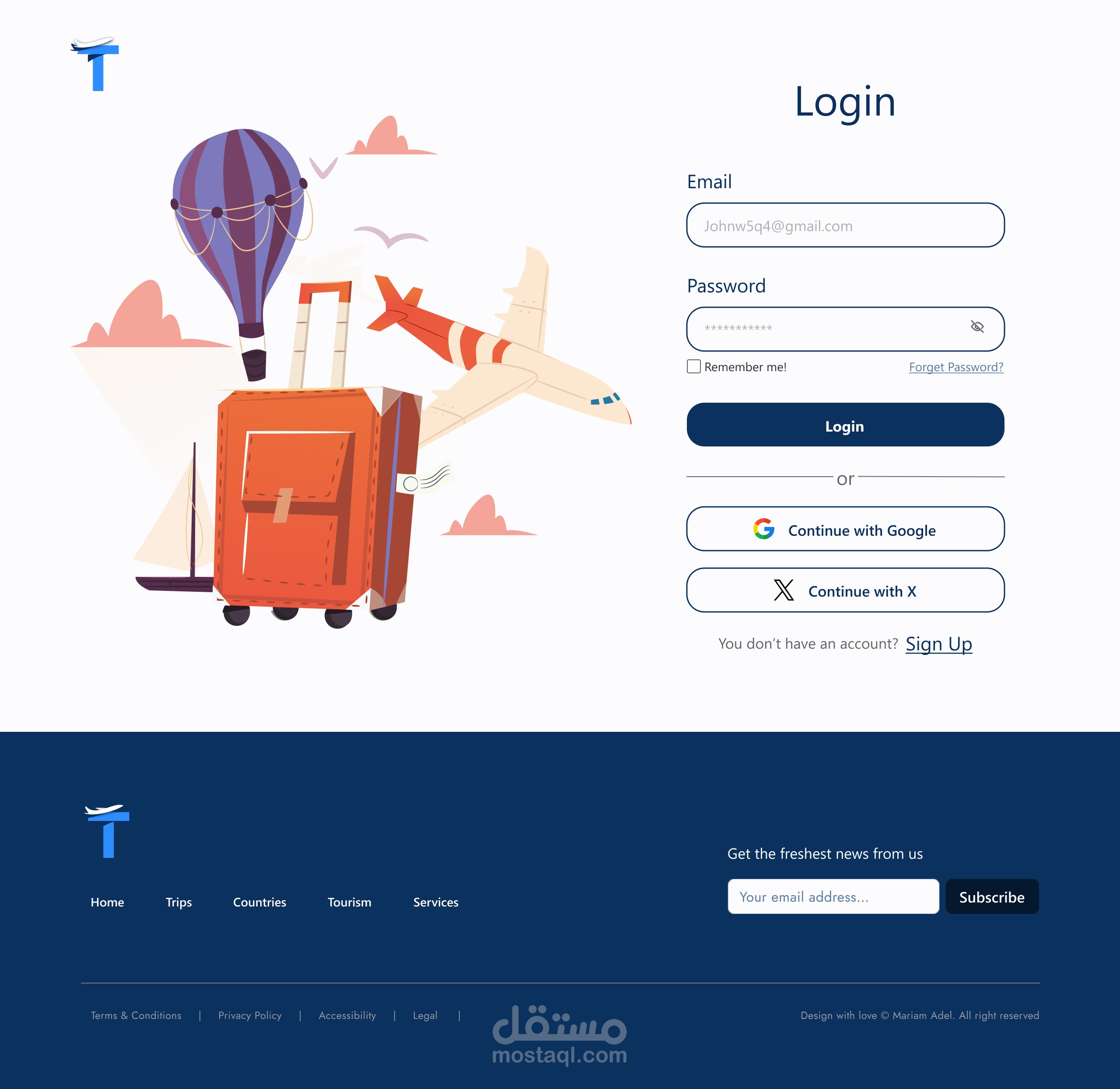
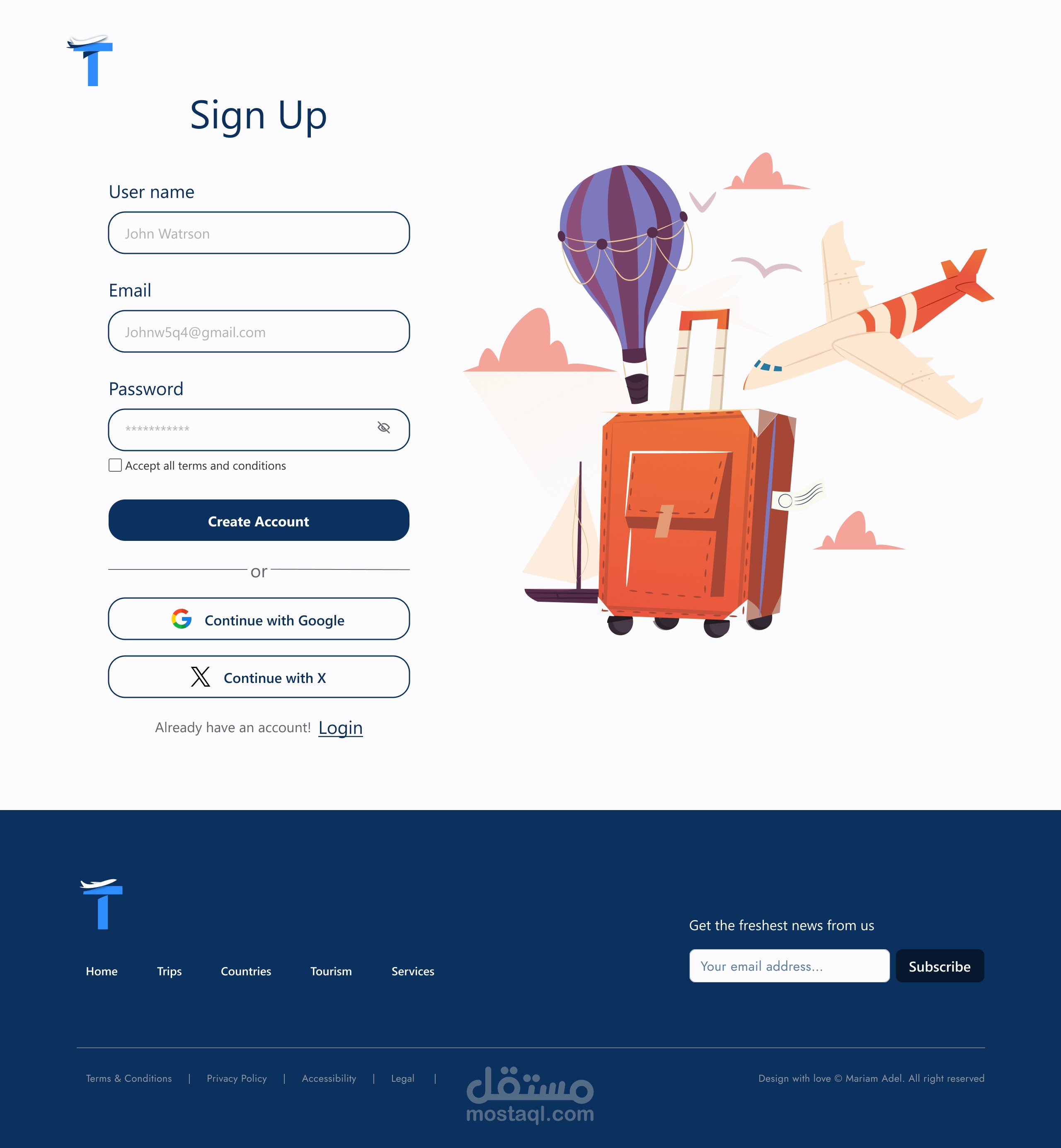
1- The hero section, I put an attractive CTA in it that matches the company's identity, a little graphic expressing travel, and a nave bar with login buttons
2- A section with the places available for travel on the site to attract users
3- A section why choose us to explain the company's features and add a sense of trust and security for the user
4- An attractive section with some customer reviews and attractive descriptions to encourage users to register on the site
Finally, the footer, I put company logo, top navocation, and a place to write the email to communicate and receive offers
بطاقة العمل
| اسم المستقل | مريم ع. |
| عدد الإعجابات | 0 |
| عدد المشاهدات | 7 |
| تاريخ الإضافة | |
| تاريخ الإنجاز |


