Financial Reporting & Financial Analysis with Tableau
تفاصيل العمل
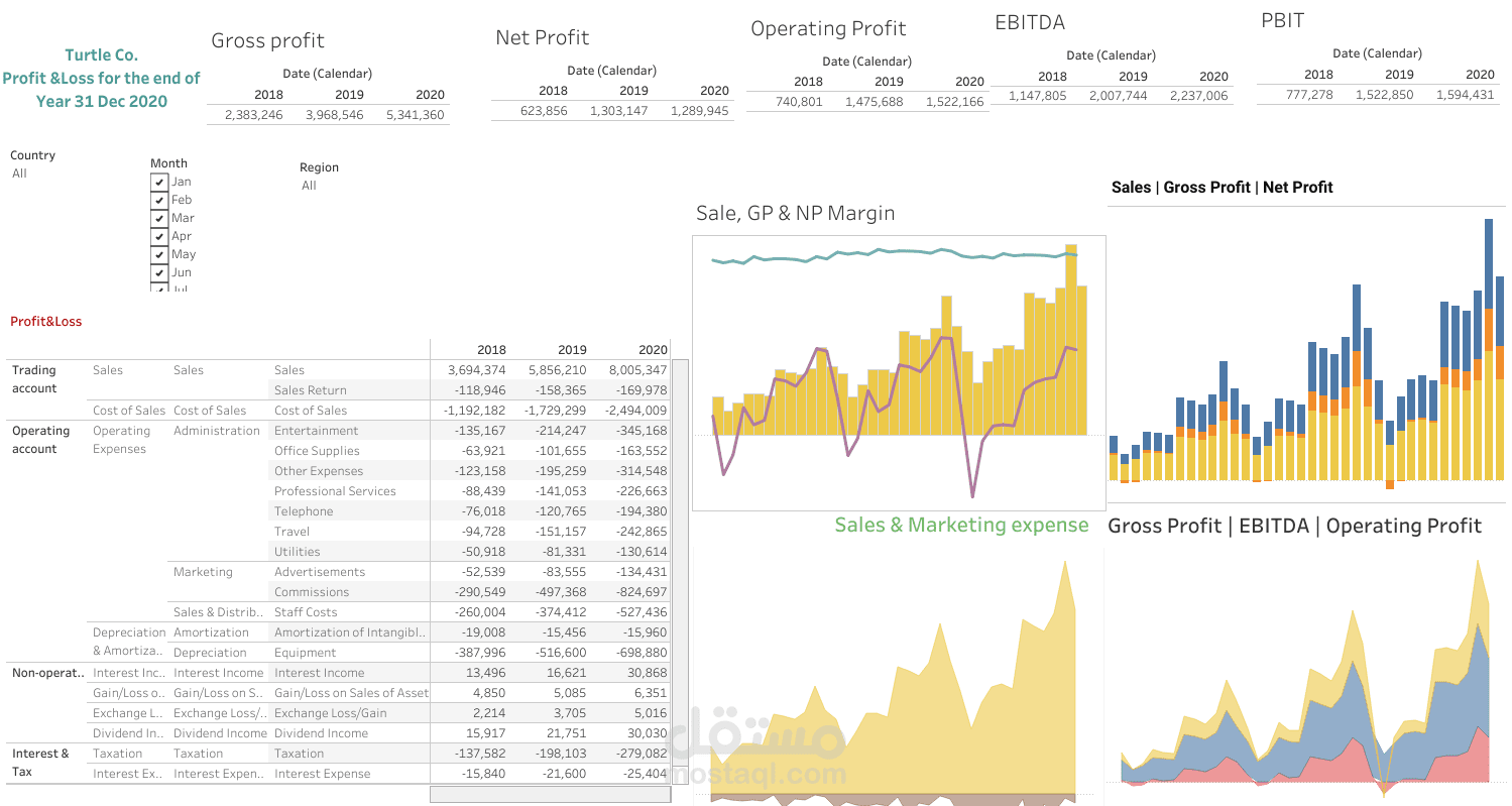
his Tableau project focuses on creating a Financial Reporting and Analysis Dashboard that enables users to visualize and analyze financial data efficiently. The dashboard helps businesses and financial analysts track key financial metrics, generate insights, and make data-driven decisions. Tableau’s interactive visualizations make it easier to explore trends, identify patterns, and compare financial performance across various periods.
Objective:
The goal is to design a comprehensive dashboard that provides real-time insights into a company's financial performance, enabling users to:
Monitor key financial metrics such as revenue, expenses, profit, and cash flow.
Analyze trends over time and compare actuals against budgeted values.
Break down data by categories such as product lines, departments, regions, or time periods.
Key Features:
Interactive Visualizations:
Revenue and Profit Analysis: Display total revenue and profit for different periods, allowing users to filter by year, quarter, or month to track performance trends.
Expense Breakdown: Show expense categories (e.g., operating costs, payroll, marketing) to highlight areas of overspending or underspending.
Profit Margins: Visualize profit margins across different product lines or services, providing insights into which areas are most profitable.
Budget vs. Actual Analysis:
Create visual comparisons between actual financial figures (e.g., revenue, expenses) and the budgeted or forecasted amounts. This feature helps in understanding variances and identifying areas where performance is above or below expectations.
Cash Flow Analysis:
Provide a detailed view of the company's cash flow, tracking cash inflows and outflows over time. Users can monitor liquidity and assess the company’s ability to meet short-term obligations.
Key Performance Indicators (KPIs):
Highlight important financial KPIs such as ROI (Return on Investment), EBITDA (Earnings Before Interest, Taxes, Depreciation, and Amortization), and Net Profit Margin. KPIs can be color-coded to show whether performance is meeting, exceeding, or falling short of targets.
Trend Analysis:
Include trend lines and time series analysis for critical financial metrics to help users identify seasonal patterns, long-term growth, or decline in financial performance.
Scenario Analysis:
Allow users to create “what-if” scenarios by adjusting key variables such as revenue growth rate, cost reduction, or investment strategies. This helps simulate potential future outcomes and inform strategic planning.
Financial Ratios:
Display important financial ratios like Debt-to-Equity Ratio, Current Ratio, and Quick Ratio, giving users a quick snapshot of the company’s financial health and stability.
Geographic Breakdown:
For companies operating in multiple regions, a map visualization can be used to show revenue and profit performance across different geographical areas.
Drill-Down Functionality:
Users can click on summary metrics to drill down into more detailed reports, such as seeing the financial performance of individual departments, cost centers, or specific projects.