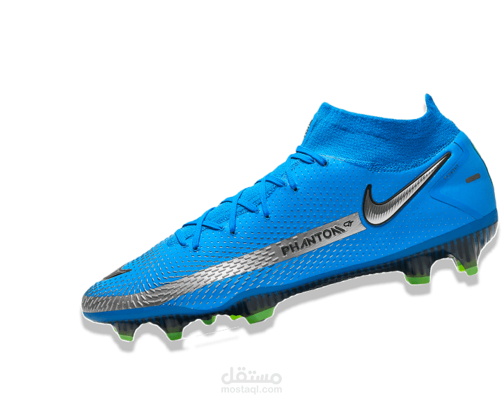
sport shoes page
تفاصيل العمل
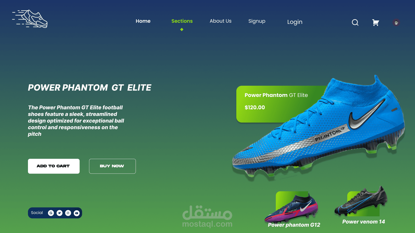
I'm thrilled to share that I've recently built a e-commerce page for a fictional shoe brand!
design phase { Figma }:
I started by diving deep into Figma's interface and explore its powerful features. I learned how to:
create a visually appealing design:
I designed a user-friendly and engaging layout for the website, showcasing the shoes prominently and incorporating a clear call to action.
Utilize Figma's tools:
Using Figma's design tools, including its interface, to create a professional design.
leverage the Figma community:
I explored the Figma community for inspiration and reference materials, helping me refine my design and incorporate best practices.
development phase html css
I then brought my Figma design to life in VS Code and go deep into HTML and CSS, mastering key skills like:
navigation bar design:
I created a responsive navigation bar that sits perfectly in the center of the page, ensuring a seamless user experience across all devices.
logo functionality:
The logo now acts as a dynamic link, redirecting users back to the homepage with a single click.
user-friendly icons:
I incorporated essential icons like a shopping cart and a user profile, providing intuitive access to key features.
interactive buttons:
I implemented visually appealing buttons with rounded corners and hover effects, enhancing the overall aesthetic and user engagement.
social media integration:
The website now seamlessly connects with the brand's social media accounts, allowing users to follow for updates and engage with the community.
product display :
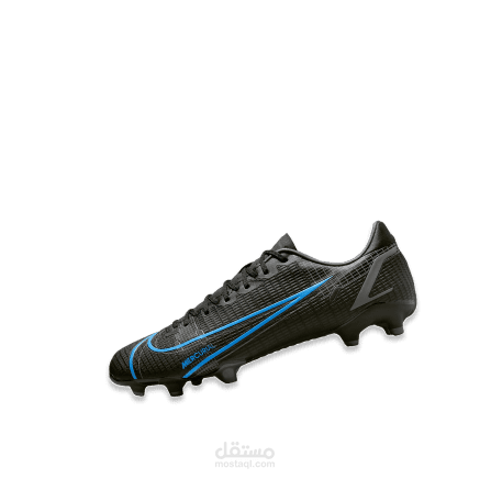
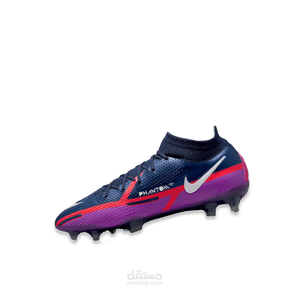
I utilized Flexbox to create a visually appealing layout, showcasing the featured shoes prominently at the top and related products in a card format at the bottom.
This project has been a fantastic learning experience, allowing me to solidify my design and development skills.
ملفات مرفقة
بطاقة العمل
| اسم المستقل | Gamila A. |
| عدد الإعجابات | 0 |
| عدد المشاهدات | 10 |
| تاريخ الإضافة | |
| تاريخ الإنجاز |

