Brand Identity Visualization for an Egyptian-Inspired Home-Made Bakery
تفاصيل العمل
For this project, I developed the brand identity for a home-made bakery business that specializes in authentic Egyptian recipes. The goal was to create a visual identity that resonates with the bakery's cultural roots while appealing to modern sensibilities.
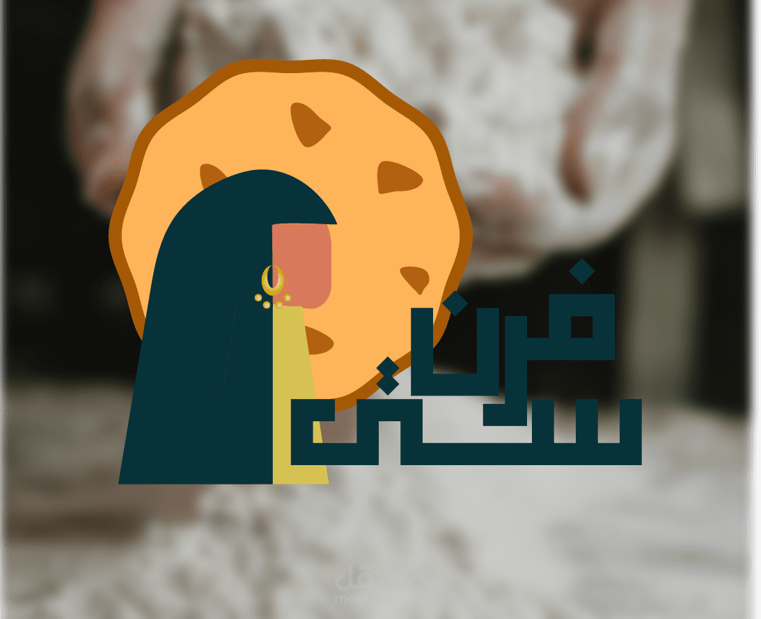
Logo Design: The logo was inspired by the strength and grace of Egyptian women, incorporating elements that reflect their cultural significance. I carefully designed the logo using the golden ratio, ensuring balance and aesthetic appeal.
Color Palette: I selected a vibrant color palette featuring blue, lime green, and pink. These colors were chosen for their ability to evoke freshness, creativity, and warmth, aligning with the bakery's brand values.
Social Media Posts: I created a series of social media posts that maintain consistency in visual language while engaging the target audience. Each post reflects the brand’s identity and highlights its unique selling points.
Packaging Design: I developed packaging examples that are not only functional but also visually aligned with the brand. The designs incorporate the logo, color palette, and additional graphic elements to create a cohesive and attractive package.
Pattern Creation: To further enhance the brand's visual identity, I designed a unique pattern that can be used across various branding materials. This pattern reflects the cultural and culinary heritage of Egypt, adding depth and context to the brand.
في هذا المشروع، قمت بتطوير الهوية البصرية لمخبز منزلي متخصص في تقديم وصفات مصرية أصيلة. كان الهدف هو إنشاء هوية بصرية تتناغم مع الجذور الثقافية للمخبز مع مراعاة الطابع العصري والجاذبية.
تصميم الشعار: استوحيت الشعار من قوة ورقي المرأة المصرية، حيث تم دمج عناصر تعكس أهميتها الثقافية. تم تصميم الشعار بعناية باستخدام النسبة الذهبية لضمان التوازن والجاذبية البصرية.
لوحة الألوان: اخترت لوحة ألوان حيوية تضم الأزرق والأخضر الليموني والوردي. تم اختيار هذه الألوان لقدرتها على إيصال إحساس بالانتعاش والإبداع والدفء، مما يتماشى مع قيم العلامة التجارية للمخبز.
منشورات وسائل التواصل الاجتماعي: أنشأت سلسلة من المنشورات لوسائل التواصل الاجتماعي تحافظ على تناسق اللغة البصرية مع جذب الجمهور المستهدف. تعكس كل منشور هوية العلامة التجارية وتبرز نقاط البيع الفريدة لها.
تصميم العبوات: طورت أمثلة لتصميم العبوات ليست فقط وظيفية بل تتماشى بصرياً مع العلامة التجارية. تتضمن التصاميم الشعار ولوحة الألوان والعناصر الجرافيكية الإضافية لإنشاء عبوات جذابة ومتناسقة.
إنشاء نمط: لتعزيز الهوية البصرية للعلامة التجارية، قمت بتصميم نمط فريد يمكن استخدامه عبر مختلف المواد التسويقية. يعكس هذا النمط التراث الثقافي والطهوي لمصر، مما يضيف عمقاً وسياقاً لهوية العلامة التجارية.
ملفات مرفقة
بطاقة العمل
| اسم المستقل | اسراء م. |
| عدد الإعجابات | 0 |
| عدد المشاهدات | 4 |
| تاريخ الإضافة | |
| تاريخ الإنجاز |