لوجو احنرافي لجمعية قاصد كريم الخيرية
تفاصيل العمل

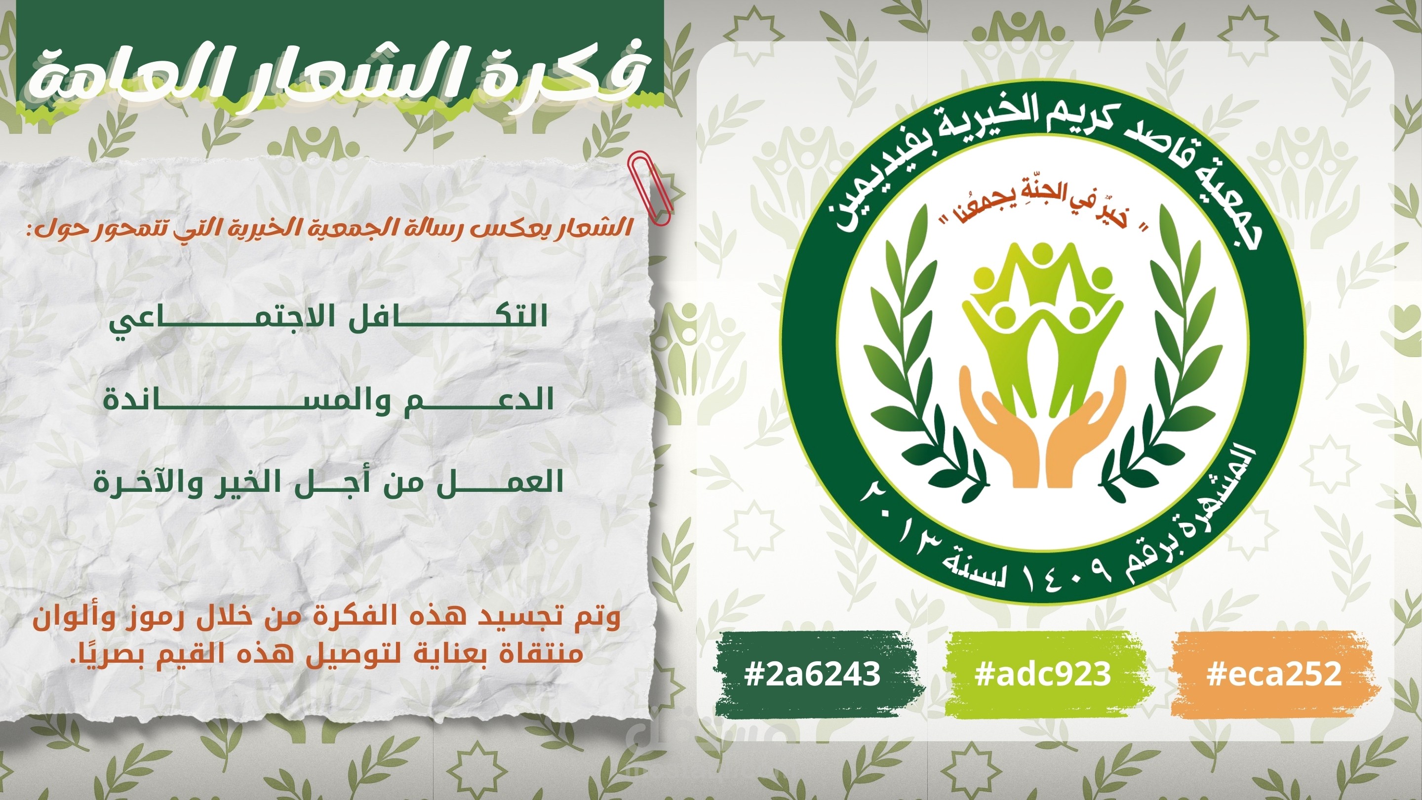
اسم المشروع: تصميم شعار جمعية قاصد كريم الخيرية
الدور: تصميم الشعار وبناء الفكرة البصرية
الفكرة والرسالة
صمّمت الشعار ليجسّد رسالة الجمعية في العطاء والتكافل. قلب التكوين هو أيادٍ حاضنة ترفع أشكالًا بشرية متشابكة؛ ما يعبّر عن دعم المحتاجين وبناء مجتمع متماسك. الشكل العام داخل إطار دائري يرمز للوحدة والاستمرارية، مع غصني زيتون للتعبير عن السلام والبركة.
العناصر البصرية
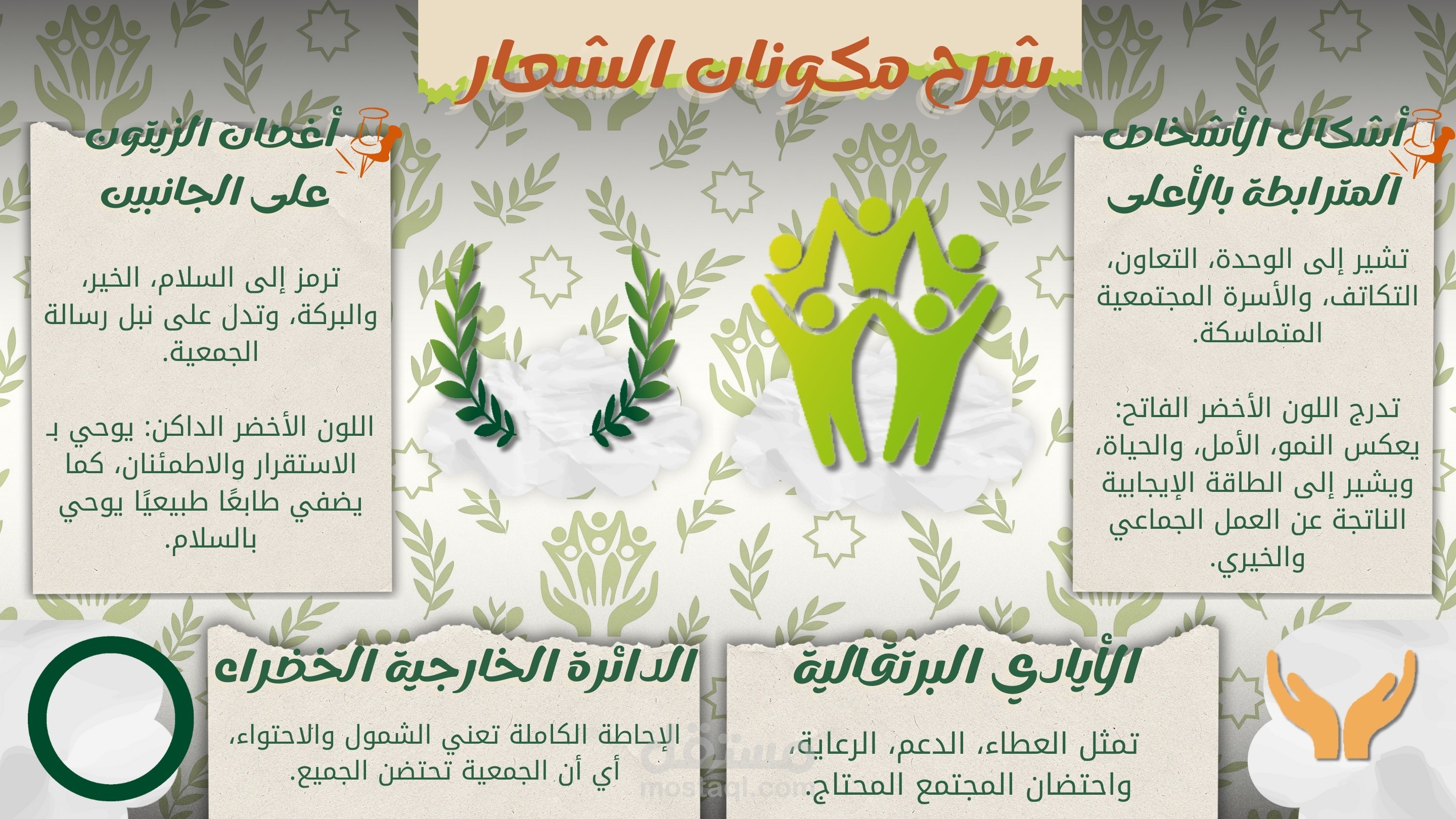
الأيدي الداعمة: تمثل الرعاية والمسؤولية المجتمعية، وتتجه للأعلى للدلالة على التمكين والارتقاء.
الأشخاص المتّصلون: يكوّنون حركة صاعدة توحي بالإنجاز والعمل الجماعي.
غصنا الزيتون: دلالة عالمية على السلام والعطاء وتوازن بصري يمين/يسار.
النص العلوي: «خيرٌ في الجنة يجمعنا» يرسّخ البعد القيمي ويضفي لمسة روحية ملهمة.
الحلقة الخارجية: تحتوي اسم الجمعية وبيانات الإشهار (المشهرة برقم 1409 لسنة 2013) لإضفاء اعتماد رسمي.
الألوان والدلالات
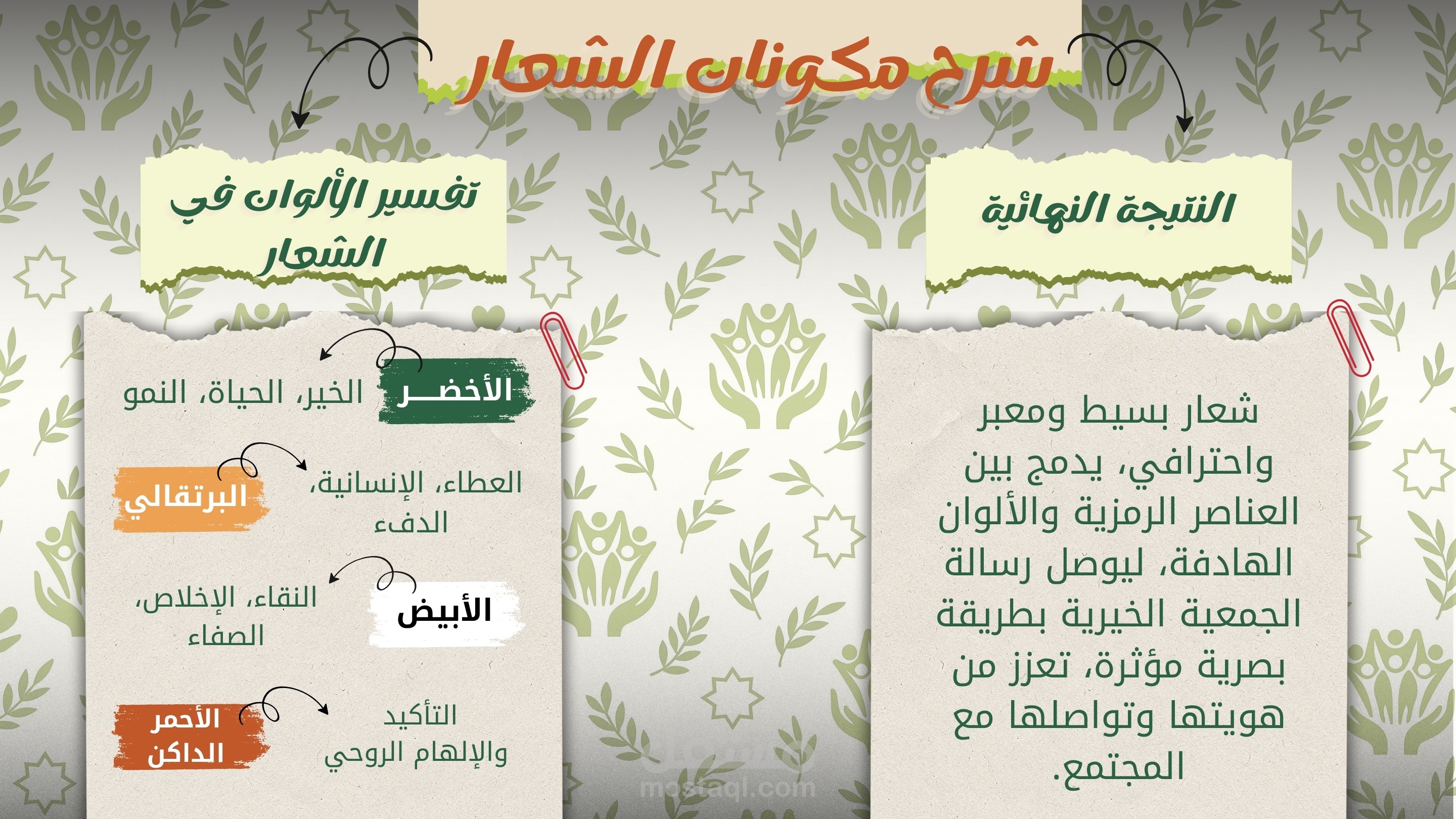
الأخضر الداكن والفاتح: النمو، الأمل، والهوية القريبة من العمل الخيري والمجتمعي.
البرتقالي الدافئ (في الأيادي): الرحمة، الدفء الإنساني، والتفاعل المباشر مع المحتاجين.
الخلفية البيضاء: نقاء ووضوح عالي للتطبيقات المتنوعة.
> (في حال الحاجة إلى دليل ألوان، يمكن اعتماد لوحة تقريبية: أخضر داكن #0B5D33، أخضر فاتح #8BC34A، برتقالي #F4A261، مع الأبيض.)
التكوين والطباعة
تناظر محوري يمنح الشعار توازنًا وثباتًا.
تدرّج أحجام العناصر من الأيدي (قاعدة) إلى الأشخاص (قمة) ليقود العين للأعلى.
حروف واضحة داخل الحلقة الخارجية لضمان قابلية القراءة في الأحجام الصغيرة.
القابليّة للتطبيق
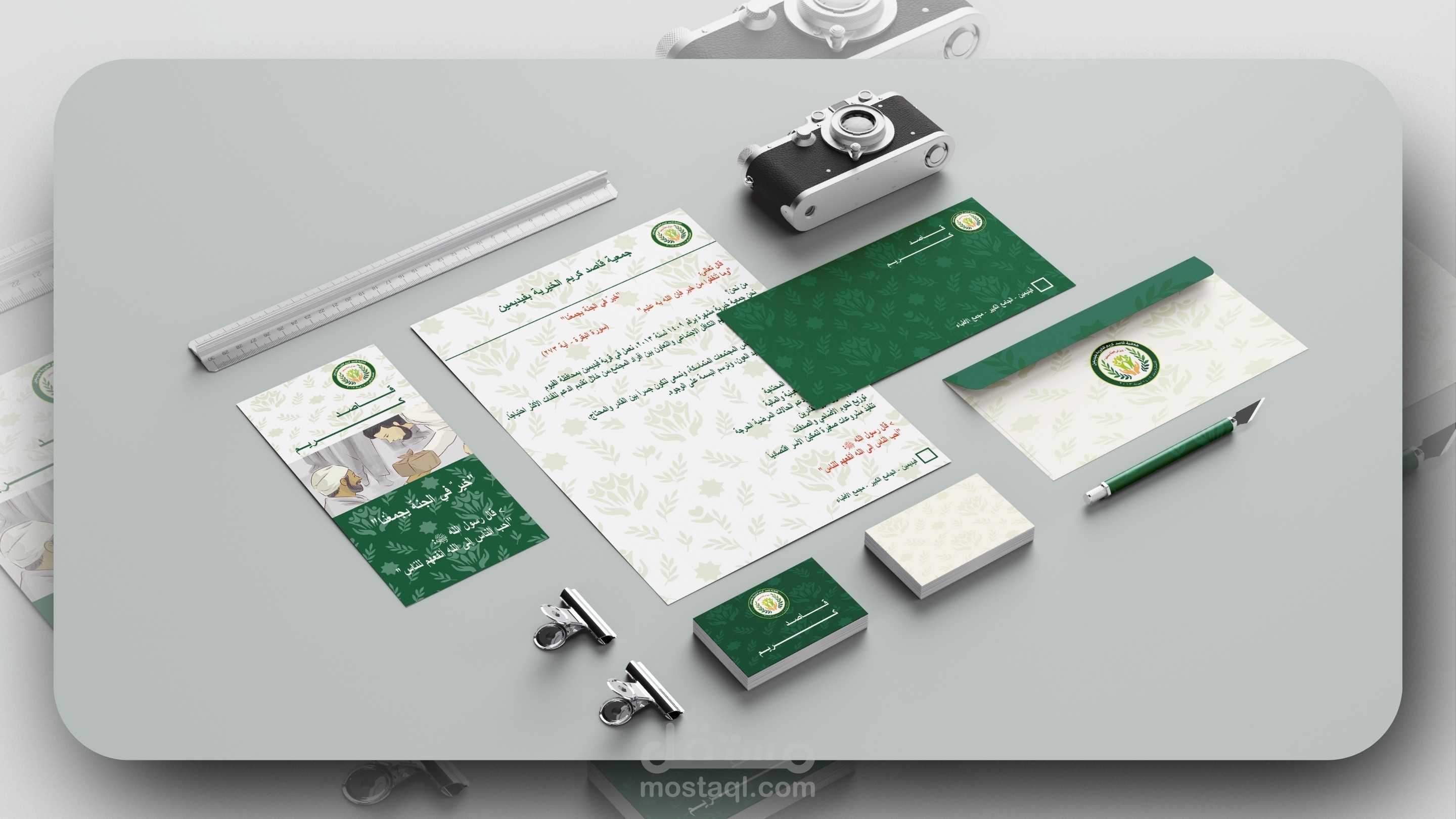
يعمل الشعار مُلوّنًا وأحادي اللون دون فقدان الفكرة.
مناسب للطباعة، الختم، التطريز، والهوية الرقمية.
يُستخلص أيقونة مختصرة (الأيدي + الأشخاص) لاستخدامات المساحة المحدودة.
إرشادات سريعة للاستخدام
الحفاظ على مساحة تنفّس لا تقل عن عرض الحلقة البيضاء حول الشعار.
تجنّب تمديد/تشويه النسب أو تغيير الألوان خارج اللوحة المعتمدة.
الحد الأدنى الموصى به للعرض الرقمي: 24–28px للأيقونة المختصرة، و120px للشعار الكامل.
Project: Logo Design – Qasid Karim Charity Association (Faydimin)
Role: Concept and visual identity mark design
Concept & Message
The logo is built to express the charity’s core values of giving and solidarity. At the center, supporting hands lift interconnected human figures, symbolizing care, empowerment, and a community that rises together. The design sits within a circular seal for unity and continuity, flanked by olive branches to convey peace and blessing.
Visual Elements
Supporting Hands: Represent compassion and responsibility; the upward gesture signals empowerment and uplift.
Human Figures: Interlinked forms create upward motion, suggesting teamwork and shared achievement.
Olive Branches: Universal signifier of peace and benevolence, providing left/right visual balance.
Upper Motto: “Khayrun fi al-Jannah yajma‘unā” (“Goodness unites us in Paradise”) reinforces the value-driven spirit.
Outer Ring: Displays the association’s name and registration data (No. 1409 – Year 2013) to add official credibility.
Color Rationale
Deep & Light Greens: Growth, hope, and a visual language strongly associated with charitable work.
Warm Orange (hands): Human warmth, mercy, and direct impact.
White Background: Clean contrast for clarity across mediums.
> (If a color guide is needed, an approximate palette can be: Deep Green #0B5D33, Light Green #8BC34A, Orange #F4A261, White.)
Composition & Typography
Axial symmetry delivers balance and trust.
Visual hierarchy from the base (hands) to the top (figures) naturally guides the eye upward.
Clear ring typography ensures legibility even at reduced sizes.
Versatility
Performs well in full color and single color versions.
Suitable for print, stamps, embroidery, signage, and digital identity.
A compact icon (hands + figures) can be extracted for small spaces and favicons.
Usage Notes
Maintain a clear safe area at least equal to the inner white ring thickness.
Avoid skewing, stretching, or non-approved color changes.
Recommended minimum digital sizes: 24–28px for the extracted icon, 120px width for the full seal.