Sales Data Analysis - Tableau
تفاصيل العمل
Sales Data Analysis
Welcome to the Sales Data Analysis project using Tableau! This project showcases the creation of insightful dashboards that analyze sales and profit data across various dimensions. The focus is on delivering a comprehensive view of sales performance through intuitive visualizations.
Dashboards
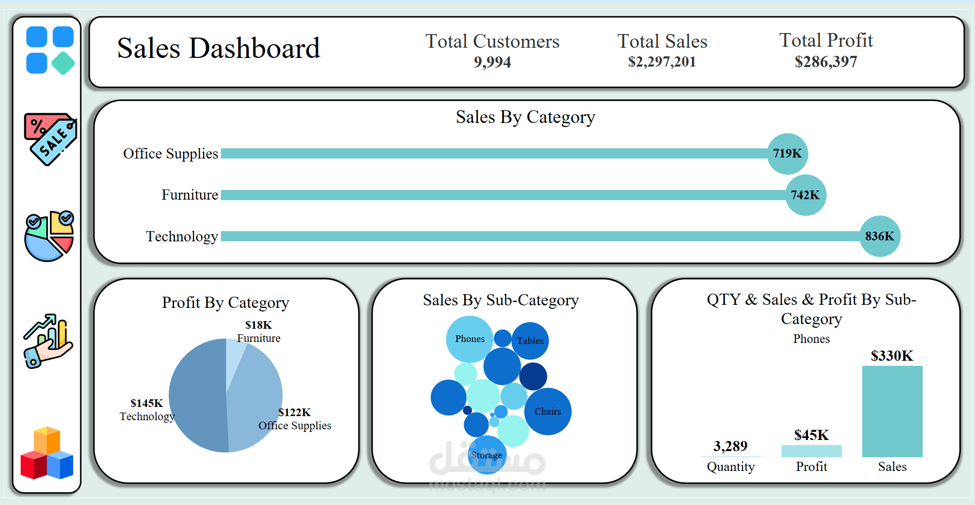
1. Sales & Profit by Categories and Sub-Categories
This dashboard offers a detailed analysis of sales and profit across different categories and sub-categories. It helps identify the best and worst performing segments, enabling targeted decision-making.
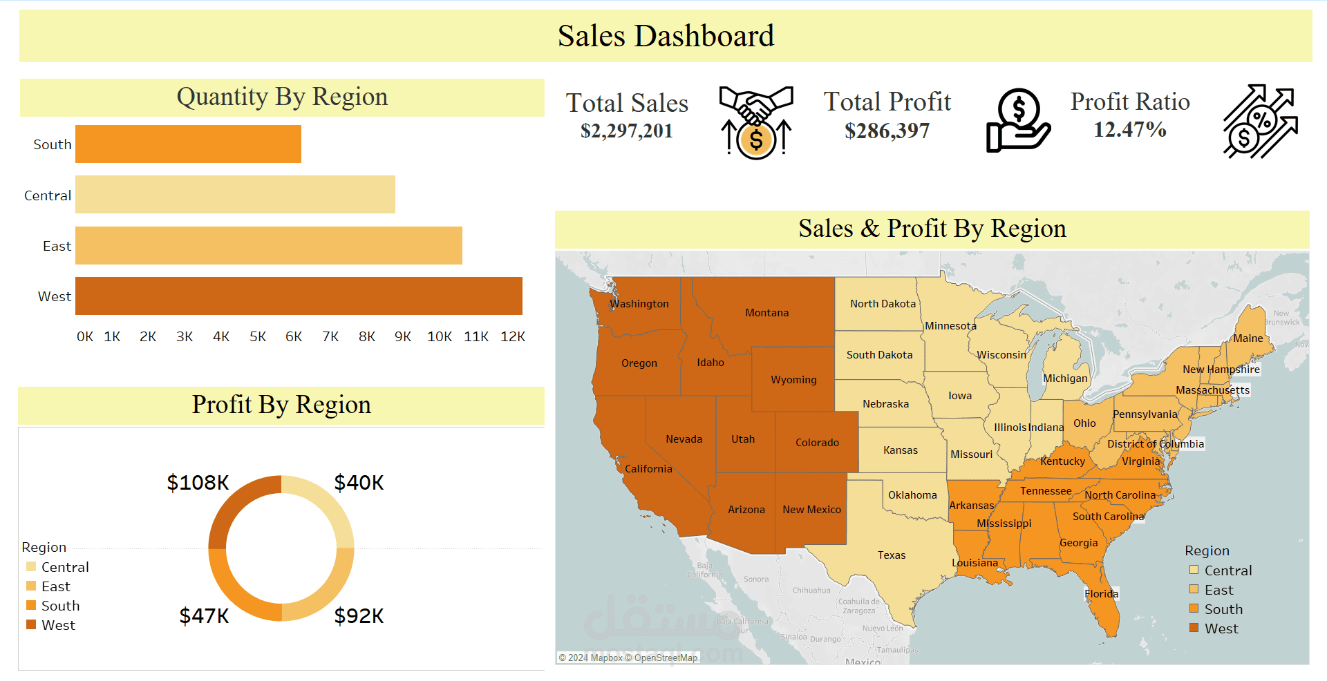
2. Sales & Profit by Country, City, State, and Region
This dashboard provides a geographical breakdown of sales and profit data. It allows for an in-depth analysis of performance by country, city, state, and region, highlighting areas of strength and opportunities for growth.
Key Performance Indicators (KPIs)
Total Customers: 9,994 ???
Total Sales: $2,297,201
Total Profit: $286,397
Profit Ratio: 12.47%
These KPIs offer a snapshot of the overall performance and efficiency of the sales operations.
Powerful Visuals
Lollipop Chart
A unique and engaging visualization used to represent data points clearly and effectively.
Donut Chart
A visually appealing way to display proportions and percentages, making complex data more accessible.
Challenges and Solutions
One of the most challenging aspects of this project was customizing the borders to be rounded. This involved meticulous work to determine the right sizes and designing the borders outside of Tableau. Despite the difficulty, this customization significantly enhanced the visual appeal of the dashboards.