Qodebites | Software house (visual identity design)
تفاصيل العمل
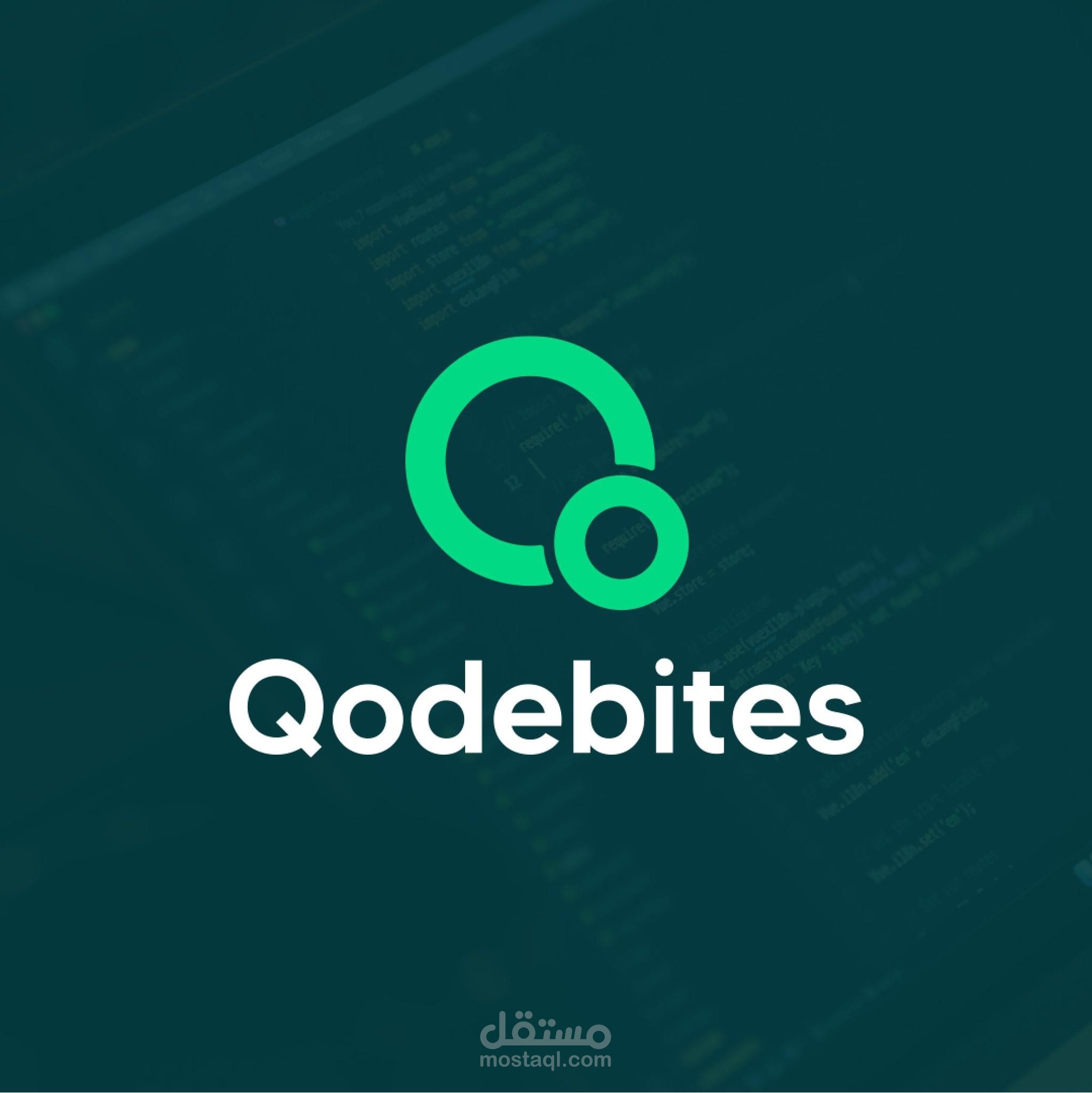


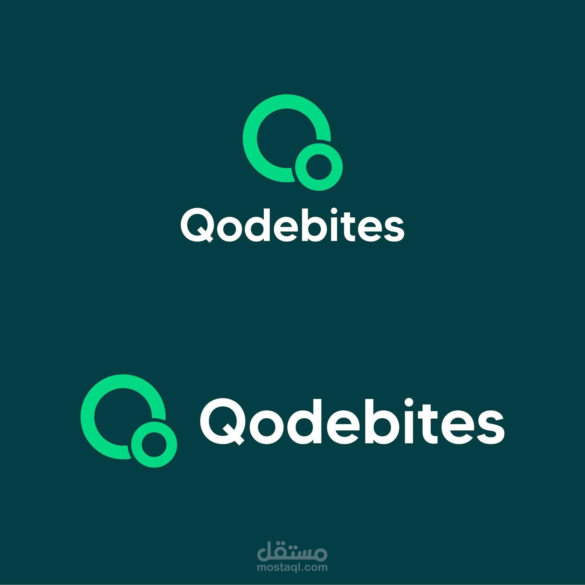
In this project, the concept was that I created these two circles to create the shape of the letter “Q” and at the same time represent the other half if the name which is “bites” which is the action that the smaller circle does which it bites the bigger one, And it also represents that this brand seeking for creative and out of the box solutions which is represented by the smaller circle getting out of the usual zone/solutions. That is the story that I created for this brand and tried to say it in a minimal way