Responsive website with Scss
تفاصيل العمل
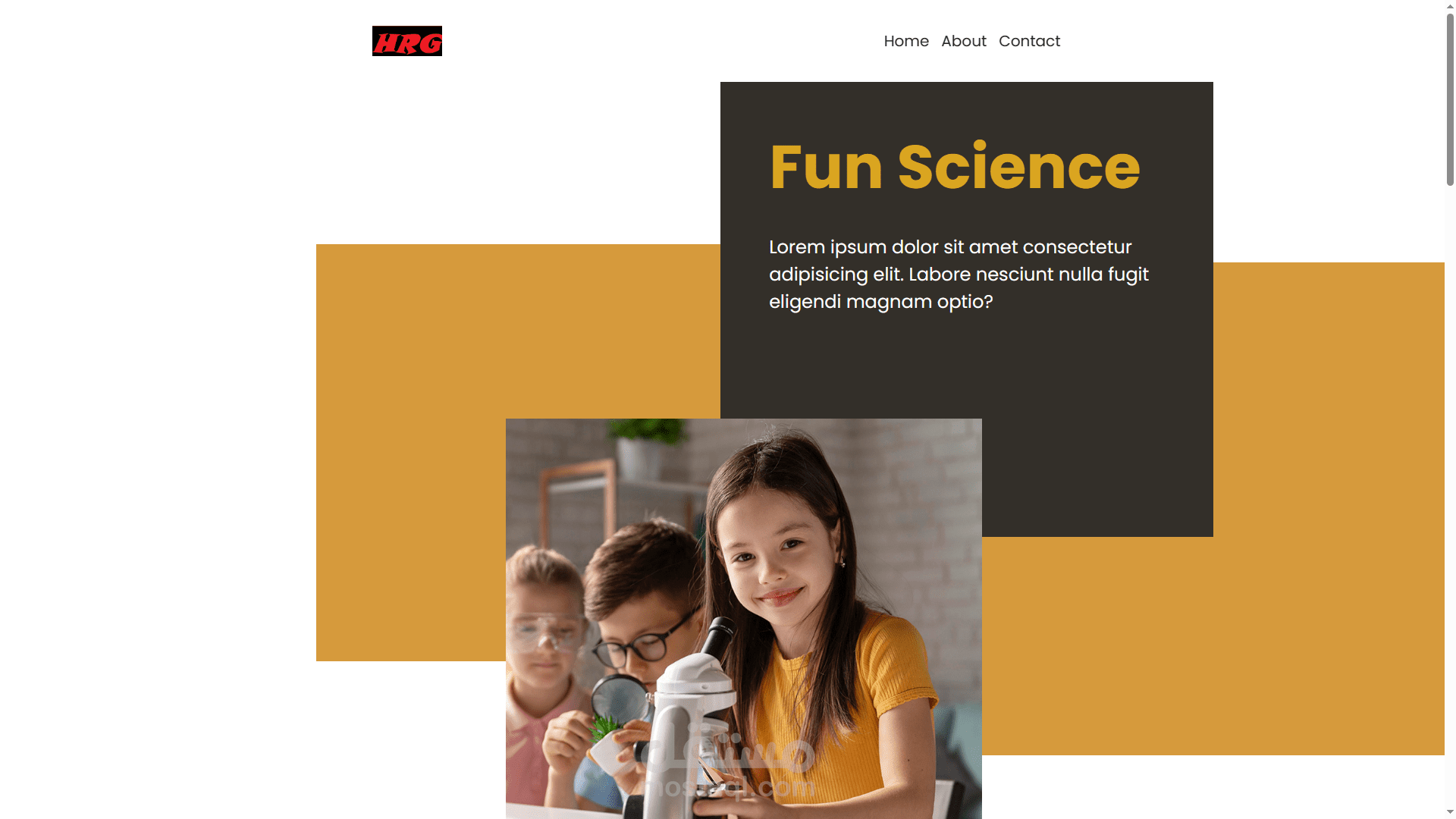

Responsive Design: The website is designed with responsiveness in mind, ensuring a seamless experience across various devices and screen sizes. Whether viewed on a desktop, tablet, or mobile device, users can easily navigate and explore the content.
Custom Styling with Sass: Leveraging the power of Sass, I implemented custom styling to enhance the visual appeal and cohesiveness of the website. Sass variables, mixins, and nesting were utilized to streamline the styling process and maintain code readability.
Bootstrap Framework: I utilized Bootstrap to expedite development and ensure consistency in layout and design elements. Bootstrap's grid system and predefined CSS classes allowed for efficient structuring of content and implementation of responsive components.
Interactive Components with JavaScript: JavaScript was employed to add interactivity and functionality to the website. From smooth scrolling navigation to dynamic content loading, JavaScript enhances the user experience and provides engaging interactions.
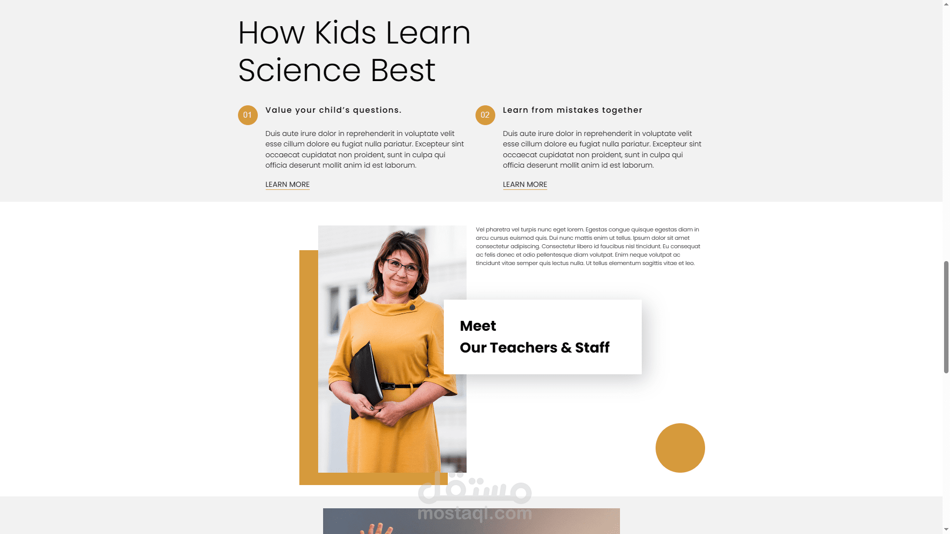
Project Showcase: One of the focal points of the website is the project showcase section, where visitors can explore my portfolio of projects. Each project is presented with a brief description, accompanied by relevant images and links for further exploration.
Contact Form: To facilitate communication and inquiries, a contact form is integrated into the website. Visitors can easily reach out to me directly through the form, allowing for seamless interaction and collaboration opportunities.