E-Commerce Website
تفاصيل العمل
Structure and Organization:
The styles are well-organized, making it easy for other developers (and yourself) to understand and maintain the code.
Color Harmony:
A balanced color palette is used to provide good contrast between text and backgrounds, enhancing content readability.
Header and Navbar Styling:
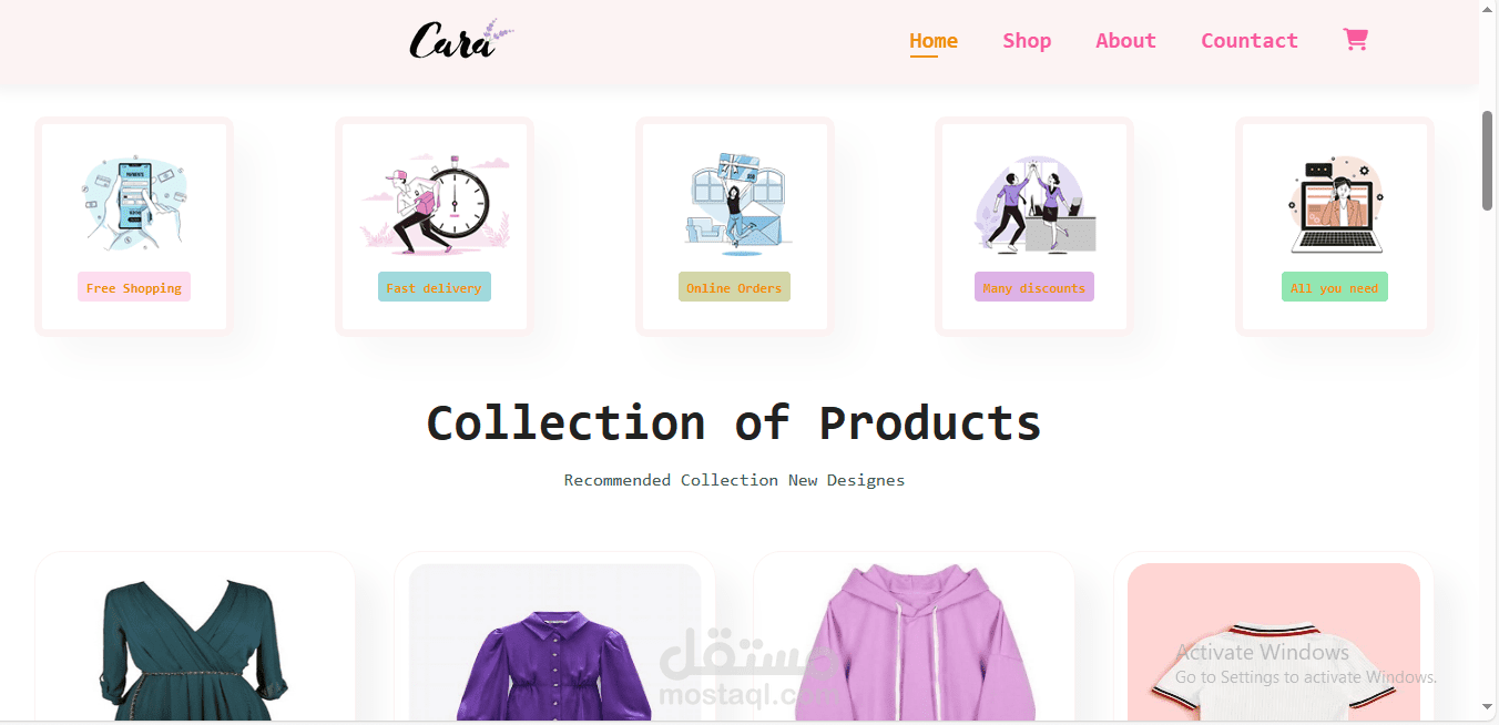
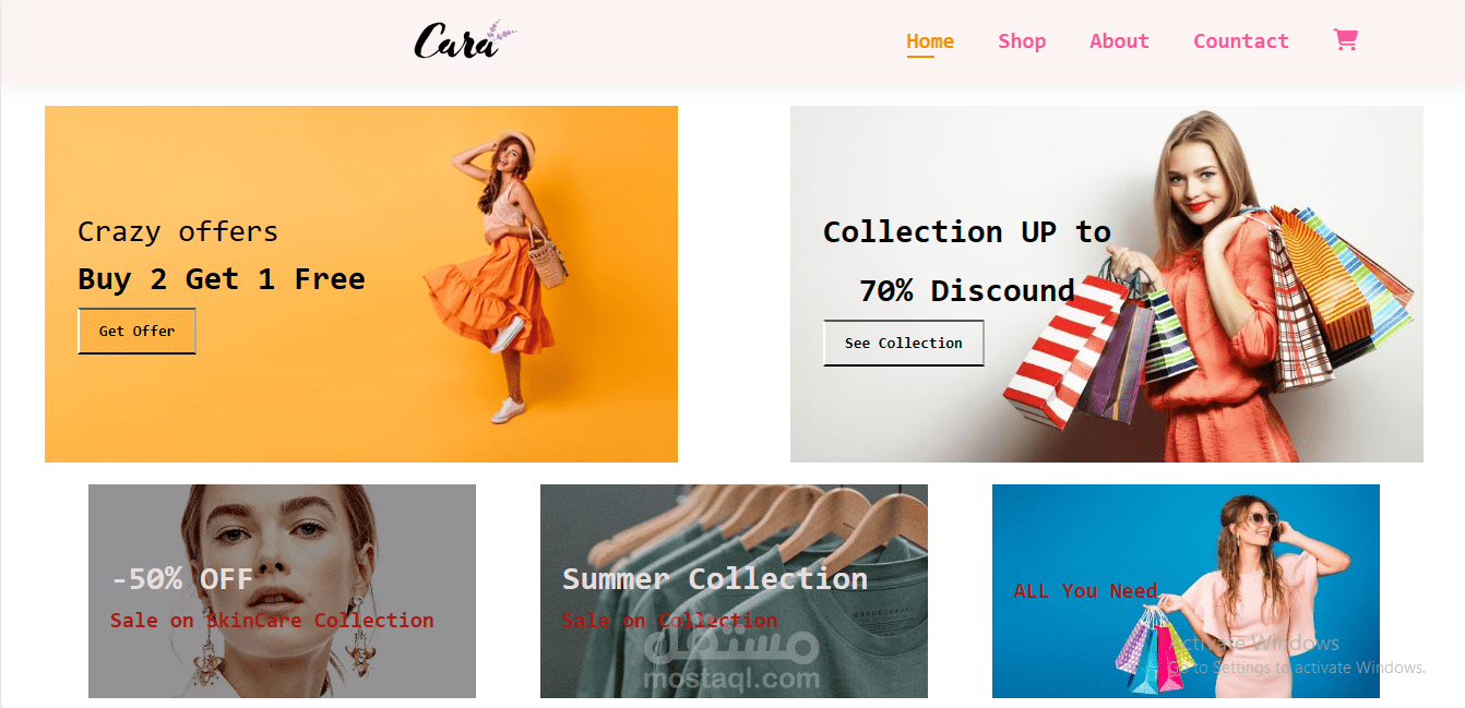
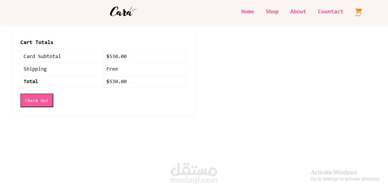
A clean and simple design is presented for the header and navbar, utilizing flex properties for efficient and flexible distribution.
Navigation Button and Interaction:
A navigation button is added, changing on hover to provide a visual interaction for the user.
Main Section and Cards Design:
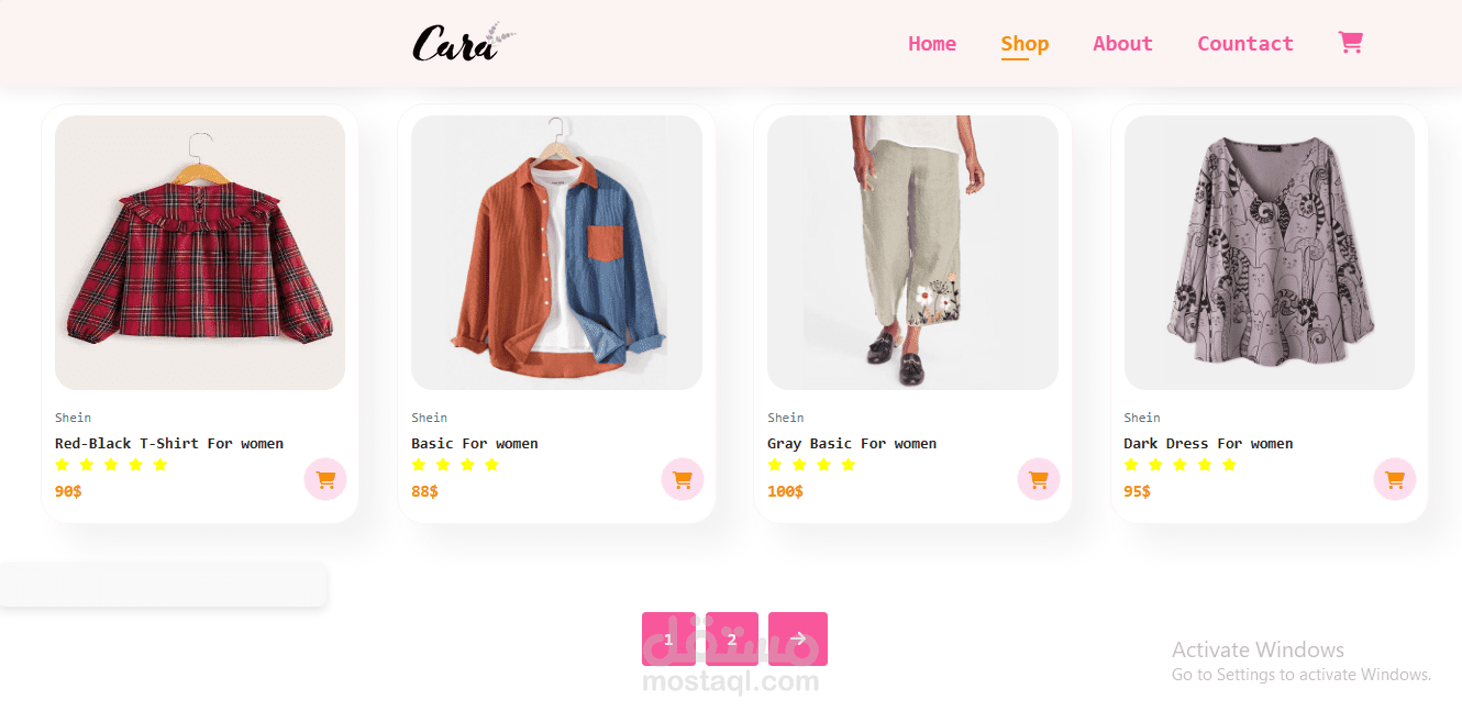
The main section of the website is designed cohesively, and product cards are presented with a well-structured format and clear information.
Homepage Layout and Banner:
A well-designed homepage layout is provided with an attractive background image in the banner.
Footer Design:
The footer is neatly organized with a flexible interface and clear links.
Button Design:
Attractive button designs are presented with improved interaction elements on hover.
Typography and Sizes:
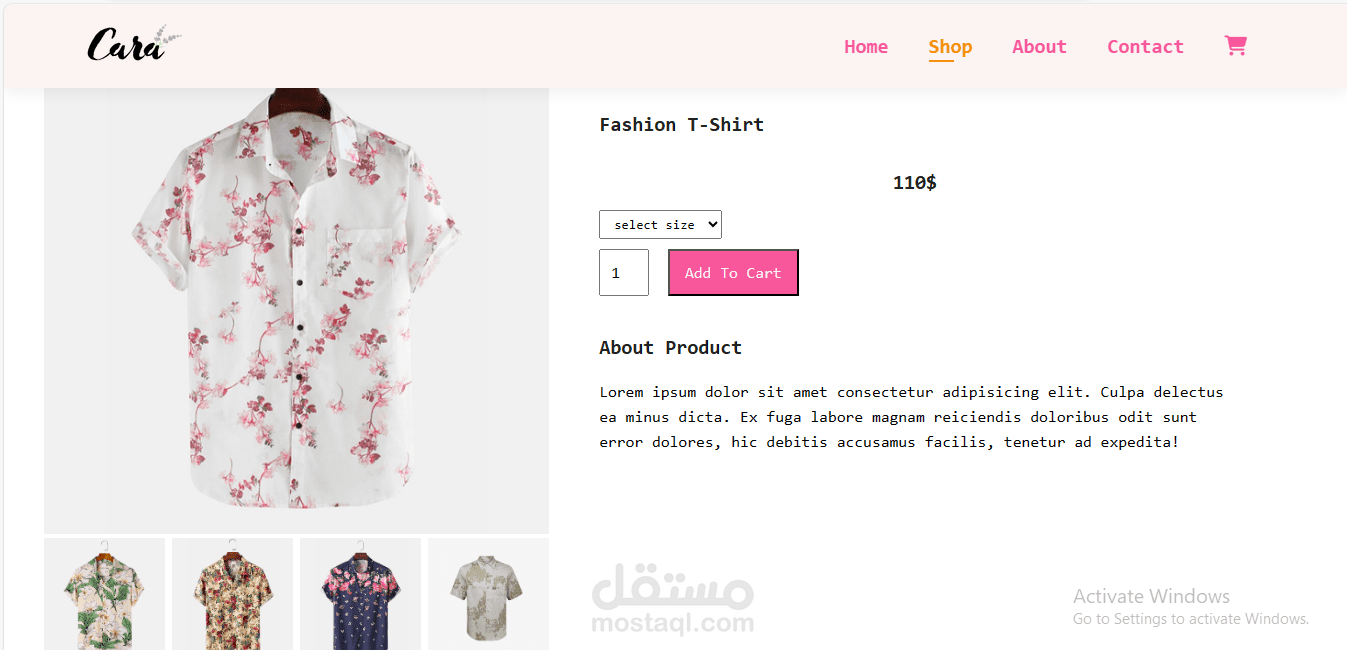
Careful choices for font sizes and styles enhance readability and make the design more appealing.
Product Page Design:
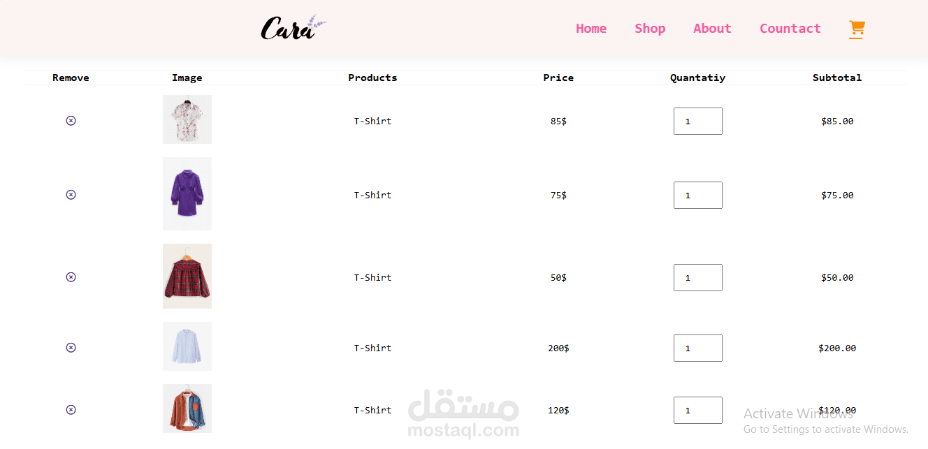
A well-structured design for the product page is offered, including a purchase button and clear details.
Navigation and Interaction Effects:
Hover effects are used effectively to guide the user and improve the interaction experience.
Responsive Design:
Indications of responsive design are made by presenting consistent layouts across various screen sizes.
Flexibility and Consistency:
Striving for consistency throughout the design to create a unified user experience.