Unveiling Flight Disruption Patterns: A Comprehensive Power BI Dashboard for Airports Delay and Cancellation Analysis
تفاصيل العمل

This project show travel data, surfacing actionable insights on:
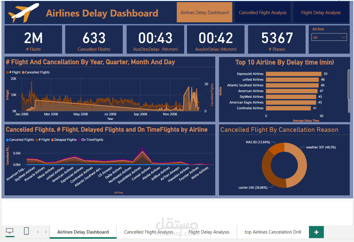
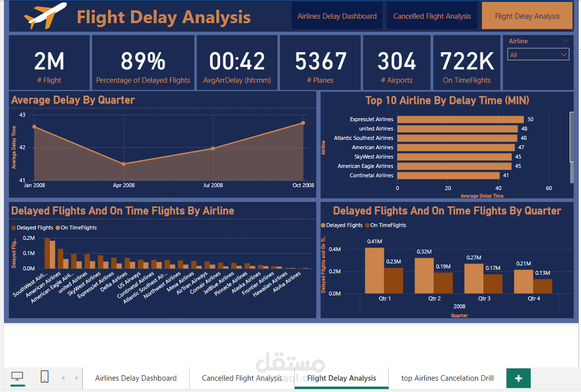
Delay Dynamics: Average wait times, culprit causes, and patterns by airline, airport, and even flight path.
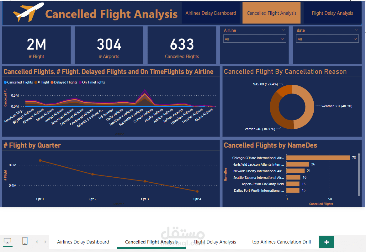
Cancellation Trends: Identify the frequent flyers of the "We're grounded" club, pinpoint reasons behind their bailouts, and strategize smoother skies.
Data-Driven Decisions: Equip yourselves with intel to optimize schedules, boost performance, and ultimately make happy campers out of weary (and delayed) passengers.
This dashboard ain't just a pretty face (though it is, with its snazzy charts, maps, and interactive filters). It's a data-powered powerhouse with:
4 dedicated decks: From a quick-glance summary to a cancellation deep-dive, you'll never get lost in the turbulence of information. ️
Seamless navigation: Filter by airlines, dates, times, and reasons with a flick of your wrist . ️
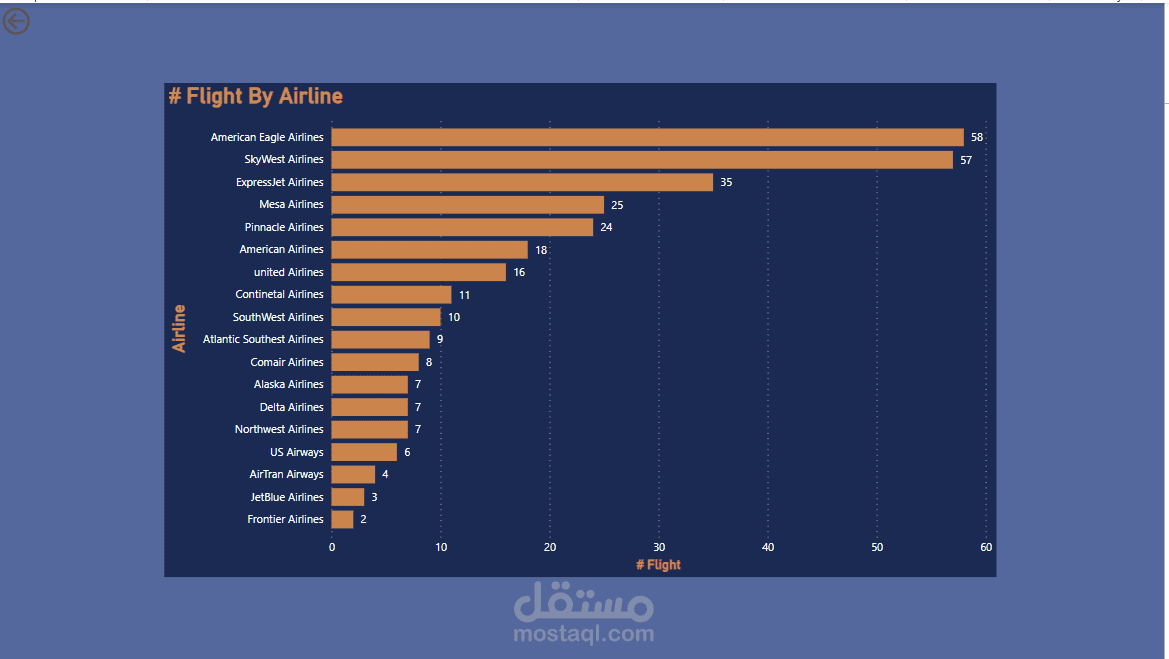
Drill-down delights: Uncover hidden patterns and relationships lurking beneath the surface of the data, like a true Power BI pirate plundering treasure!
So, fellow Sinore devs, let's set sail on this data odyssey and conquer the mysteries of flight disruptions! Share your thoughts, insights, and maybe even some Power BI wizardry in the comments below.