Responsive Ecommerce Website
تفاصيل العمل

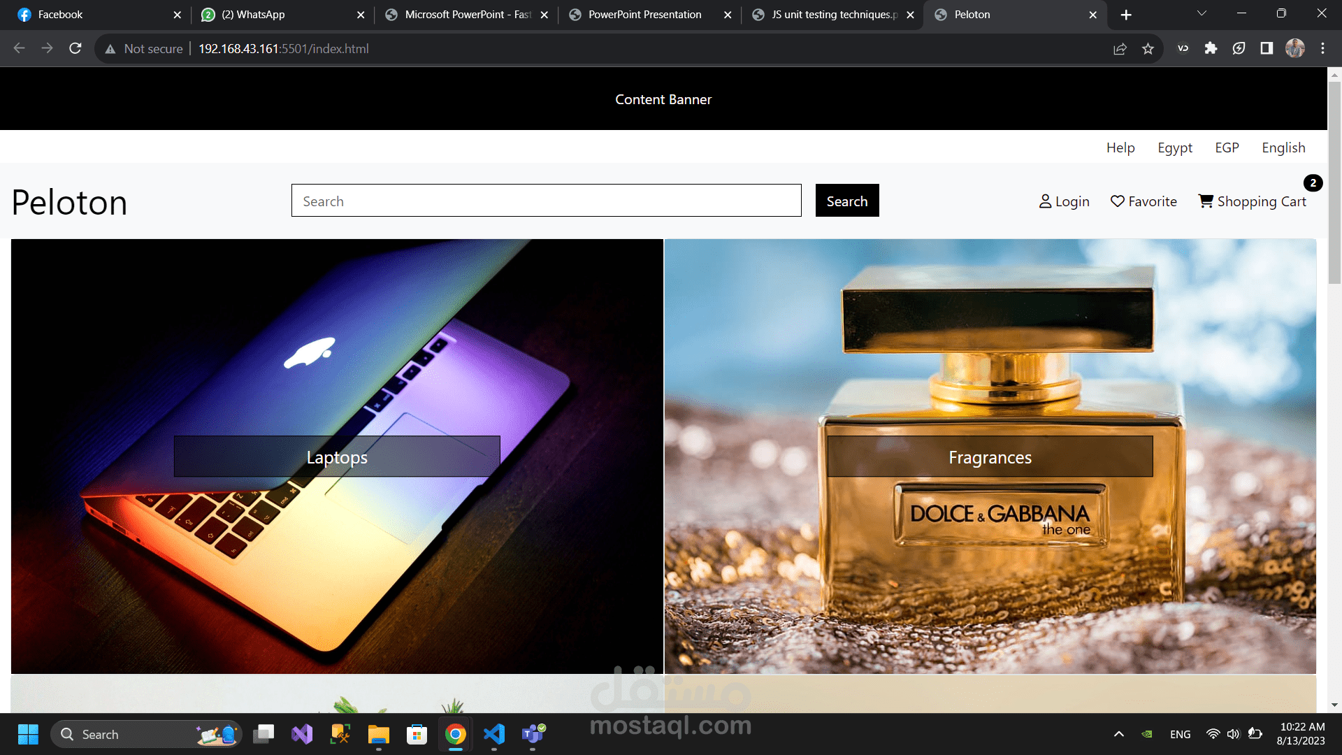
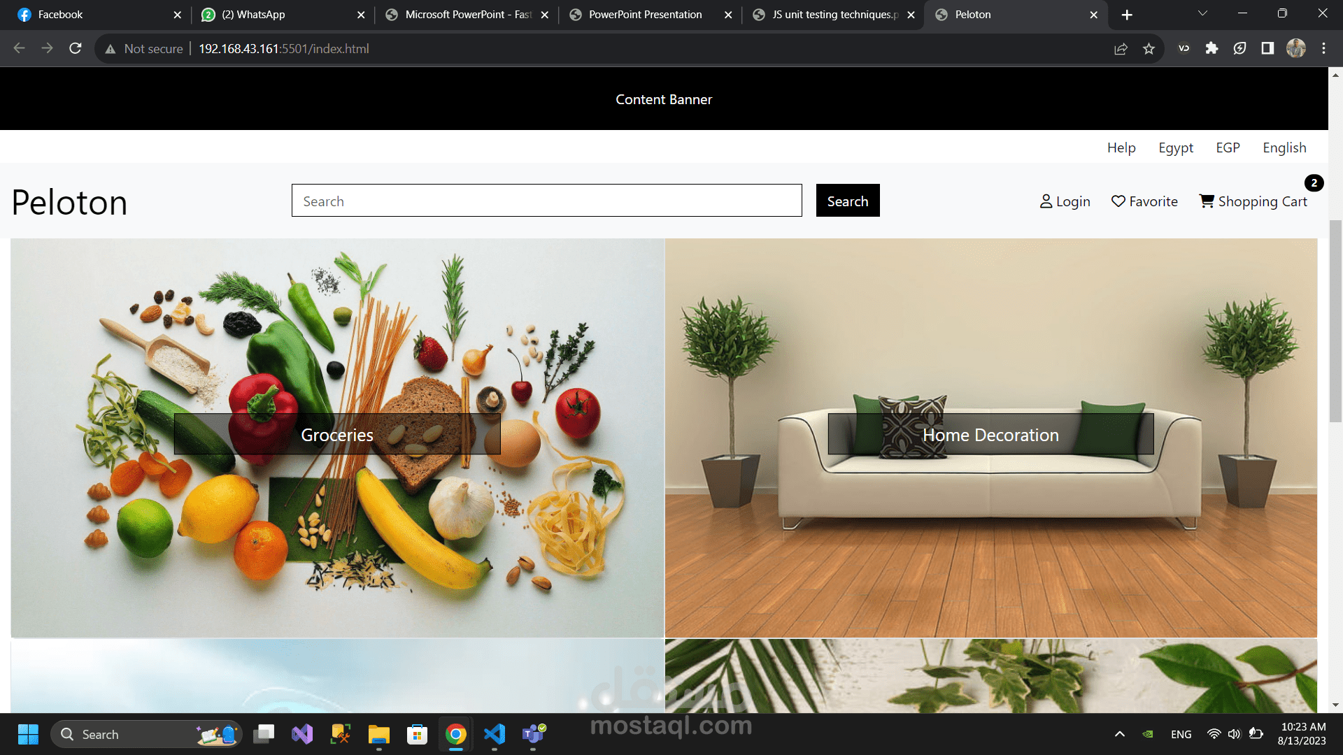
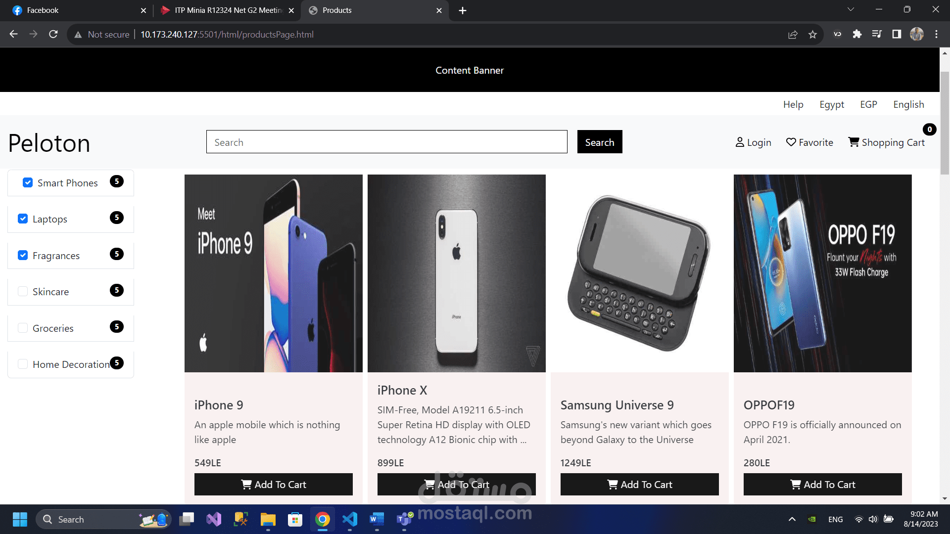
Our responsive ecommerce website is designed to provide a seamless and user-friendly online shopping experience across all devices. Whether your customers are browsing on a desktop computer, a smartphone, or a tablet, our website automatically adjusts and adapts to their screen size and resolution, ensuring optimal visibility and functionality.
With a responsive design, your ecommerce store will look and function flawlessly on various platforms and operating systems, including Windows, macOS, iOS, and Android. This flexibility allows you to reach a wider audience, catering to the preferences and habits of your diverse customer base.
Our responsive ecommerce website not only offers a visually appealing layout but also prioritizes usability and intuitive navigation. The interface is designed to be clean, organized, and easy to navigate, allowing customers to quickly find the products they desire and complete their purchases with minimal effort.