Domty | Sandwich Packaging
تفاصيل العمل
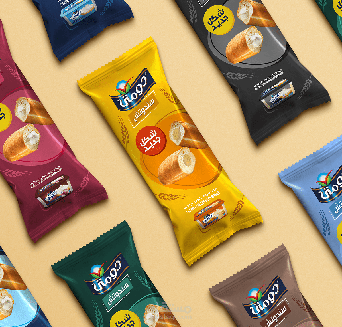
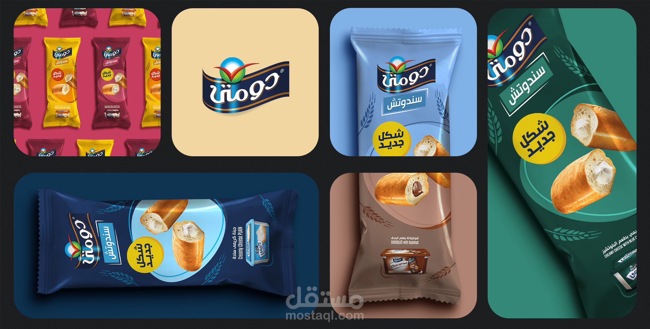
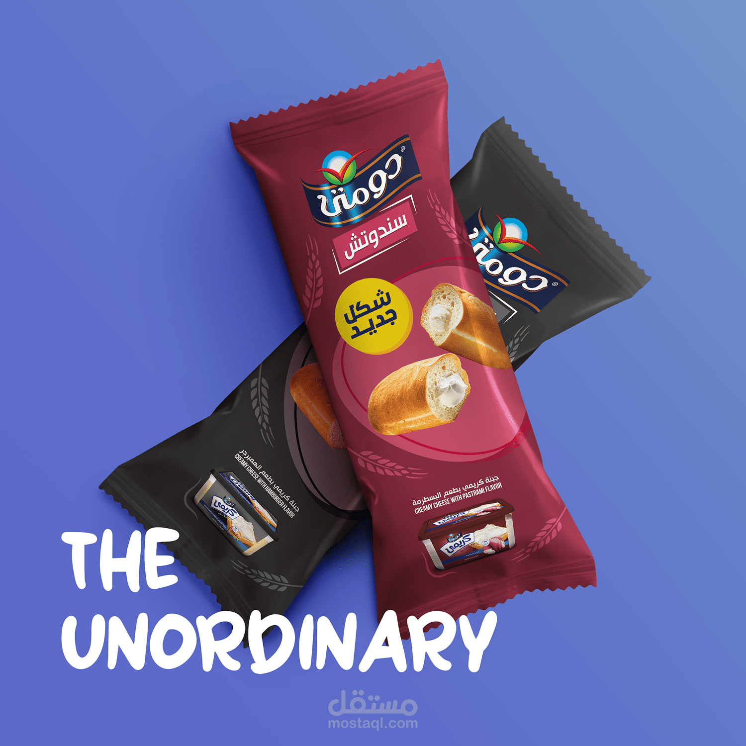
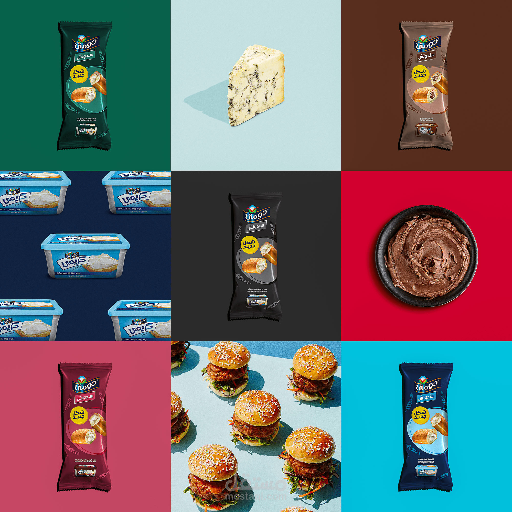
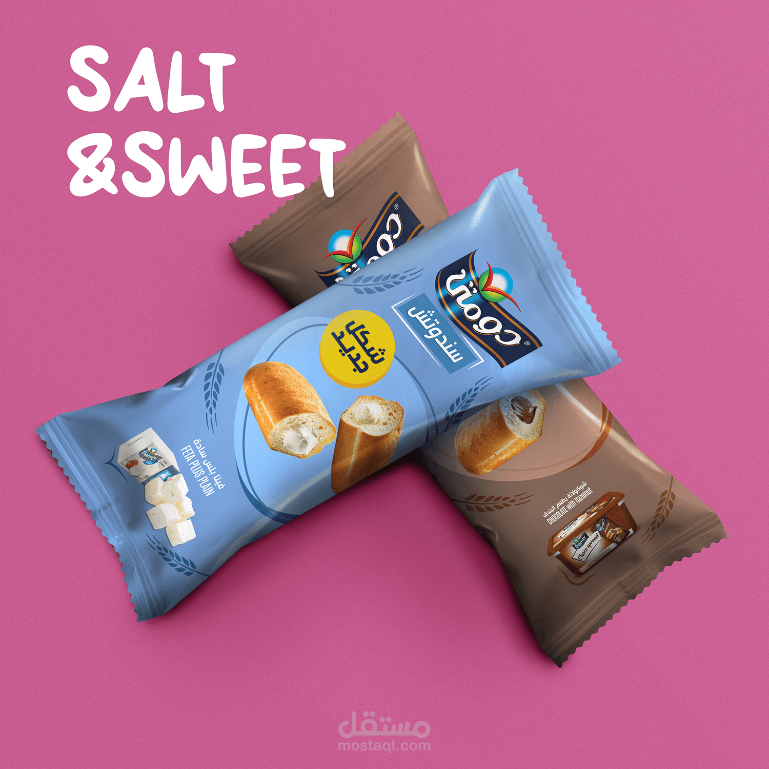
دومتي كان لديها رؤية جريئة. لقد سعوا إلى الارتقاء بتجربة السندويشات المحبوبة من خلال تصميم تغليف جديد وجذاب. لذلك قمت بتصميم تغليف من شأنه أن يثير الحواس ويلتقط أعين المستهلكين. مستوحاة من جوهر الشطيرة نفسها ، قمت بدمج اللون الذهبي للقمح ، رمزًا للتغذية والرضا. لقد غرست التصميم بعناية في جوهر كل نكهة ، مما يضمن مجرد رؤية منتجات دومتي للجبن الأخرى. وجعل هذه العبوة انعكاسًا للعناية والعاطفة التي تتماشى مع كل شطيرة دومتي ، ودعوة العملاء لتذوق اللحظة واحتضان النكهات.
domty had a bold vision. They sought to elevate the experience of their beloved sandwiches through a captivating new packaging design. So, I crafted a packaging design that would tantalize the senses and capture the eyes of consumers. Inspired by the very essence of the sandwich itself, I incorporated the golden hue of wheat, a symbol of nourishment and satisfaction. I carefully infused the design with the essence of each flavour, ensuring the mere sight of Domty's other cheese products. Let this packaging be a reflection of the care and passion that goes into every domty sandwich, inviting customers to savour the moment, and embrace the flavours.