Covid Dashboard Tutoiral
تفاصيل العمل
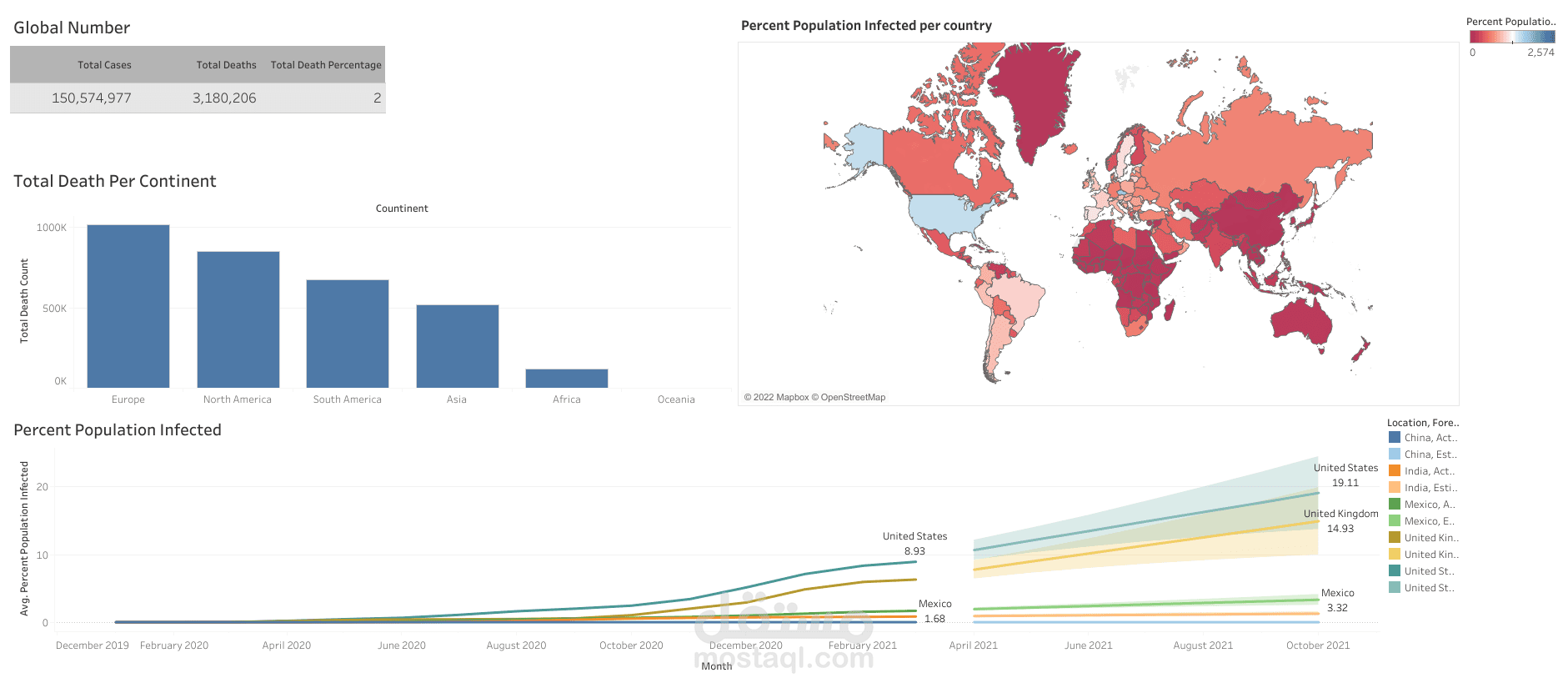
A COVID-19 dashboard is a visual representation of data related to the COVID-19 pandemic, such as the number of cases, deaths, and recoveries, as well as other key metrics such as hospitalizations and testing rates. In this tutorial, we will walk through the steps to create a simple COVID-19 dashboard using Python and the Plotly library.
Step 1: Data Collection and Preparation
The first step is to collect and prepare the data for visualization. We can use an API to access real-time data from reliable sources such as the World Health Organization or the Center for Disease Control. In this tutorial, we will use data from the COVID-19 Data Repository by the Center for Systems Science and Engineering (CSSE) at Johns Hopkins University.
We can use the Pandas library in Python to read in the data and prepare it for visualization. For example, we can filter the data by country or region, and aggregate it by day or week.
Step 2: Data Visualization
Once the data is prepared, we can use Plotly to create interactive visualizations that can be displayed on a web page or in a Jupyter Notebook. Plotly provides a variety of charts and graphs, including line charts, bar charts, and choropleth maps.