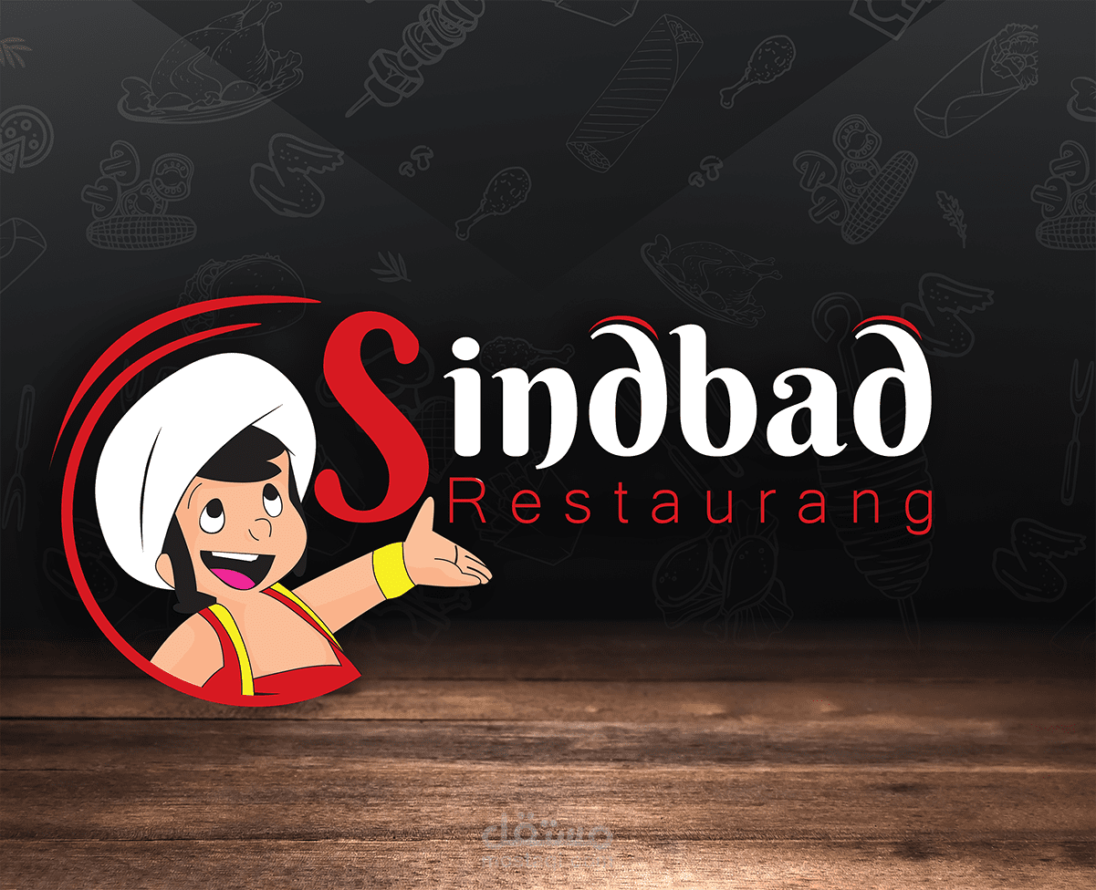
Sindbad restaurant
تفاصيل العمل


مطعم سندباد في السويد من المطاعم الجيدة وقد قمت بعمل تصميم يتناسب مع الاسم. لقد اخترت الخلفية الرمادية مع وجود صور مرسومة للاطعمة مع درجة شفافية مناسبة بحيث تظهر الخلفية بشكل مميز.
الوان المشروع كان الابيض والاحمر والاسود و الرمادي و القليل من الاصفر وهذه الالوان تتناسب مع بعضها بشكل كبير و تعطي رونق جميل للتصميم.
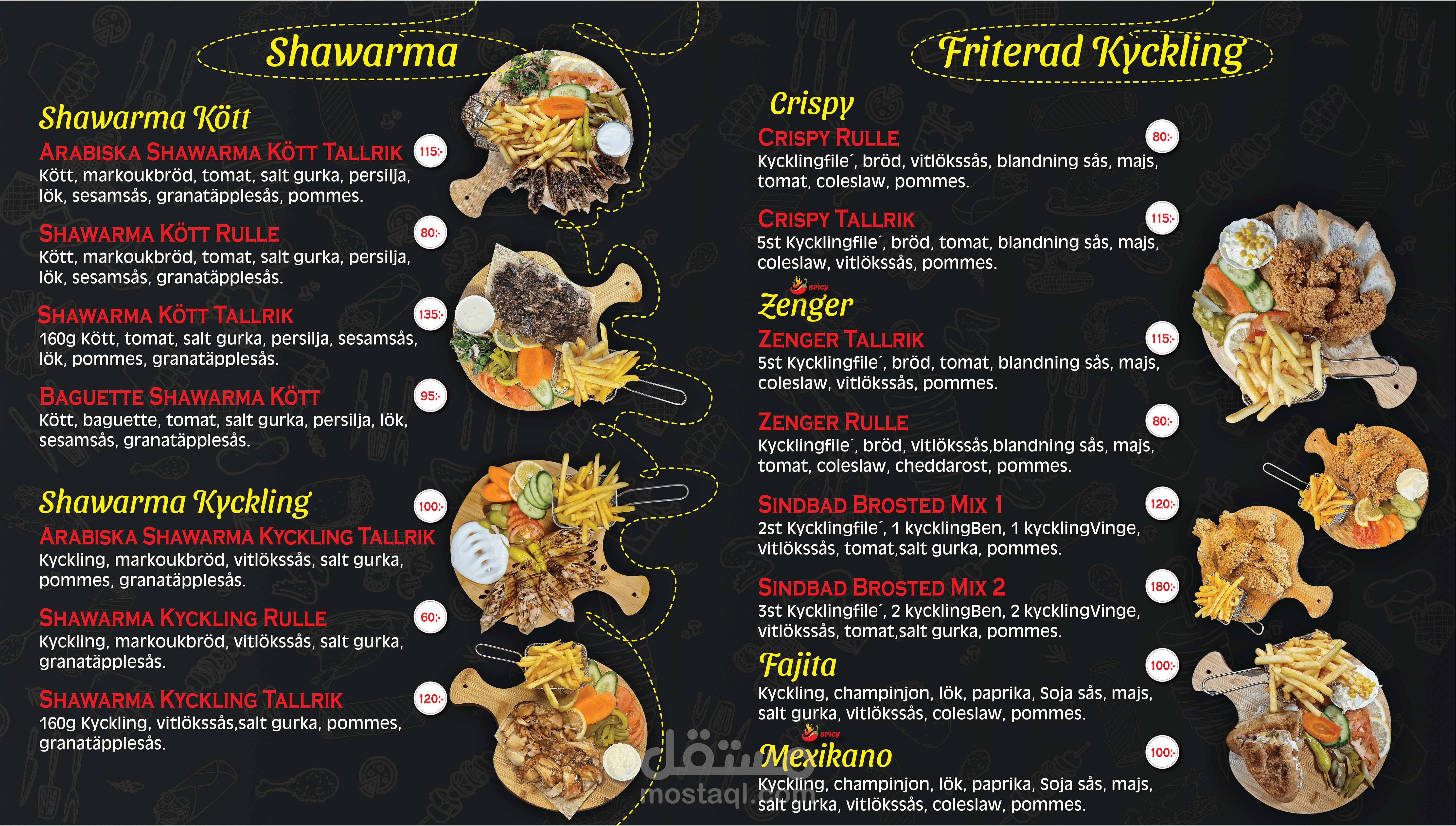
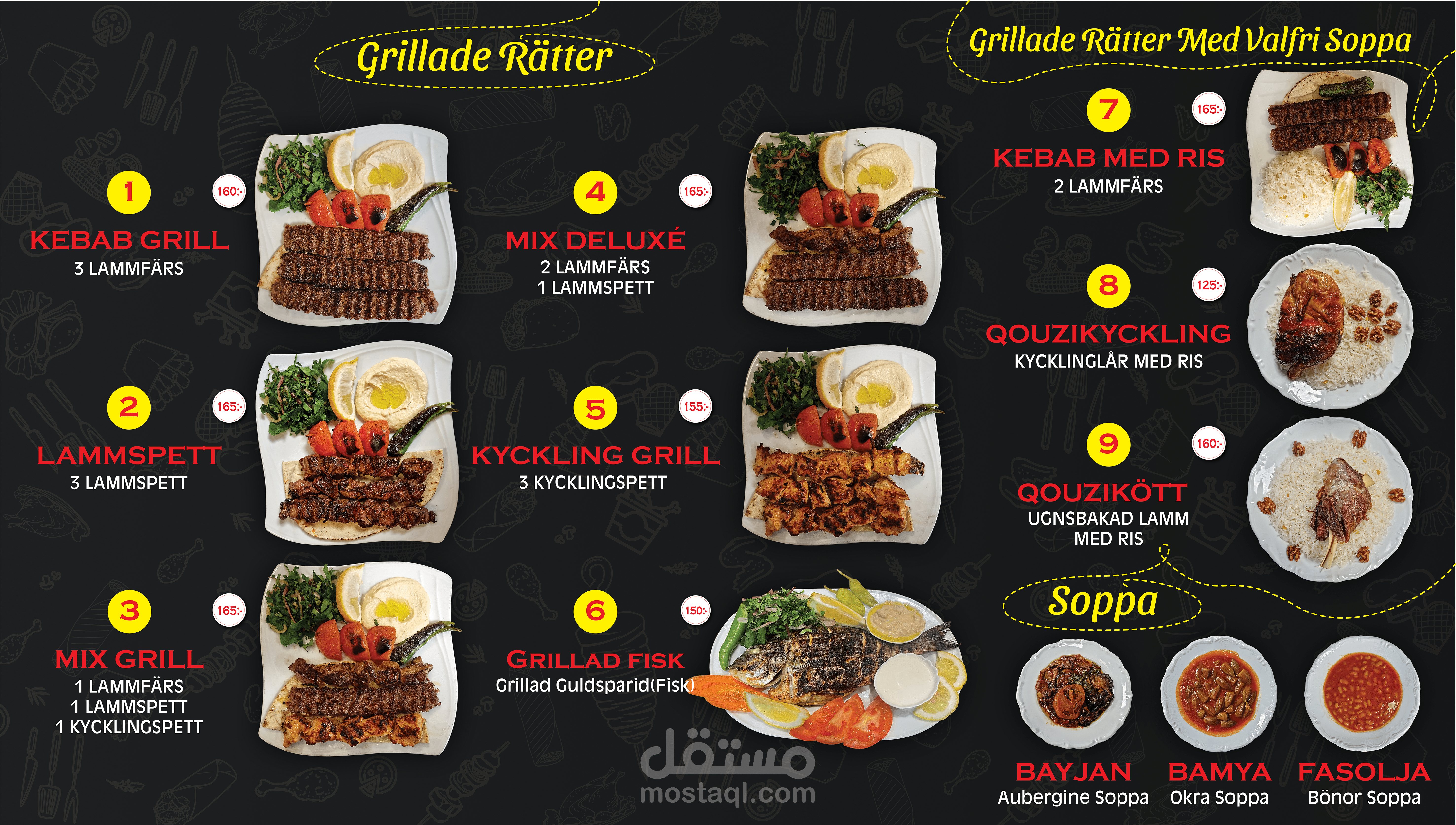
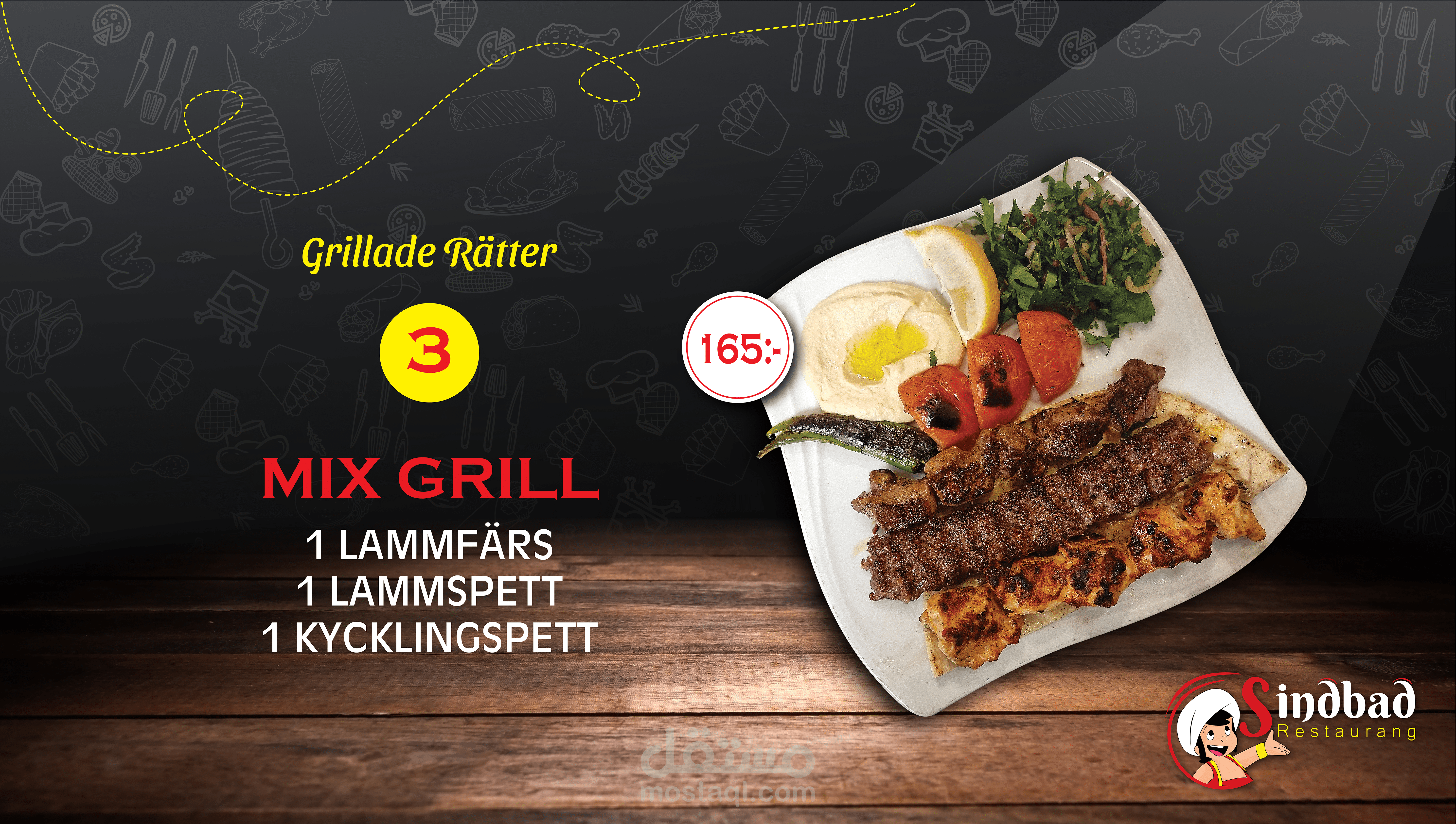
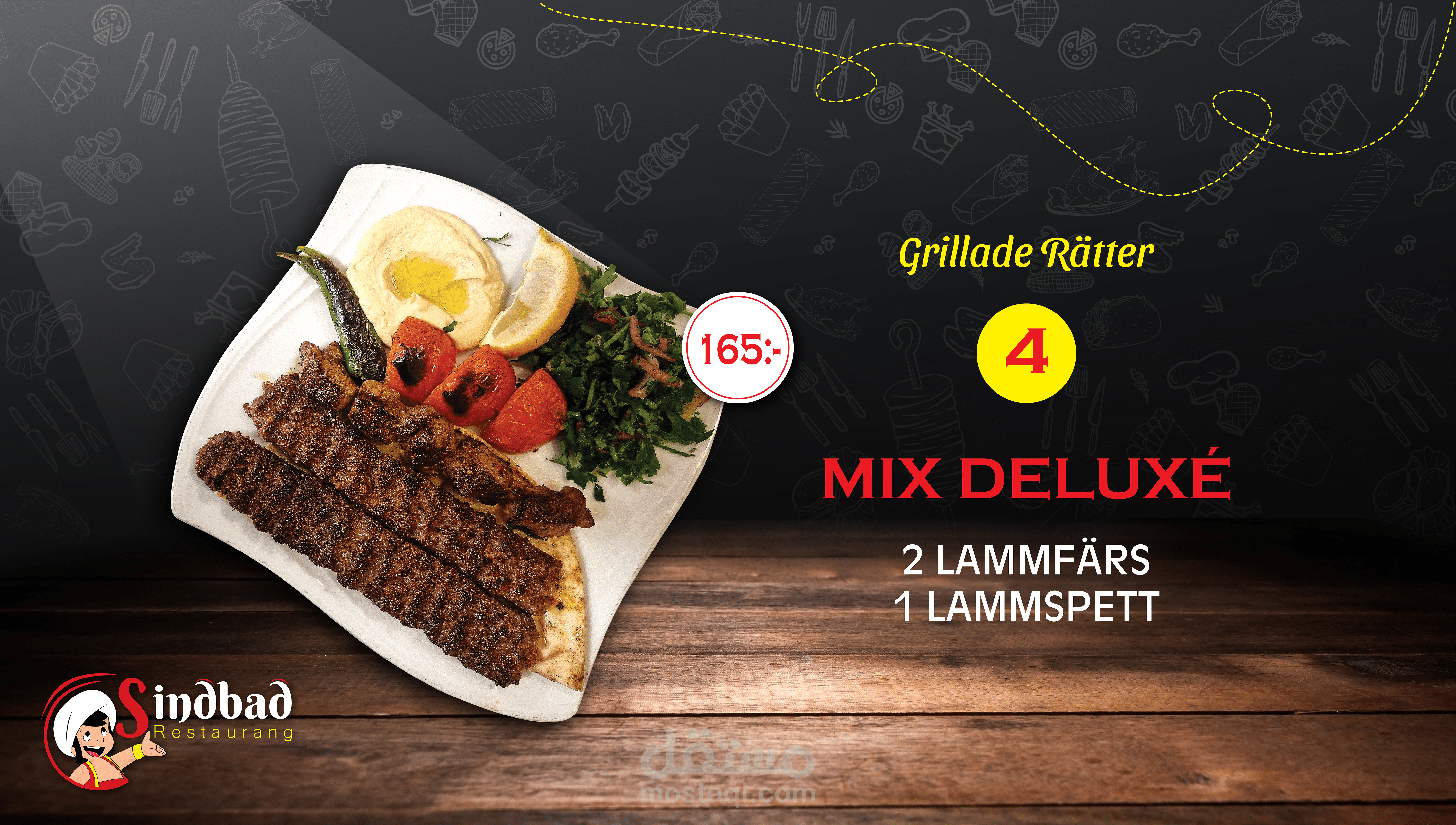
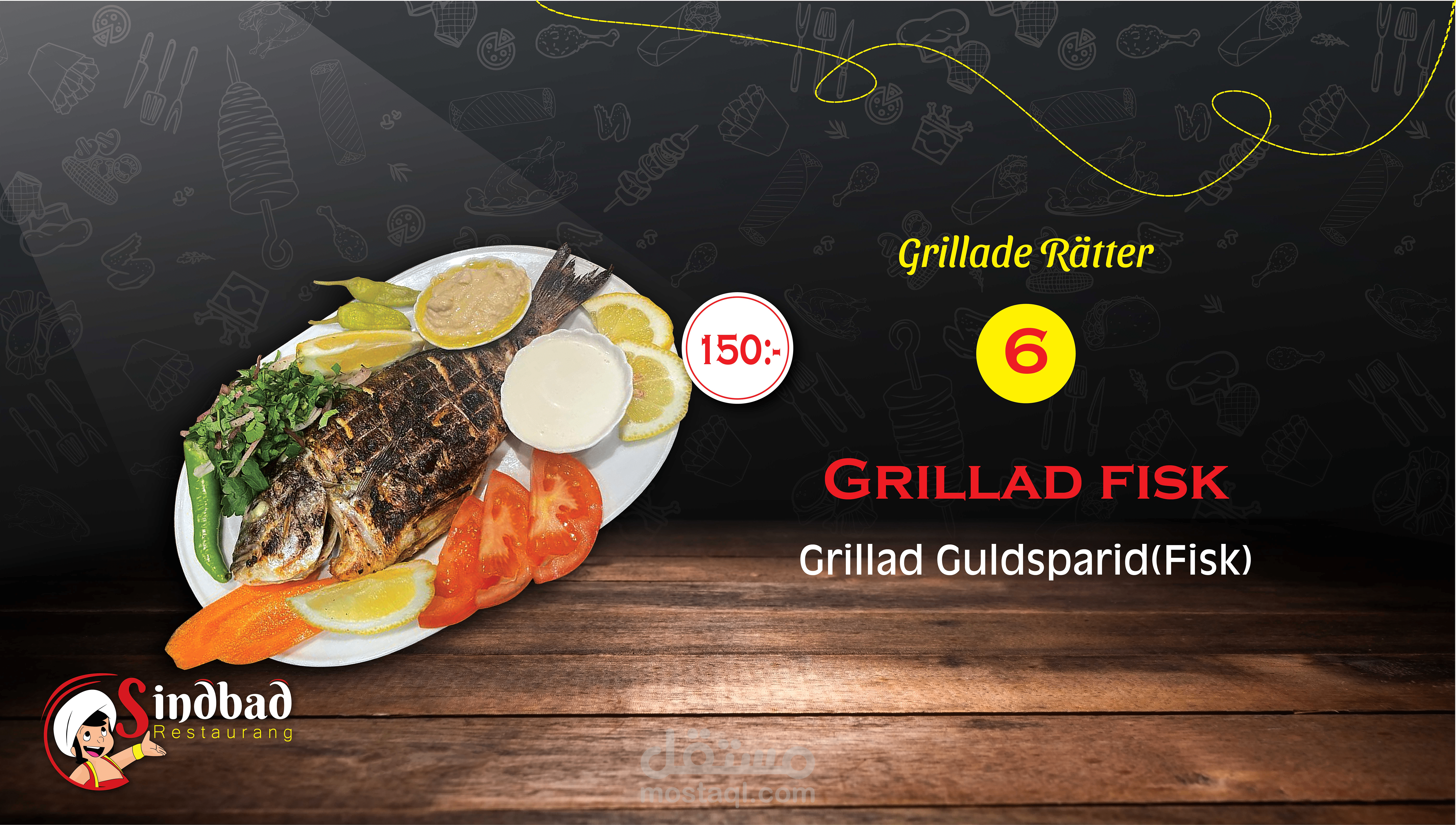
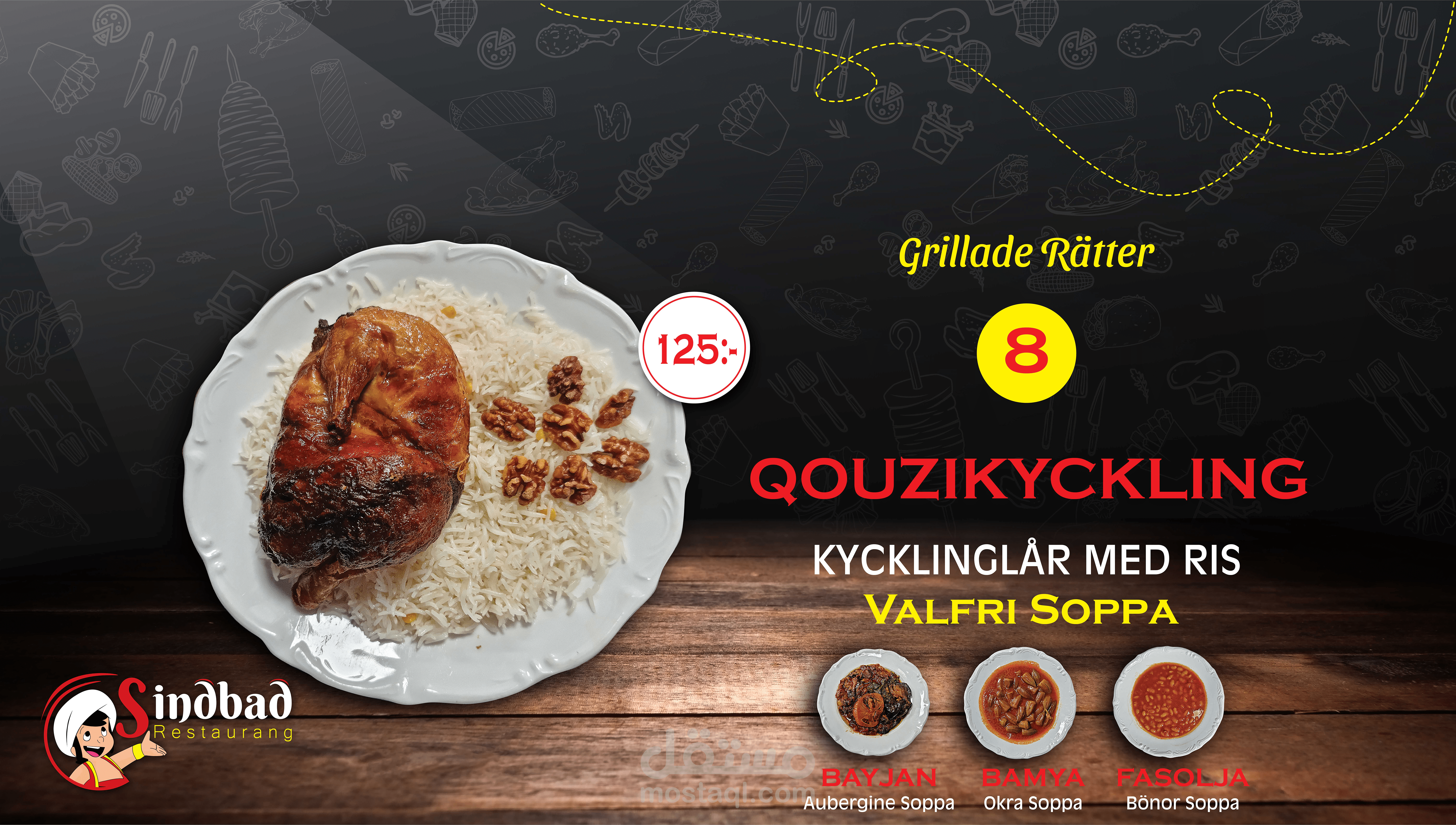
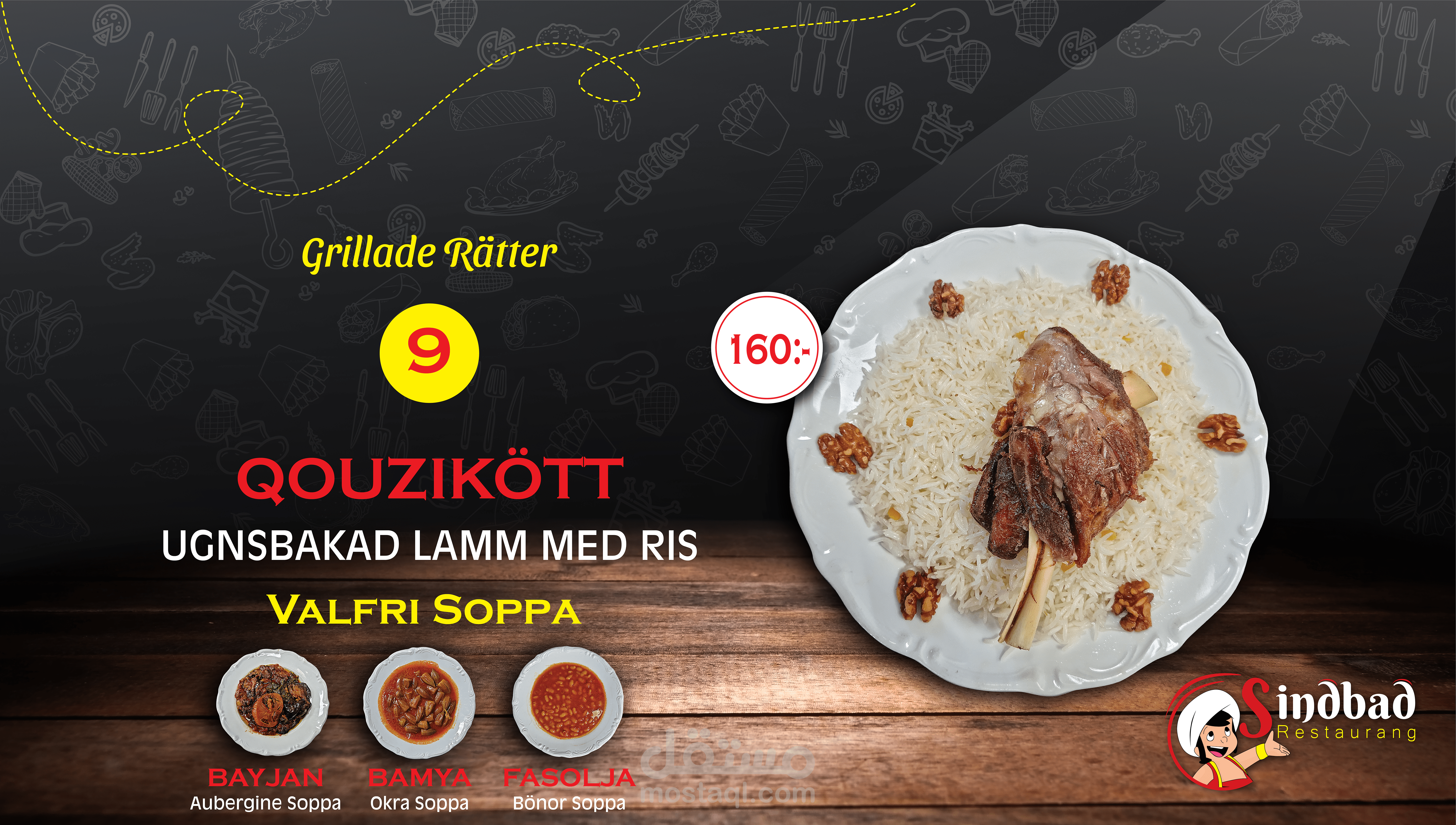
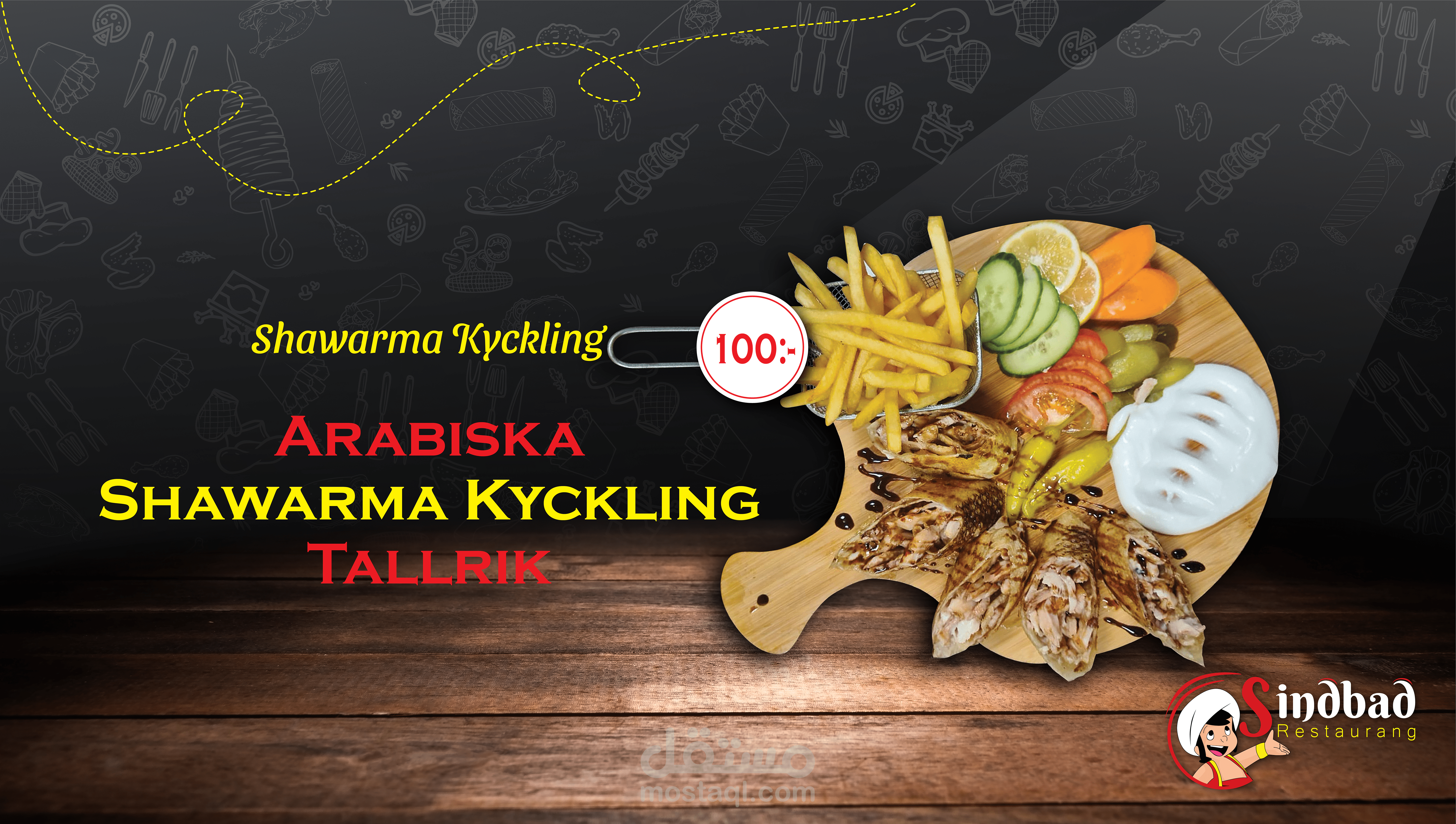
كان العمل مؤلف من عدة مراحل لانجازها و كانت البداية مع اللوغو ثم قمنا بالبدء في بتصميم لائحة الطعام لتاخذ هذا الشكل الجذاب وقد قمت بتصوير جميع الوجبات و تنسيق الصور وقصها بشكل يتناسب مع طريقة ترتيبها في لائحة الطعام.
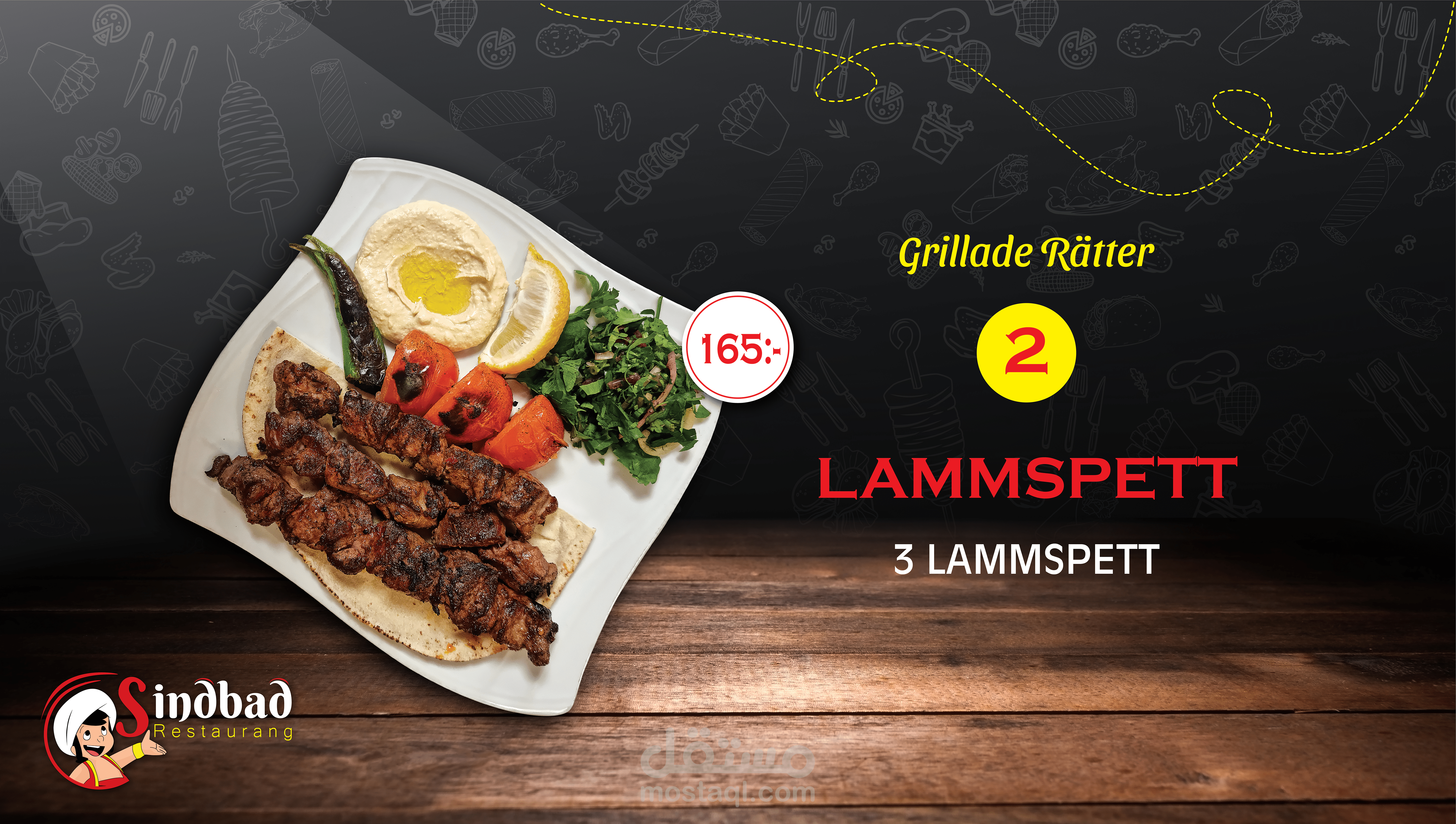
لدى صاحب المطعم ثلاث شاشات لعرض لائحة الطعام لذلك قمت بتصميم لهذه الشاشات تتناسب مع الحجم و الشكل والاضاءة و كان يوجد شاشة ضخمة منفصلة اعددت تصاميم متنوعة لهلا لعرض الوجبات عن طريق صور و فيديو.
The Sindbad Restaurant in Sweden is one of the best restaurants in the world, and I created a design that matches its name.
The background is gray with a draw of food with an appropriate level of transparency so that the background stands out clearly.
White, red, black, gray, and a little yellow were the colors used for the project, and they blended beautifully and gave the design a beautiful luster.
After creating the logo, we designed the menu to take this attractive form in the following stages.
The meals were photographed, coordinated, and cut in accordance with the menu arrangement.
The owner of the restaurant has three screens to display the food menu, so I designed these screens to suit the size, shape, and lighting.
There was a huge separate screen. I prepared various designs for it to display meals through pictures and videos.